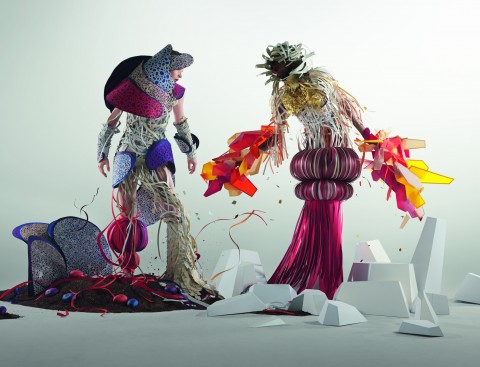
“Designers take a modern twist on the traditional for spring 2014 by pairing soft pastels with vivid brights to create a colorful equilibrium. Inspired by a mixture of blooming flowers, travels abroad and strong, confident women, designers use color to refresh, revive and defy conventional wisdom.” -from the Spring 2014 report
Yes, some of the color descriptions can be a tad fatuous (Sand “conjures images of the beach” – oh do tell). In fact, jettisoning the entire prose portion of the report could only enhance it – it’s rather like having somebody explain a joke to you. Just give us the color chips and the breezy fashion sketches and we’d ooh and ahh appropriately.
Yet enough of this sniping; we said we love the report and here is why. We live in a world torn by violence, disaster and financial woe. And occasionally it all feels like we chose the wrong page in a “Choose Your Own Adventure” book.
But so long as we live in a world where Pantone continues to devote itself to something as important to the enjoyment of life as color, and does so with all of the precision and sobriety of a physician healing the sick, surely that’s still a world worth living in. (And your colors are Placid Blue, Violet Tulip and Hemlock. Wear them in good health, sweetie darlings.)

