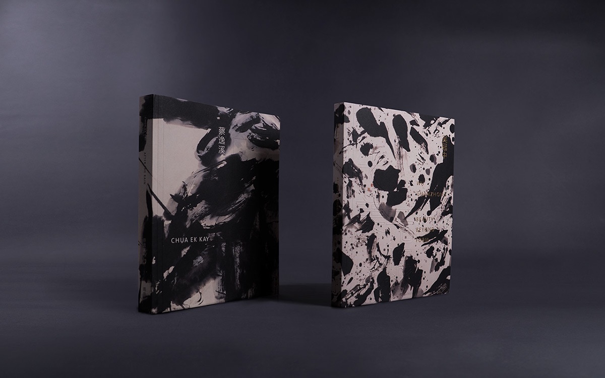
While we’ve traditionally been advised to “take the rough with the smooth” in life, our society has virtually eliminated the former in terms of those things that surround us. Everything is rounded corners and sterile environments these days, the Web simply being the apotheosis of this. Perhaps that is why print projects that employ textures are the ones that truly stick with us. This pair of 200-page art catalogues designed by Singapore’s Somewhere Else Co. for two different exhibitions are intriguing examples of that.
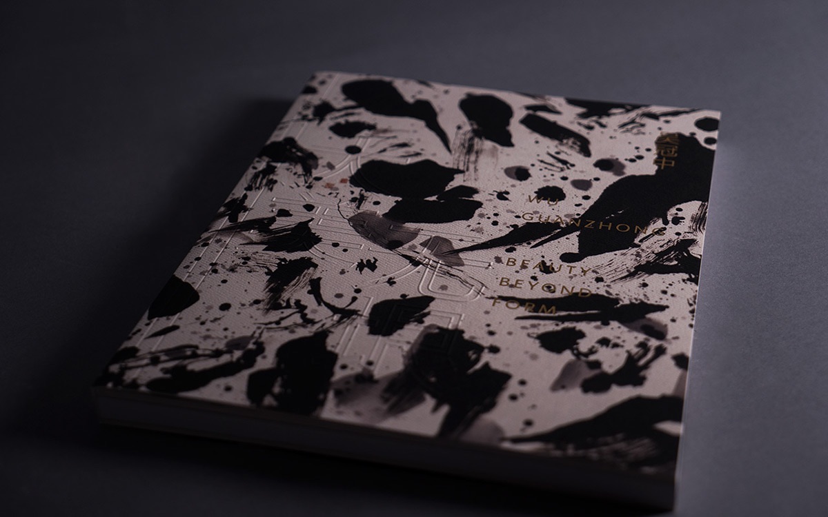
The cover of “Beauty Beyond Form” blends a textured cover, embossing and the artist’s own highly-texturized visuals to transform this book into something that would look more appropriate on an easel. How often do you see something in which gold foil stamping is actually the least impressive detail?
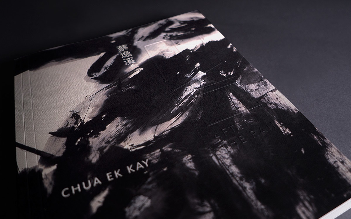
The other volume (above) employs the same techniques to a somewhat different effect. Since the moodiness of Chua Ek Kay’s art is rightfully the focus here, the embossing and textured paper of the cover is more attuned to our sense of touch, though it does still impress visually, too. The double score on the left of both catalogues adds further dimension, as well as seemingly nudging the framing of the piece to the right.
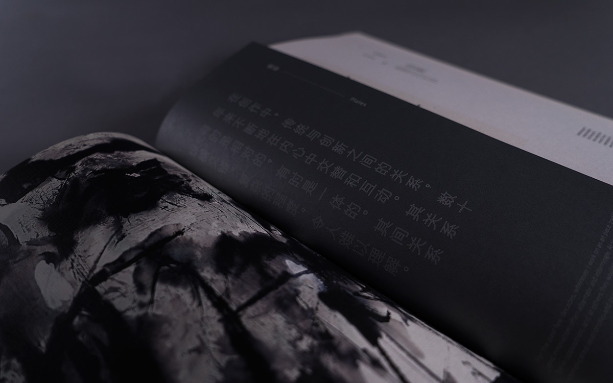
Our multi-sensory artistic exploration continues inside with the type of moody spreads we’ve come to expect from those gorgeous covers. While Google Cardboard and other platforms continue to attempt to make 2016 “the year of virtual reality,” it is design such as this that provides the element missing from them all – a true, tangible experience.
Discover more Cool Designs right here.