 By Aaron Berman
Designers, for the most part, are a cheery lot more interested in beauty and style than wanton violence. Which is why it came as a shock when not one but three designers referenced a scene from the brutal 2000 horror flick “American Psycho” in as many weeks. Each time the subject had been business cards, and if you know the movie or the novel on which it’s based, you know the scene they couldn’t help mentioning.
Patrick Bateman, who’s butchered several people without blinking an eye, only becomes visibly disturbed in a meeting with fellow investment bankers…when he sees their business cards are nicer than his.
[youtube=http://www.youtube.com/watch?v=aZVkW9p-cCU]
For all its goofiness, the scene gets at something fundamental about the creation of the perfect business card. Brochures and websites are nice for equating a potential client with your wares, but the business card is, quite literally, a part of yourself and your brand that you leave behind. And whether that part of yourself is kept for months or tossed the moment you walk away comes down to what that card says about you, and how useful it is to the recipient.
The most memorable ones we’ve seen recently consist of little more than imagination, excellent printing and finishing techniques, and keen attention to detail.
Pushing the (Dimensional) Limits
Seems like you can’t go anywhere without coming across somebody rabbiting on about “3D printing.” Miraculous though it is, business cards that have an appearance of 3D can be pretty unforgettable, too.
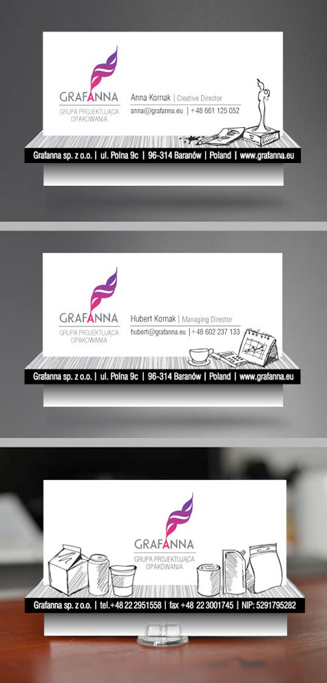
This card for the Polish packaging design group Grafanna was created last year by creative director Anna Kornak. In keeping with a somewhat cartoony design theme that carries through to its website, each card boasts a “shelf” that seemingly emerges from the card itself. On the front, the shelf holds items fundamental to each person’s job function – Kornak’s (above) shows a pencil, an ink splotch and one of her design awards. On the back, the shelf features some of the different packaging types in which Grafanna specializes.
“They are a good start to business meetings,” admits Kornak. “When we meet with our business partners, we give them our business cards in little plastic stands – then the 3D effect is evident and impactful.” Frequently the cards themselves are conversation starters with potential clients, she explains, “which is very nice.”
The cards were printed on 350g offset white with UV varnishing. “This refinement makes some elements on the surface extremely reflective and glossy,” says Kornak. “This helps get the three-dimensional effect.” An individually developed punch completed the process.
Focus on the fold
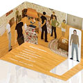
One of our favorite cards is this one for InWorld Solutions, and came to our attention courtesy of foldfactory.com’s Trish Witkowski.
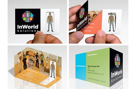
Designed by Gee + Chung Design, this award-winning piece gives each employee their own avatar on a flat-folded, business-card-size piece. When you unfold the card, the diecut avatar finds itself in a three-dimensional illustration – a floor and two walls – unique to them. When all is said and done, you’re looking at a printed four-color process, aqueous coat, scored, handfolded and glued piece that’s liable to sit on someone’s desk indefinitely.
Paper with a purpose
While novelty has its place, if you really want someone to hang on to your card, you could do a lot worse than making it, well, functional.
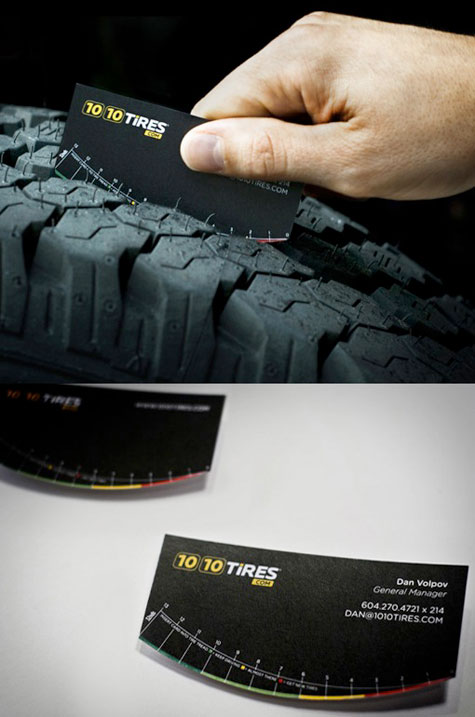
If your racket is selling tires, you can either slap a picture of a tire on your business card, or you can do what advertising agency Spring did for client 1010 Tires.com: create a card that actually measures the depth of a tire’s tread.
“They are printed on 120 lb. matte card stock and were custom cut in order to achieve the shape of the bottom,” says James Filbry, associate creative director and partner at Spring.
Not only do they tell potential customers how much tread they have left, but also when it’s time to get new tires. That, as they say, is where the rubber meets the road.
Timeless elegance
After all the folds, three-dimensionality and gimmicks, though, we have yet to find a card that makes a stronger impression than this one.
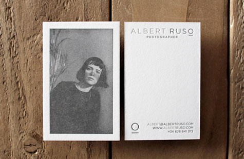
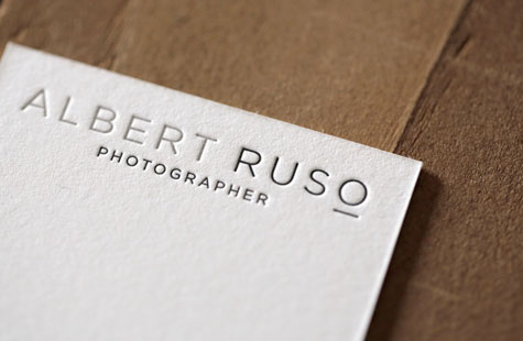
For Albert Ruso’s card, La Trastería letterpressed a halftone of the photographer’s portrait of illustrator Blanca Miró onto Neenah Paper’s CRANE’S LETTRA 600 gsm fluorescent white paper. Mr.Wonderful’s logo completes the elegant effect. (Neenah featured the card recently on its “The Beauty of Letterpress” website.)
In short, it is a card that is timeless, collectible, and worthy of any profession. Even that of a psychotic investment banker.
………
 A former writer and editor for USA Today, Aaron Berman is the editor of PaperSpecs, and covered the newspaper industry for the Newspaper Association of America’s monthly magazine, Presstime. He is also author of the forthcoming book “Soap: The Inside Story of the Sitcom that Broke all the Rules,” and seriously needs another cup of coffee right now darn it…