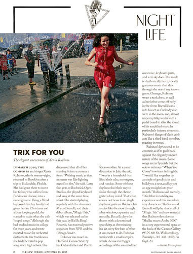
 How do you redesign a magazine as beloved and respected as The New Yorker? Very carefully, as it turns out. This month, creative director Wyatt Mitchell and his team began with subtle changes to the departments “Goings On About Town” and “Briefly Noted,” the contributors page, and the table of contents, as well as its fiction sections.
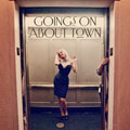
While much of the redesign consists of changing the number of columns and adding a more distinctive presentation of the opening image for “Goings on About Town,” according to The New York Times, the typefaces are also getting a new treatment.
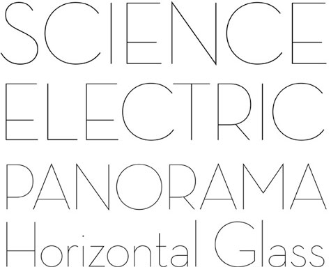
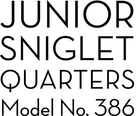
The traditional Irvin typeface is being redrawn, and is now joined by Neutraface (examples below) as a secondary choice. The latter, named for architect Richard Neutra who specified open and unobtrusive lettering for his commercial buildings, was designed by Christian Schwartz, and released by House Industries.
Says longtime editor David Remnick, The New Yorker is “a living thing. It should also have a sense of fun and improvisation and experiment.” Just don’t experiment too much there, David.