While we appreciate fine beers, wines and spirits as much as the next person, we have to admit it is the label that draws us in, and the label alone that we remember long after we’ve slept off the product inside the bottle. We kick off this new “Cool Labels of the Week” feature with three delightfully sinister varieties, including a double shot from those maestros of the macabre, Hired Guns Creative.
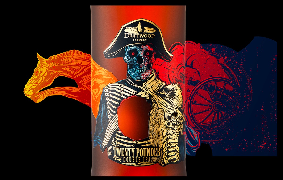
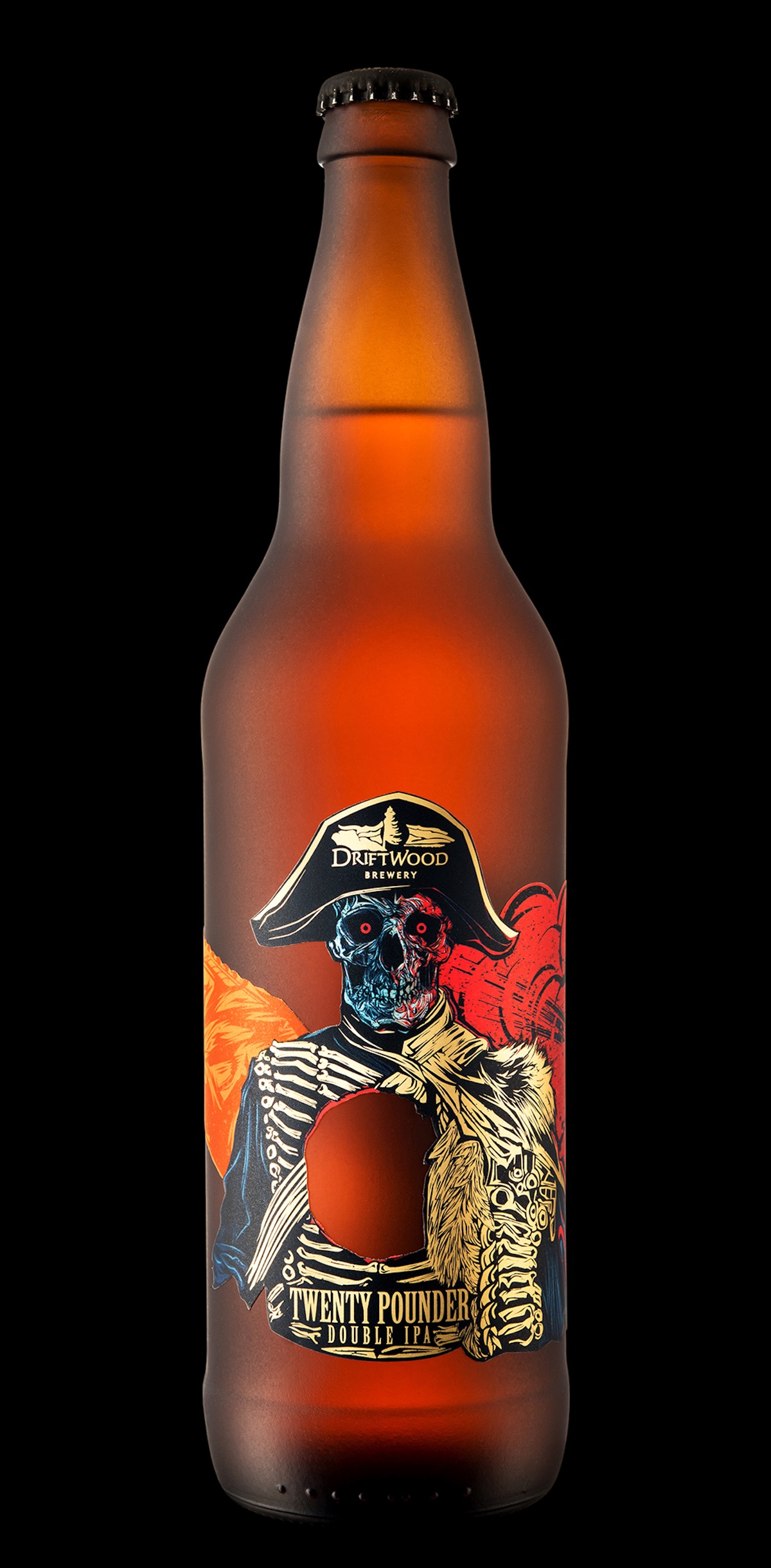
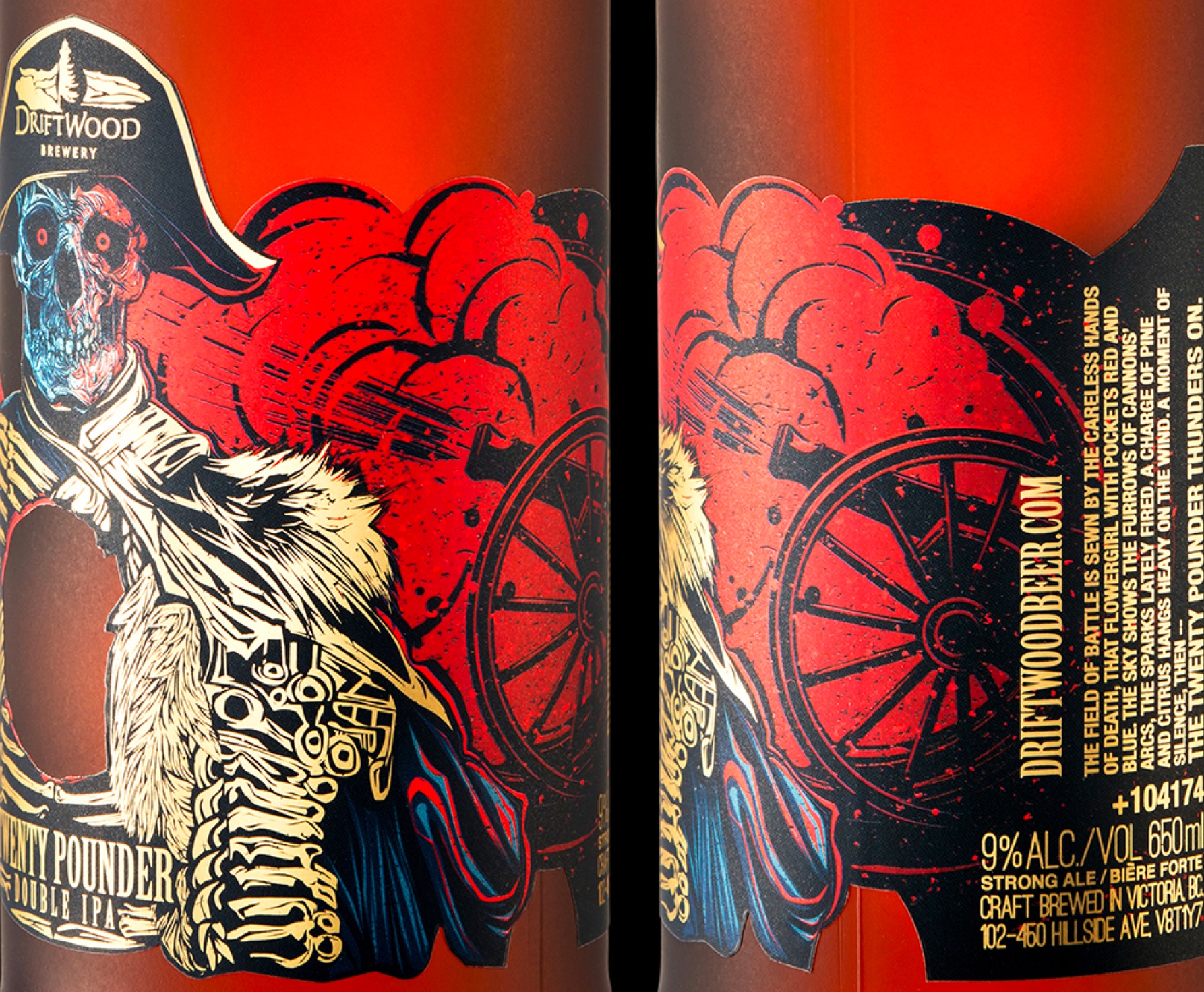
Twenty Pounder Double IPA Label
If by some stroke of luck this is the first time you’ve come across Hired Guns, you’re in for a little treat. The fevered minds there have a delightfully ghoulish sense of humor when it comes to designing labels. This one for Twenty Pounder features a grinning general shot through the chest by the eponymous 20-pound cannon ball (actually a relatively simple die cut), gold foil bone braiding on the jacket, and vivid reds and blues throughout.
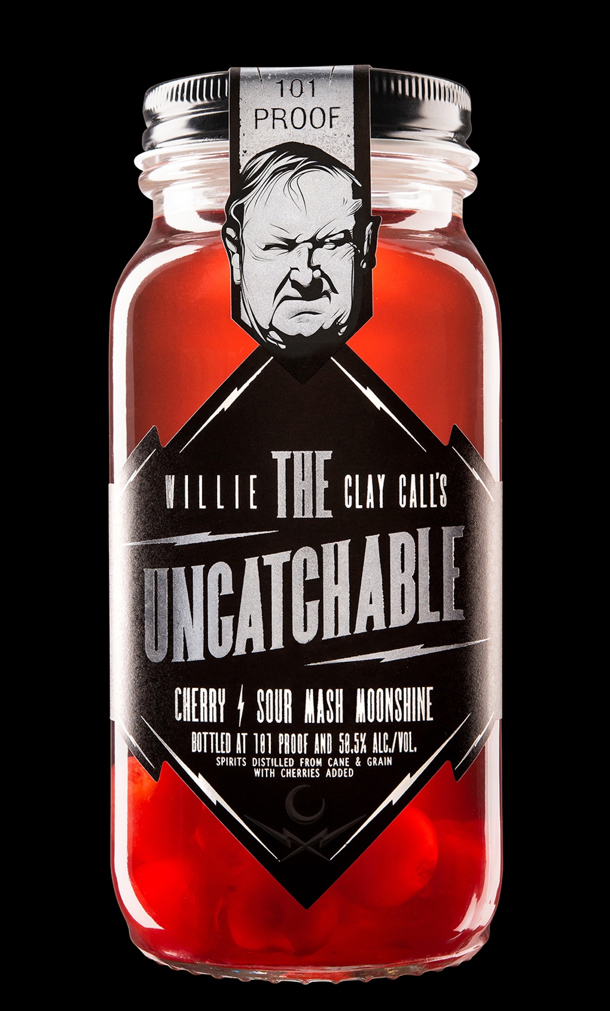
The Uncatchable Moonshine Label
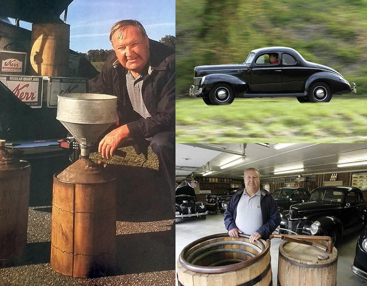
This is an example of Hired Guns being “restrained.” Moonshine has a long and fabled history in the United States. Call Family Distillers recently went legit after several generations of underground activity, and tasked the agency to whip up a label that would pay tribute to 150 years of moonshining in their native Wilkes County, N.C. (The name “The Uncatchable” comes from the sobriquet that ATF agents tarred Willie Clay Call [see images below] with back in the day.)
“For the packaging, we set our type front-and-center in bright silver foil and pearl white, popping it off the matte black labels. Lightning bolts form the frame and lend their shape to the dieline. An illustrated portrait of Willie Clay Call crests the cap strap, putting the final seal on the mason jar — the same jar of moonshine handed down for 7 generations, now available during daylight hours.”
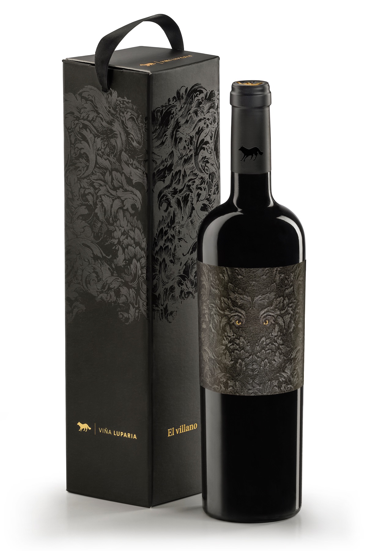
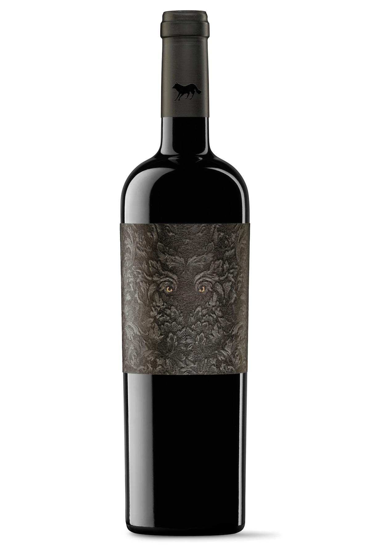
El villano (‘The Villain’) Wine Label
Though we may be taking a break from Hired Guns, we’re still very much in frightening territory with TSMGO (The Show Must Go On)’s label and box design for El villano wine. Those foil eyes stare out at you as if belonging to a beast lying in wait for its prey. So mesmerizing are they, you might not even notice the wolf shape on the bottle neck. Meanwhile:
“The silhouette of the villain is built with few elements, technically complex: A recreation of a vine leaf motif with a set of black on black where the contour of the figure of the wolf and its mystery guest. The cottony texture of the paper invites touch and test the application of relief gives depth to the whole. Finally stamping golden eyes of the villain creates a contrast and an inescapable focus of attention.”