 When one-woman typography phenomenon Jessica Hische decides to give her blog readers tips on choosing just the right type for what they’re trying to accomplish, we listen. More accurately, we bow gratefully and point our readers to her detailed thoughts on the subject. (Note that due to the way her blog entry is placed, you will have to scroll down to the subject “Choosing the Right Type.”) Here are some highlights from those thoughts.
Make sure your type has:
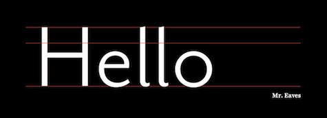
- A decent size x-height (height of lowercase characters). “If the x-height is too low, the typeface will appear smaller overall and the caps will have too much emphasis which interrupts smooth reading. If the x-height is way too high, your eye won’t be able to distinguish quickly between caps and lowercase, which can make you lose your place while reading. A generous x-height allows you to set type at small sizes (for captions and the like) and have it still be very legible.”
- Generous spacing between letters (especially for text type, as opposed to display type). “If you feel like you have to add letter-spacing to 16px body copy, you might be working with a typeface that is too tightly spaced, or too tightly spaced for your taste.”
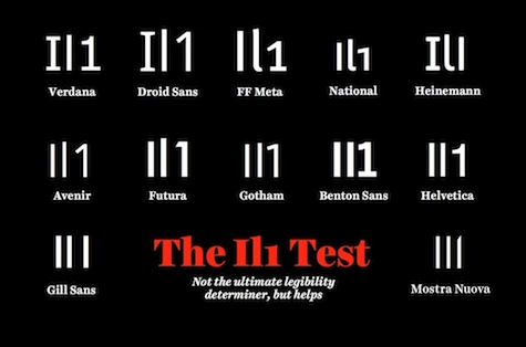
- Enough letter variety if it’s sans serif. “I try to find sans-serifs that pass the Il1 rule. Type a capital I, a lowercase l, and a number 1 next to each other. If you can’t tell the difference between these characters, you may run into some trouble when setting the text.”
Thanks, Jessica 🙂