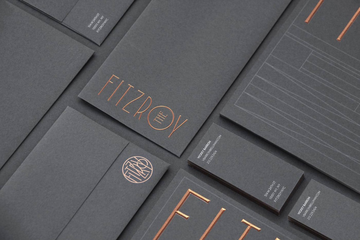
Everyone has their shortlist of favorite designers – not necessarily the ones lionized at industry conferences, perhaps, but those that nevertheless produce inspiring work year after year. Kevin Cantrell is definitely on that list for us. Even when he’s not crafting intricate typography, he impresses with a knack for nailing the right type for the right product or service as he does here for The Fitzroy luxury condos in New York City.
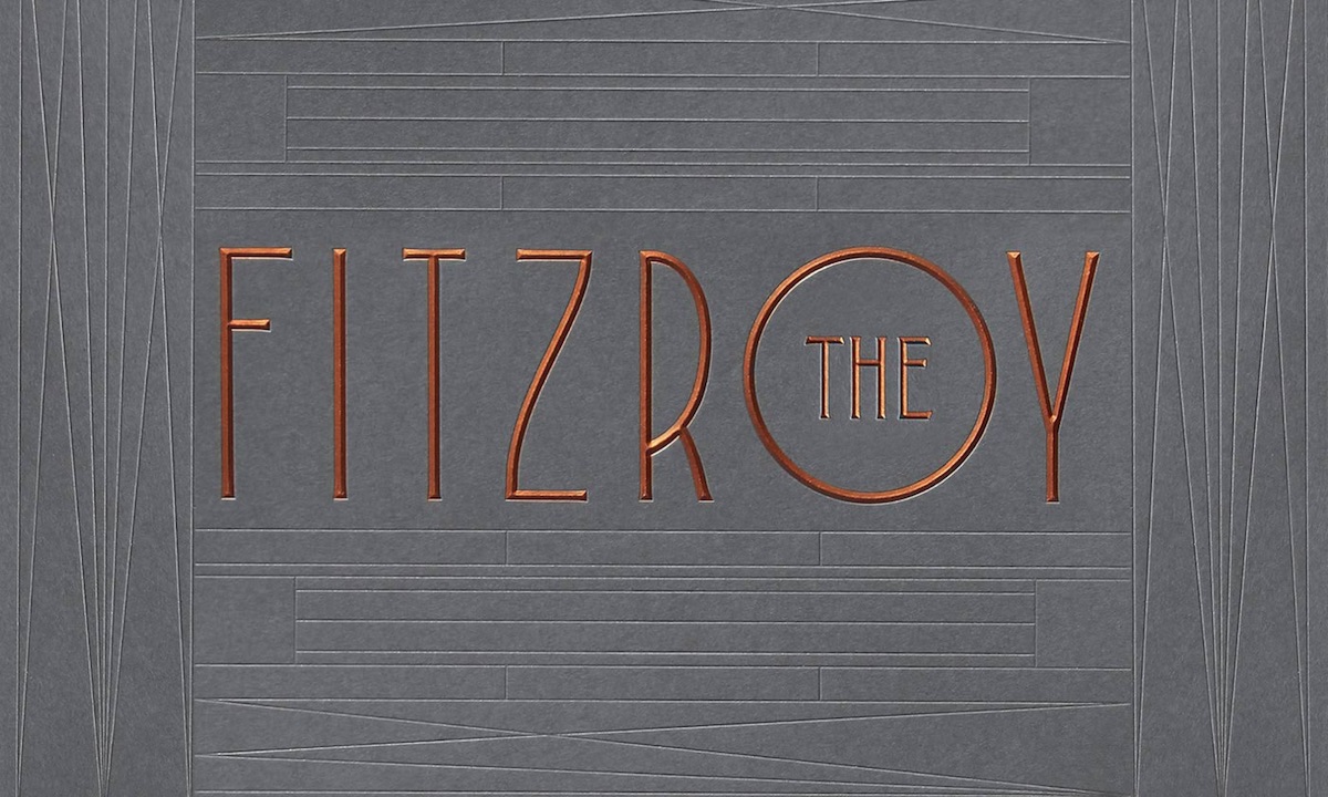
The slender, beveled type and debossed lines call to mind the Art Deco sensibilities we’ve come to equate with another “Fitz” – F. Scott Fitzgerald and his jazz age. Indeed, this influence becomes increasingly apparent the more you look at these identity materials.
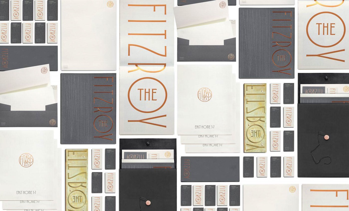
If there is one element that arguably doesn’t work, it is the jamming of “Fitzroy” into a circle (lower left corner of the image above). Interestingly, the relative complexity of what is clearly meant to be a logo of some sort only further demonstrates how effective and elegant the cleaner “Fitzroy” nameplate actually is.
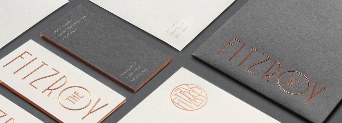
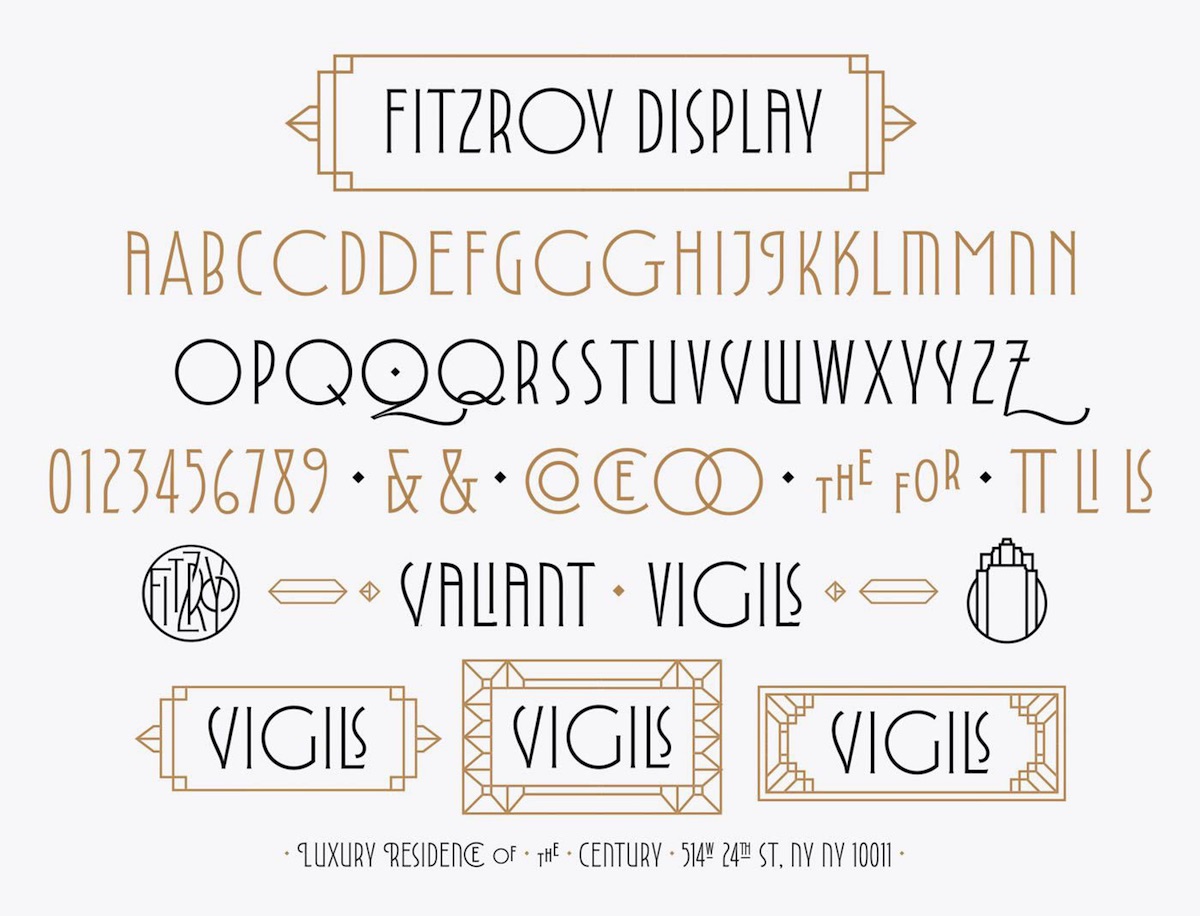
In addition to the stationery, Cantrell “named the building (based on the lost Fitzroy Road that ran through Chelsea in the late 19th century), created a dynamic and contemporary brand identity system across multiple brand touchpoints including brochure, sales promotional package, floorpans, website, billboards, signage, photography art direction, and a proprietary font, Fitzroy Display.”
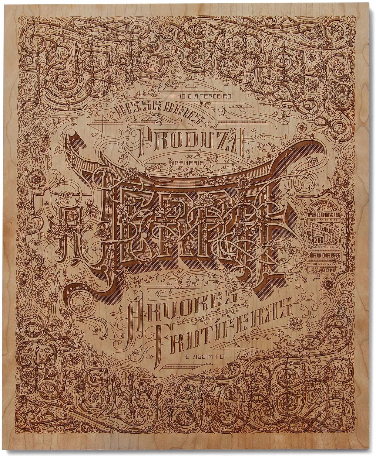
To fully appreciate Cantrell’s work on The Fitzroy, it helps to examine what he’s been known for previously, such as the print below.
Discover more Cool Designs right here.