 By Jack Bredenfoerder
Last week, color expert Jack Bredenfoerder gave us his forecast for this year’s color trends. This week we conclude with a brief Q&A with him about what goes into the making of a color trend, the psychology of color, and Pantone’s Color of the Year concept. –ed.
When we talk about color, are there separate trends between those we see online and those we see in print, fashion, and other “real world” venues?
Yes definitely, but there is an advantage to first define the macro color direction as I have illustrated. The individual industry trend expressions can be quite useful references for further defining your own particular industry’s color direction.
For PaperSpecs, I would suggest it would be best to closely follow the print, fashion and home décor color trends and directions. I have prepared a Pinterest board and selected links from these three industries for your reference. I believe these work very well with the Color Feast direction I have defined earlier.
Similarly, in order to discover a color trend, presumably we must place limits on the data we consider: geography comes immediately to mind. (Do we see the same trends in China as we might in Great Britain, for example?) But also, are there different trends between age groups, artistic mediums and so on?
Geography and culture have always been a major consideration and must be considered, but the world is becoming smaller. Ideas and trends travel quickly between regions, cultures and industries. That’s why the factors driving the trends are so important. The trend may not be expressed exactly the same way in China as in Great Britain, but if the driver is the same it is more likely to be a cross-cultural trend.
Color Marketing Group does a great job conducting color workshops globally and regionally in order to identify and explain both global and regional trend directions. Throughout the year, they conduct regional workshops that define the drivers and the color directions for that region. Then, usually in November, those results are brought to a global color design summit to compare and discuss. From that summit, the global color drivers and directions are defined.
Do we really even inhabit the same world anymore enough culturally to be able to have a color trend in common? (For example, people who are greatly in tune with technology trends are seeing one set of phenomena in smartphone and web design, while those who follow fashion are likely seeing another.)
I would have to say we definitely still do inhabit the same world. What individuals choose to follow is the big question. Once again, this goes back to what issues (drivers) are causing them to make these choices. What is important to them? Also keep in mind that people are in touch with multiple media and industries. They freely switch back and forth, but the issues that are important to them are still the same. The context is what’s changing; the big drivers evolve over time.
Is there anything that’s surprised you so far in what you’ve seen of current color trends?
I expected the new direction of deepening and richer colors, but I was a bit surprised how designers are using black as a binding agent to anchor some of the brighter colors and still get the intended direction.
Pantone’s Color of the Year, Radiant Orchid, was a bit of a surprise in that it is so bright and vibrant, but it is understandable that Pantone wants this color to be noticed and talked about. I see it being used as the accent or diva of a color story. I can see it being the star that everyone notices, but it will need a deeper ground around it to truly shine.
Do you believe the psychology of color itself has changed significantly in recent years? Can we confidently draw the same conclusions about what the color red means to us, for example, as once we did in the ‘70s and ‘80s?
In contrast to many of my colleagues, I am not of the opinion that individual colors can easily have meanings assigned to them. It’s the context and how you put the colors together that really creates “meaning” for a color story. Consider how words can have multiple definitions and it’s how you put them together that really defines the real meaning of a written message. The same is true with color.
While I will acknowledge that there are some established cultural color conventions like Feng Shui, Chakra and others, my skin crawls when I hear a marketer or designer say we used red because it is the color of love. Can’t it also be the color of carnage and hate? In music, it would be like saying that middle C meant happy and E flat meant sad – totally bogus. Put the notes artfully together and you can create a love song, a march, a waltz, or many other expressions. It’s how we use and create with color that communicates the meaning, not the individual colors. As we create new stories, for new directions, the color meaning will change. I believe that has always been the case.
Pantone’s ‘Color of the Year’
How influential would you say Pantone is overall in its influence of color trends?
Very Influential. Pantone has done an excellent job over the years of differentiating its color system as the designer’s color system, while other color systems have presented themselves as more scientific. Pantone assembles panels of leading designers each year to create its forecasts and color directions.
Picking out one color as the “Color of the Year” is a bit oversimplified but it is a great marketing tool, and Pantone does an excellent job selling it. With every new fashion year everyone talks about “the” color or colors for that fashion season. Pantone is simply giving consumers what they are asking for in a well-managed media blitz.
Do you believe this annual announcement influences design trends beyond those of companies looking for a quick boost in sales tied to easily re-colored products (coffee mugs, etc.)?
Yes definitely in the case of Pantone, but also paint manufacturers like Sherwin-Williams, Benjamin Moore and AkzoNobel. These companies have dedicated staff and designers who track color and design direction and trends.
They also do annual and seasonal reports beyond their “Colors of the Year.” In the reports, they offer why they believe their directions are valid and they usually define their drivers. This information is often available at little or no cost to the rest of us.
There are many other trend services and trend groups that have reports available, but these often come with heftier price tags. A smart company will gather all this information and examine it for common treads that may be relevant to their particular product lines. The “Color of the Year” is more the cherry on the sundae to attract attention to the full trend report and the expertise they offer.
The color is said to be chosen based on trends that Pantone itself has seen in various industries. Once the color is announced, it then influences many in those same industries to use it. Is it possible then that Pantone is too involved in this sector to be able to accurately chart trends without itself influencing the phenomenon it’s trying to study?
This is a reoccurring concern that has been expressed not only about Pantone, but any group that offers a color forecast. It’s the idea of the self-fulfilling prophecy – does the forecast then become the driver itself? To be totally honest, I would say the answer is yes. It does happen and is part of the overall mix. However, is it necessarily a bad thing for a company that truly does study the pulse and direction of color to take a leadership position? The consumers are the ones that ultimately have the say.
If companies simply apply color to product just because some trend service says it is the right color and there is no real research to back it up, that induced color trend would most likely be a flash in the pan fad or a complete failure.
What are your thoughts on 2014’s Radiant Orchid Color of the Year?
It is not a new color and I don’t see it as emerging from the fashion runways at this point in time. It has been successful in the market for at least five years and is still growing.
The battle of the blue and red states and their corresponding color trends are now over 10 years old. With that battle came the emergence of the purple family as a common ground color. Men before this direction were rarely seen wearing purple, and especially not one this bright. Newscasters and celebrities were some of the first to accept it.
After 2008, it took hold and has not diminished since. I particularly felt that this was the important color of 2008. With that said, I think that this color has a lot of life left in it, especially when I see the general direction and psyche moving to establish common ground within our society.
To your point above, I do think that by Pantone selecting this color, it will magnify its importance and strength. During the Olympics I noticed that Meryl Davis shifted from a blue dress in her long program in the team competition to this color for the individual long program. Besides the fact that it looked better with Charlie’s deep purple attire, I think the color added a lot of visual excitement and passion. It was also interesting that when Bob Costas returned after his pinkeye problem, he wore this same color in his tie and shirt.
For PaperSpecs, I would suggest that you might use this color as an accent or liner. You might want to consider Sherwin-Williams’ “Color of the Year,” which is a much darker and less saturated purple. I think the Benjamin Moore “Color of the Year” and the AkzoNobel “Color of the Year” fit more in line with the global color directions I have seen from Color Marketing Group.
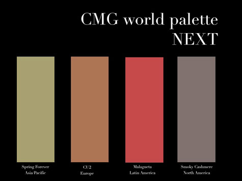
Never mind Pantone, what is Jack Bredenfoerder CMG’s Color of the Year, and why?
If I were to call out one single color it would be the color located in the bottom left-hand corner of my forecast.
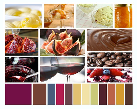
This deep wine color is a bridge between purple and red. If it were food, it would be full of anti-oxidants and taste delicious. In combination with my other forecast colors, I believe it creates a direction more conducive to conversation and exchange of ideas.
………….
 Jack Bredenfoerder is a seasoned color design and marketing professional with more than 19 years of brand design experience at Landor Associates, where he specialized in color strategy, trends and forecasting. Jack’s perspectives on color have been featured in leading business, consumer and design-industry trade publications including the Financial Times, The New Yorker, Communication Arts, ID and Advertising Age. He has also served as an advisor to HGTV.