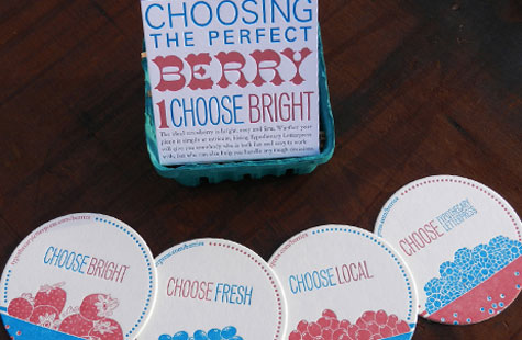
When designing her self-promotional piece, Megan Zettlemoyer, a designer turned letterpress printer, was inspired by the process shoppers use to pick fresh fruit. The resulting dimensional package is ripe for the picking and in season any time of year.
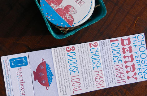
Yep, picking fresh fruit and a good letterpress shop has a lot in common. You should choose Bright, Fresh and Local. Clean and straight-to-the point copy sends a clear, quick message to potential clients in the accordion-folded brochure. The last panel is perfed so you can tear off a business card.
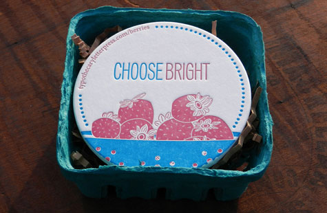
As a nice gift that builds on the message, a set of four coasters with berry illustrations (printed in two colors on 58 pt. IPR Creative Board) rests underneath the brochure (printed on 110 lb. Crane’s Lettra).
A berry tray that holds all the elements in this package is a perfect choice that once again reinforces the marketing. In the end, recipients had a useful piece, print sample and clever design all wrapped up with cotton butcher string.