Calendars are among our favorite end-of-year entries around the Gallery. (And if truth were told, usually the most creative forms of self-promotion we see from our talented design teams.) Taylor Design’s 2014 edition is not only clever and original, but it strikes just the right tone for a happy new year.
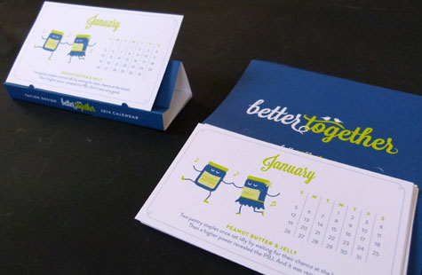
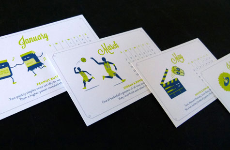
The theme is “Better Together.” The copy on the front of the envelope says it all very well: “It seems today even the smallest differences spark all-out war. Or least a lot of foot-stamping. [We] would like to help conquer the divide by honoring those things that coexist beautifully.”
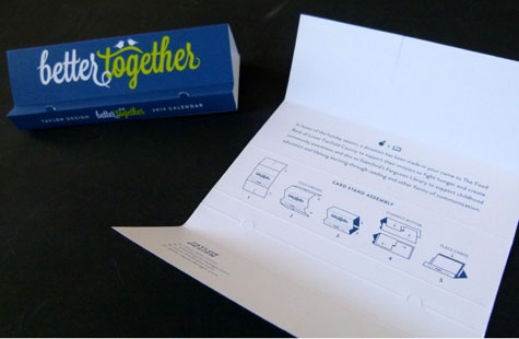
From Batman and Robin to Camembert and Cabernet, the illustrations on the six 5.75 x 4.25 cards make their point for togetherness. Each card is printed in two colors (one month on one side and another month on the other side) on bright and sunny Mohawk Via Vellum. Some strategic diecuts and scores, a fold or two later, and voila, the outer wrap that holds the cards in place turns into an easily assembled display easel.
As always, design details win the day … the words better and together are joined together in their looping script, two love birds sitting atop the cross stroke of the “t” in together, the delicate dotted border that frames each month’s card.