We learned to make sure the ink colors worked in harmony with each other.
– Kit Hinrichs
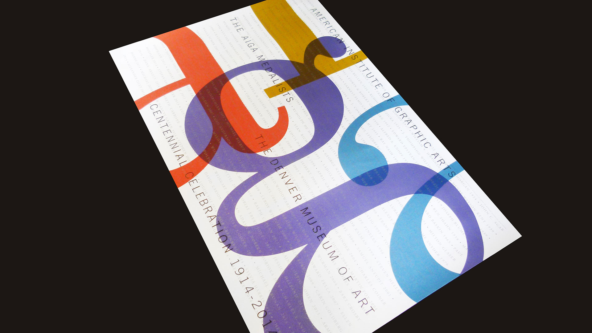
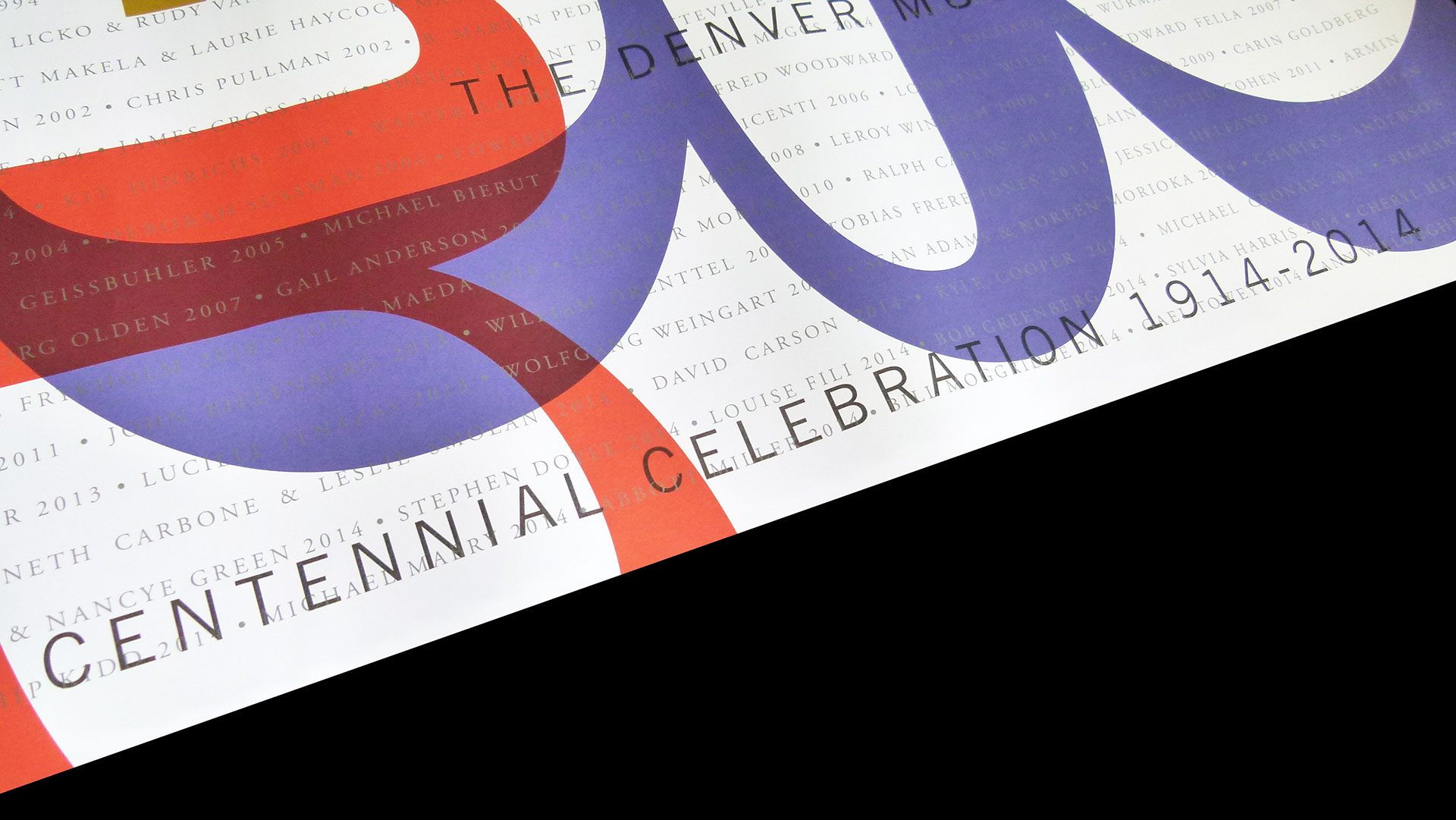
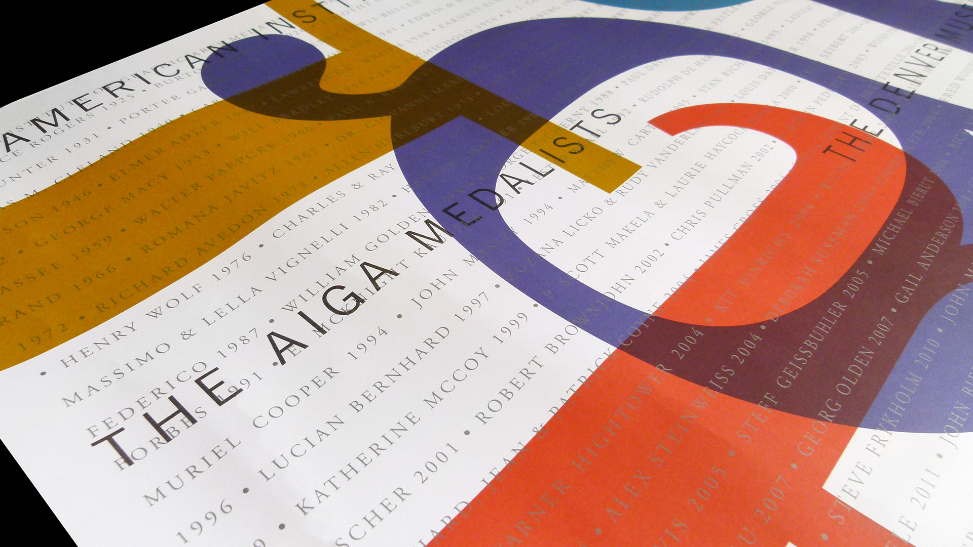
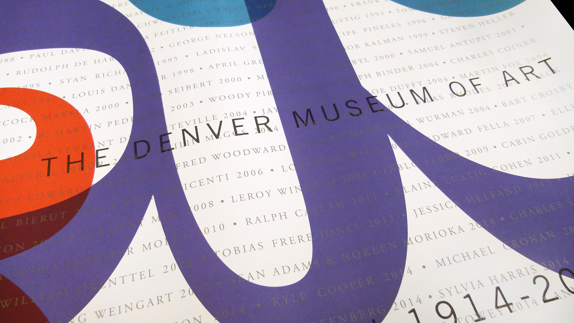
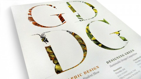
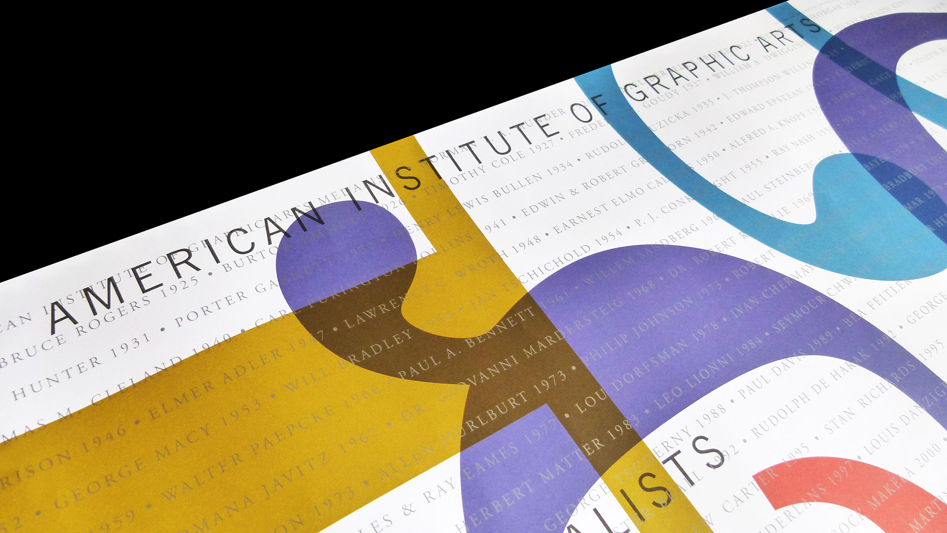
This commemorative poster for AIGA’s 100th anniversary pays tribute to all that came before … literally! The design, created by Studio Hinrichs, features the names of ALL past medalists.
Harmony is the story here. From its six spot colors to the multiple layers of typography, the creative team developed a nice visual texture via the overlapping elements. The fresh palette printed beautifully on Mohawk Superfine Cover, and type was perfectly readable under the saturated colors.
Bleed placement of the AIGA initials (in large lowercase letters) serves as the central, connecting graphic, keeping the flow interesting while providing a restful spot for the eye amid the many honorees. Congratulations are in order all around.