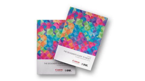
Spotlight: Sylvamo
“We must run as fast as we can just to stay in place,” the Red Queen admonished Alice in “Through the Looking-Glass” which, let’s face it, is a pretty good description of being a designer, too. You spend so much time meeting deadlines, it’s easy to miss important innovations that can make your work stand out, and yourself more competitive in today’s super-competitive marketplace. One of those innovations: the dream pairing of extended color gamut digital printing and Accent Opaque from Sylvamo. (Sylvamo Corp. is a wholly owned subsidiary of International Paper Company.)
Chances are you’re pretty familiar with the miracles digital printing can produce, including the ability to customize every piece in a single print run, but you may not realize just how vibrant it can make your work, too. Here’s our old friend Alice again to give you a retina-searing example of that.
Alice’s Adventures on Accent Opaque
In this 18” x 24” print of a classic John Tenniel illustration from the book, Lewis Carroll’s heroine attempts to play croquet with a flamingo and a hedgehog. Printed on an HP Indigo 10000 digital press on 100 lb. Accent Opaque Digital Super Smooth Cover paper, the image bursts to gorgeous life thanks to the use of fluorescent Pink ink in one of the press’ extra color stations (in addition to the usual CMYK). The way the Pink bleeds off the page is a final, dramatic touch.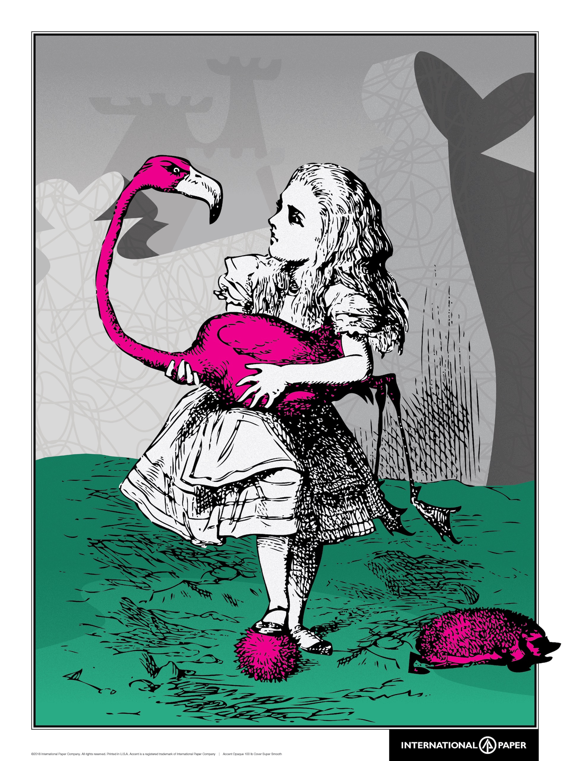
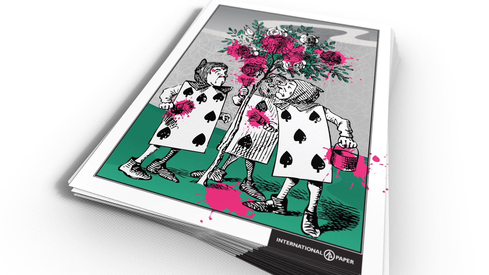
You can really see the advantage of the Accent Opaque Digital sheet’s high 97 brightness in this second Alice print, too, which features the playing card gardeners from Wonderland trying to get to the bottom of who splashed paint on whom while trying to paint a rosebush. (Hey, it’s Wonderland.)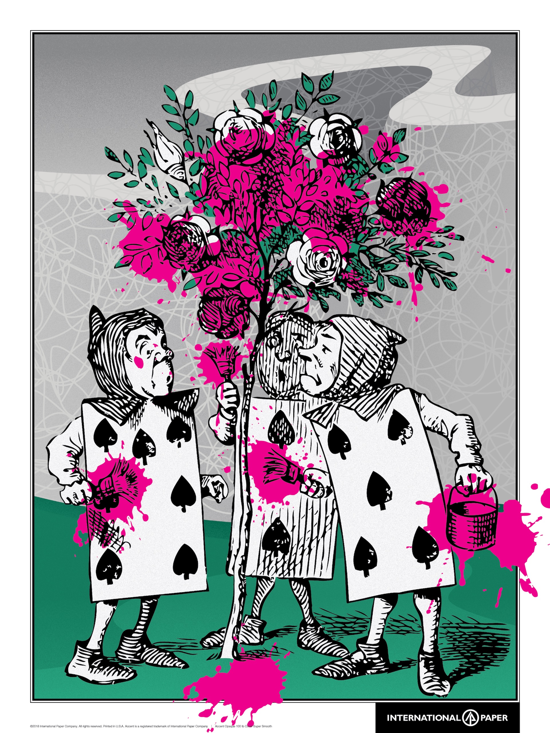
Both posters, printed by New York City’s DCC, make it easy to see why the use of vibrant neon colors is one of this year’s hottest design trends, especially on a paper that offers a Blue White, eye-pleasingly bright shade such as Accent Opaque.
The Next Step: Extended Color Gamut Blends
Just as Alice’s pursuit of the March Hare down the rabbit hole led her into a world of wonder, using a digital press’ additional color stations is your portal to near-infinite creative possibilities.
For starters, you can now mix those extra colors on digital presses to match more than 90% of Pantone colors. That means it’s easier to match your client’s corporate colors even on short print runs and on pieces that take advantage of digital’s personalization and customization features, such as variable data printing.
This extended color gamut also allows you to create work that is much more vibrant than what’s possible using 4-color process alone, increasing its visual impact, and thereby helping your clients better stand out from the competition.
Like Alice, it’s very easy to fall down the rabbit hole of what is possible with digital color today – you’ll want to consult your printing partner for all the details before you begin designing. Just be sure that you insist on a sheet that won’t let you down. Take one look at these Wonderland prints and you’ll see why so many designers choose Accent Opaque every time.
Ready to see the Accent Opaque difference for yourself? Request your Alice in Wonderland prints right now! Hurry, this offer ends Sept. 30th. (North American requests only, please.) THIS CONTEST IS NOW CLOSED