Spotlight: Echelon Fine Printing
If you’re wondering who it is that’s living your dream life as a world-renowned designer, wonder no longer. Michael Vanderbyl and his multidisciplinary studio, Vanderbyl Design, have done it all – furniture, branding, even fashion apparel. He’s also the creative force behind some of the most successful and interesting wine labels in Napa Valley. And he would be the first to tell you that being a successful designer isn’t down to skill, experience and visual sense alone, particularly when it comes to print. You also need to have a printer you can rely on again and again to bring your creative visions to life. He’s found that in Echelon Fine Printing.
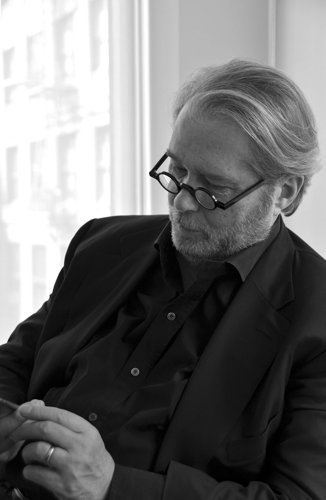
Michael Vanderbyl (Photo credit: Peter Fishel)
A Partnership of Design & Quality Production
“I’m a firm believer that if you’re quality, you don’t have to tell people, you just show them,” says Vanderbyl; the less you say, the more elegant it’s going to be. It’s a belief that’s served him well since he first took Napa by storm with his work for Scarecrow wine, and it’s one he hews closely to today. Take the label and accompanying materials he crafted for PerUs wines.
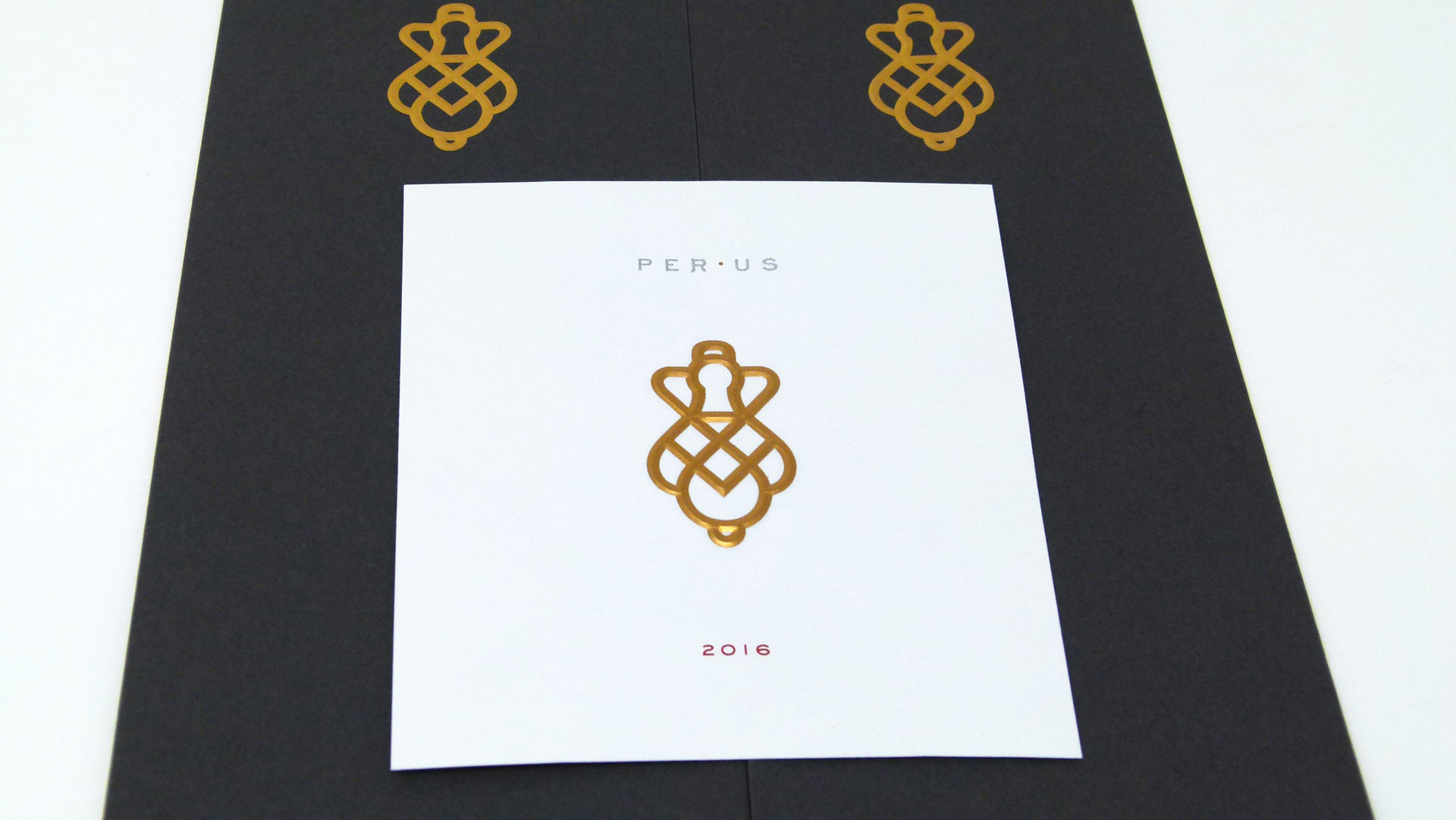
About five years ago, the vintner’s CEO, Anmol Bhandari, came to him with a hand-drawn logo for the label, the designer recalls. “Normally I don’t work that way, but it seemed to be a very personal project for him. So we sort of made it our own by the time it was done, adding more geometry and elegance. We refined it so it could look much more like a keyhole.”
The key, in this case, was finding the perfect combination of both papers and printing and finishing techniques to communicate the quality of the bottles’ contents. It was time to get in touch with Echelon again.
For nearly 25 years, Vanderbyl has worked closely with print expert Chip Forman who knows a thing or two about the power of collaboration. Their most recent efforts together have been at Echelon Fine Printing – itself the result of a merger between print powerhouses The Ligature, BurdgeCooper, and Complete Graphics. That combination created one of the world’s largest engraving companies. Today, Echelon possesses the experience and attention to detail that designers like Vanderbyl depend on for high-end clients such as Napa Valley’s best.
“If somebody’s selling a bottle of wine for $380, you don’t want to come off looking cheap,” Vanderbyl observes. “Plus there’s so much wine in the world, the way you make it stand out is to really play it up. That’s why we’ve been using the printer we’ve been using.”
The Allure of Hand-applied Labels
As with previous fine wines Vanderbyl has handled, the labels for PerUs were destined to be hand applied. “Mostly in the wine industry bottles are machine labeled,” the designer explains. “A bottle gets filled, it rattles down the line, and it wraps the back and front label on the bottle, and then it goes into a box. They can emboss, but by the time they press the label on, it pretty much crushes that emboss. And papers are very limited to you in assembly-line wine labels.”
There’s also the fact that the vineyards and companies the designer works with are relatively low-production ones, where a yield of 10,000 cases would be fairly large; most are in the 500 to 3,000 case range.
Finally, using hand-applied labels not only tells the discerning wine consumer that the contents of the bottle are of the highest quality, he adds, “It allows us to use really wonderful engraving and embossing techniques on paper stocks that are far more elegant than what will run through an automatic bottling line. It really adds a depth of quality to the product.”
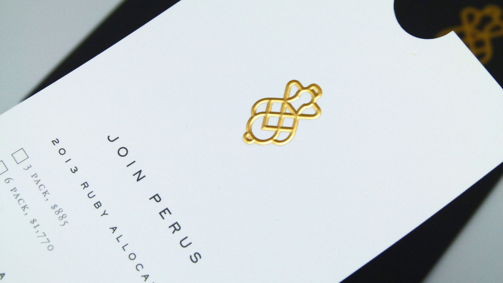
In the case of the PerUs labels, this took the form of a front label printed on 32 lb. Crane’s Lettra Fluorescent White that features a 4-color, engraved, registered emboss, complete with varnish and die cut.
“It’s a subtle yet dramatic effect,” says Echelon’s Chip Forman. “There are multiple passes for each color: one color, one pass. And then to finish it with special metallics we embossed it to refine the look of the metallic material and engraving. The comparison between this and litho is dramatic. I mean you cannot get metallic, especially on uncoated paper, to look like engraving at all. Coated you get a look, but with engraving, they really are the true metallics.” (The PerUs back label features engraving on 80 lb. Neenah Classic Crest Epic Black Smooth Text.)
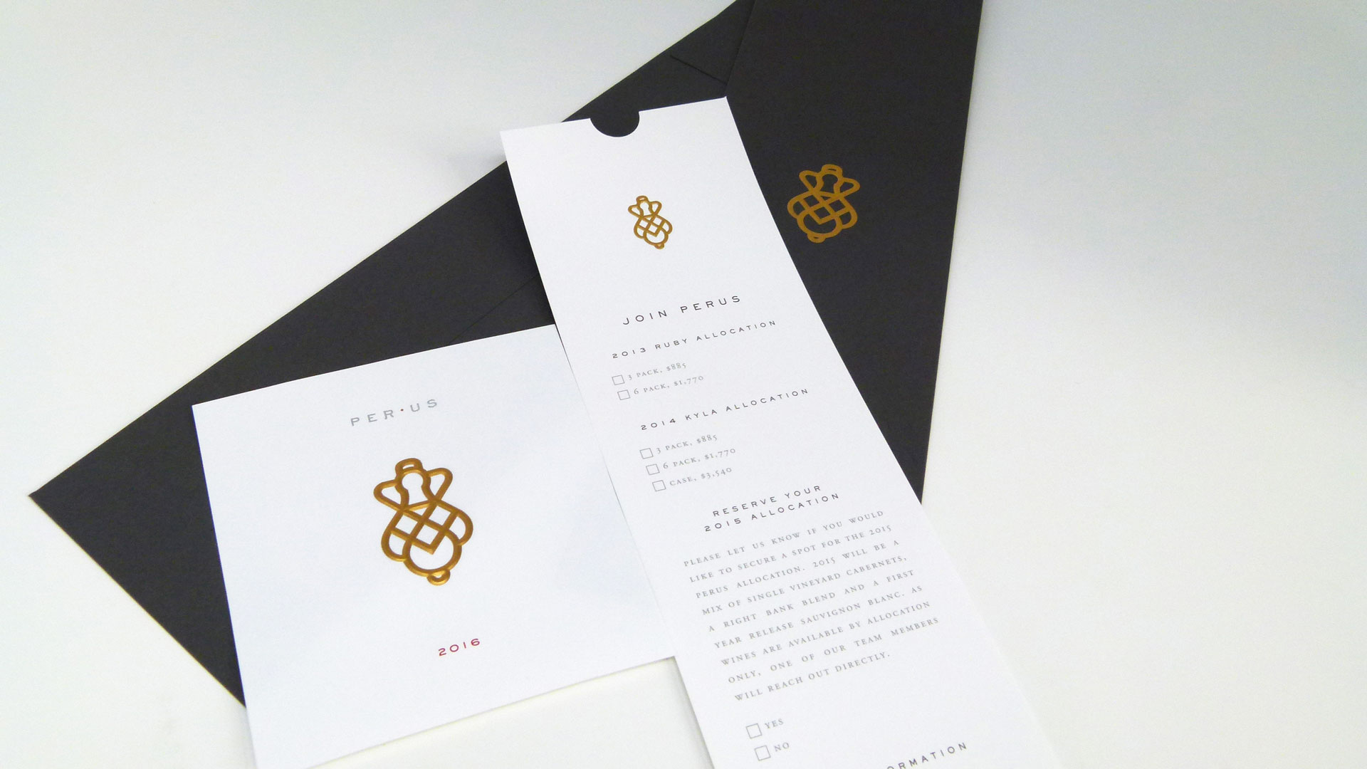
In addition to the labels, Echelon also produced several accompanying pieces for PerUs, also designed by Vanderbyl. These included:
- Business cards on 130 lb. Neenah Classic Crest Solar White Eggshell Cover
- Monarch letterhead on 32 lb. Crane’s Lettra Fluorescent White
- Order form: A duplex laminated sheet made up of 110 lb. Neenah Classic Crest Solar White Smooth Cover, and 4-ply rising museum board, “a thick mounting board that is used normally for framing,” Forman explains. “I’m not sure of the caliper on this but it’s extremely thick.” Adds Vanderbyl: “It was like an invitation to preview the wine but it was engraved and foil stamped – it was the fanciest response card you’ve ever seen.”
Observes the designer finally, “I’m a big fan of elegant and beautiful and extravagant. That’s what you have to be with wine.” And fortunately for both him and his clients, it is the type of work that Echelon Fine Printing provides each and every day.
Want to experience that elegance for yourself? [CLOSED] Enter to win one of 50 sample packs, which include the PerUs wine label discussed above. Hurry, contest ends Nov. 29th! (North American entries only, please.)

