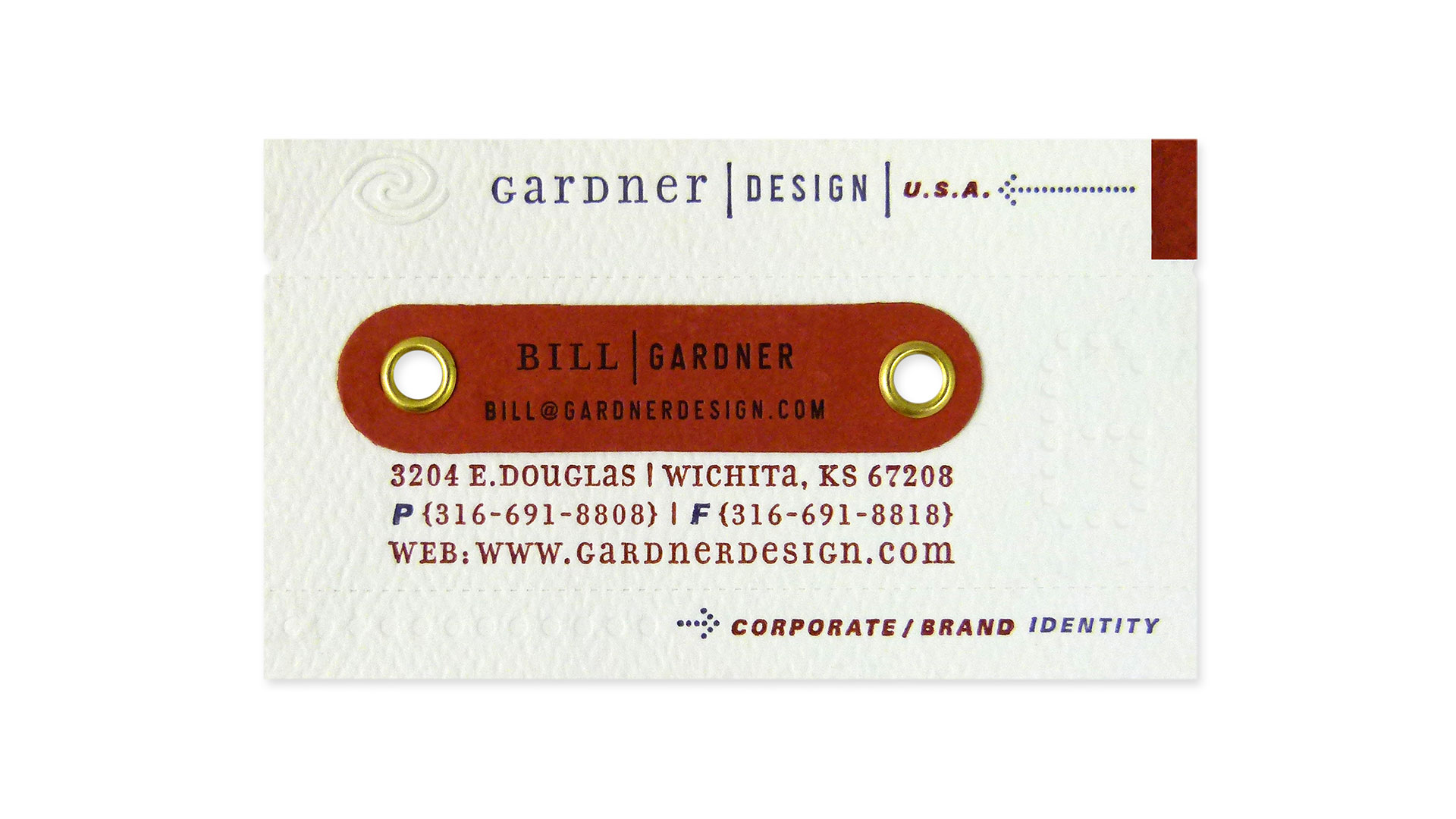
The simplified name personalization system of die-cut tabs applied by grommets is definitely a highlight. It allows us to create cards for new designers with great ease and efficiency.
– Brian Miller, Gardner Design
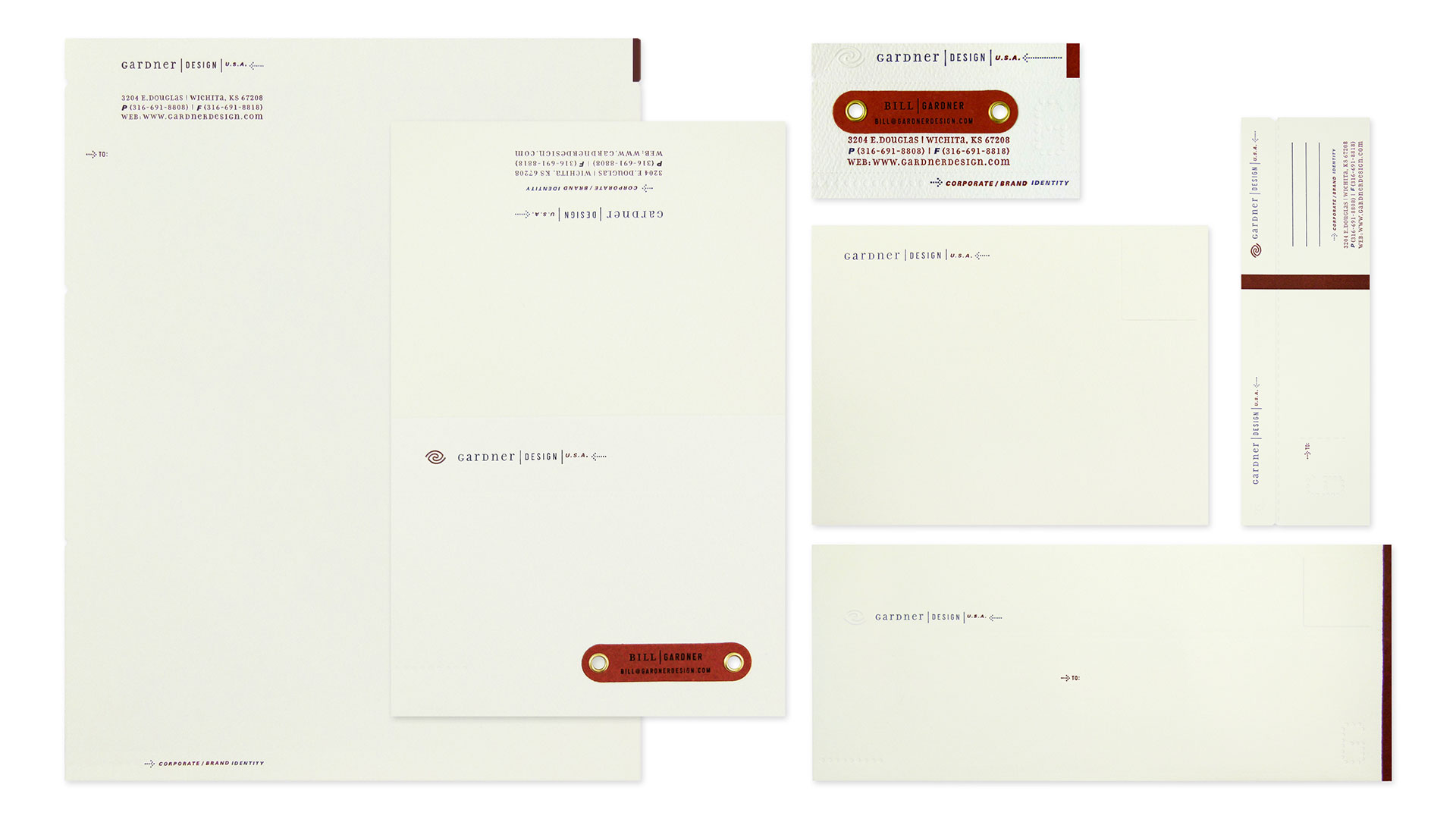
Way back in 1999, before the letterpress craze was in full swing, Gardner Design made the unique decision to create a stationery system in which all the typography was letterpress printed. Gardner had struck up a trade with a trusted local printer who had a full-service shop, including letterpresses, and the firm was eager to show off its knack for detail through its own communication materials.
“The trade situation seemed like a unique opportunity to turn our stationery system into a physical ‘proof’ of this attribute we strive to provide to our clients,” says Brian Miller, designer, art director and co-creative director of the project.
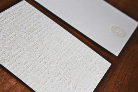
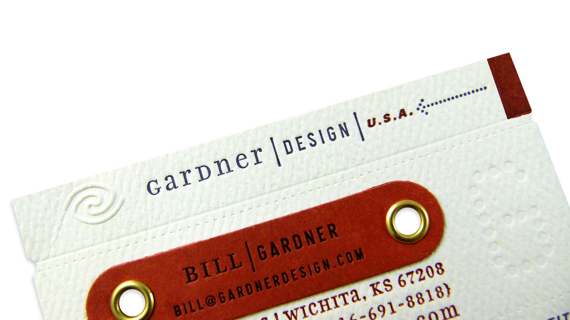
Miller’s favorite part of the system is the hand-applied nametag that’s fastened with gold colored grommets. This little touch of hardware is a perfect “supporting element” for items such as business cards and thank-you notes. The die-cut tabs —printed on Neenah Environment Rust — allow the firm to create cards for new employees easily and efficiently.
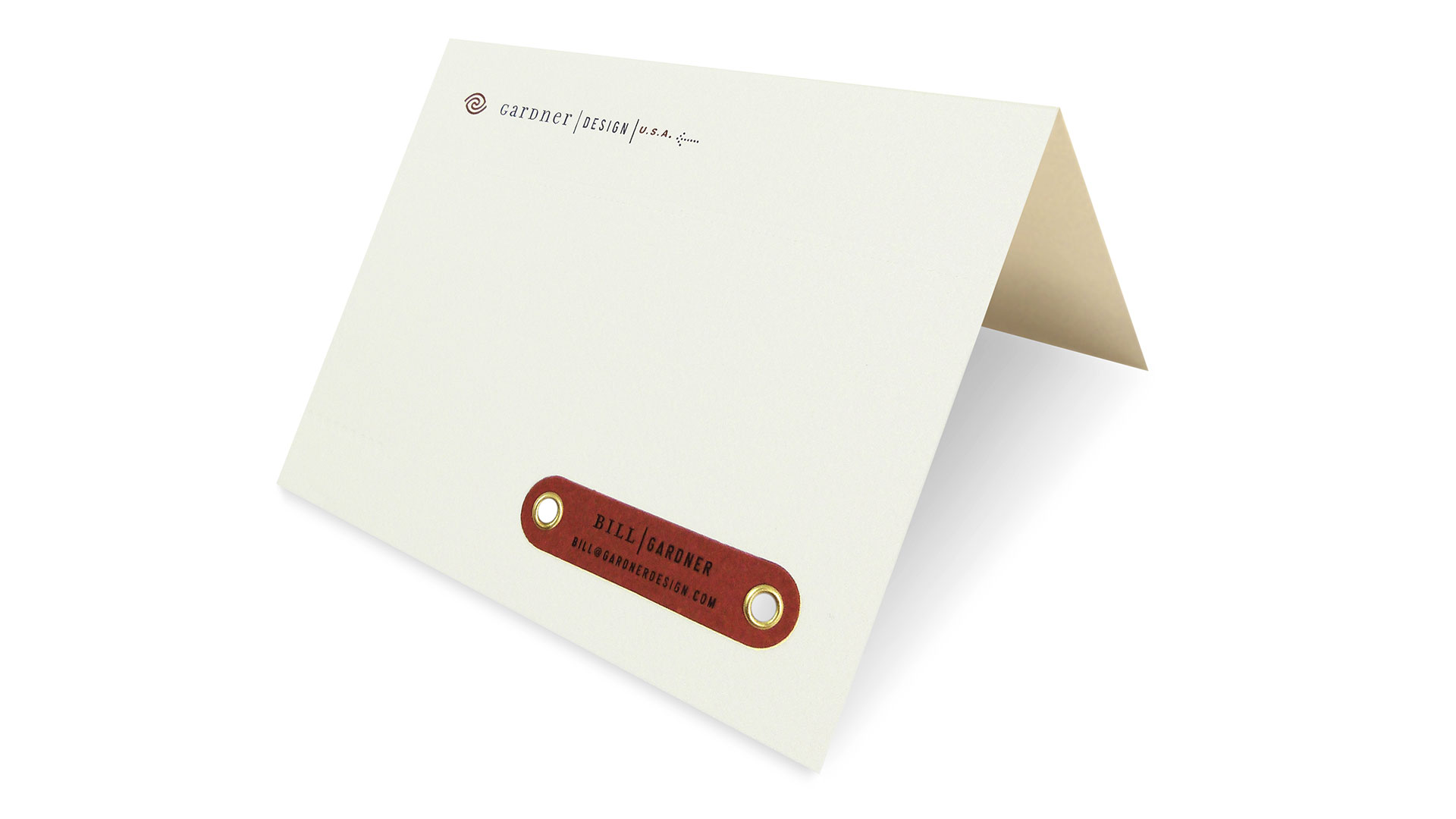
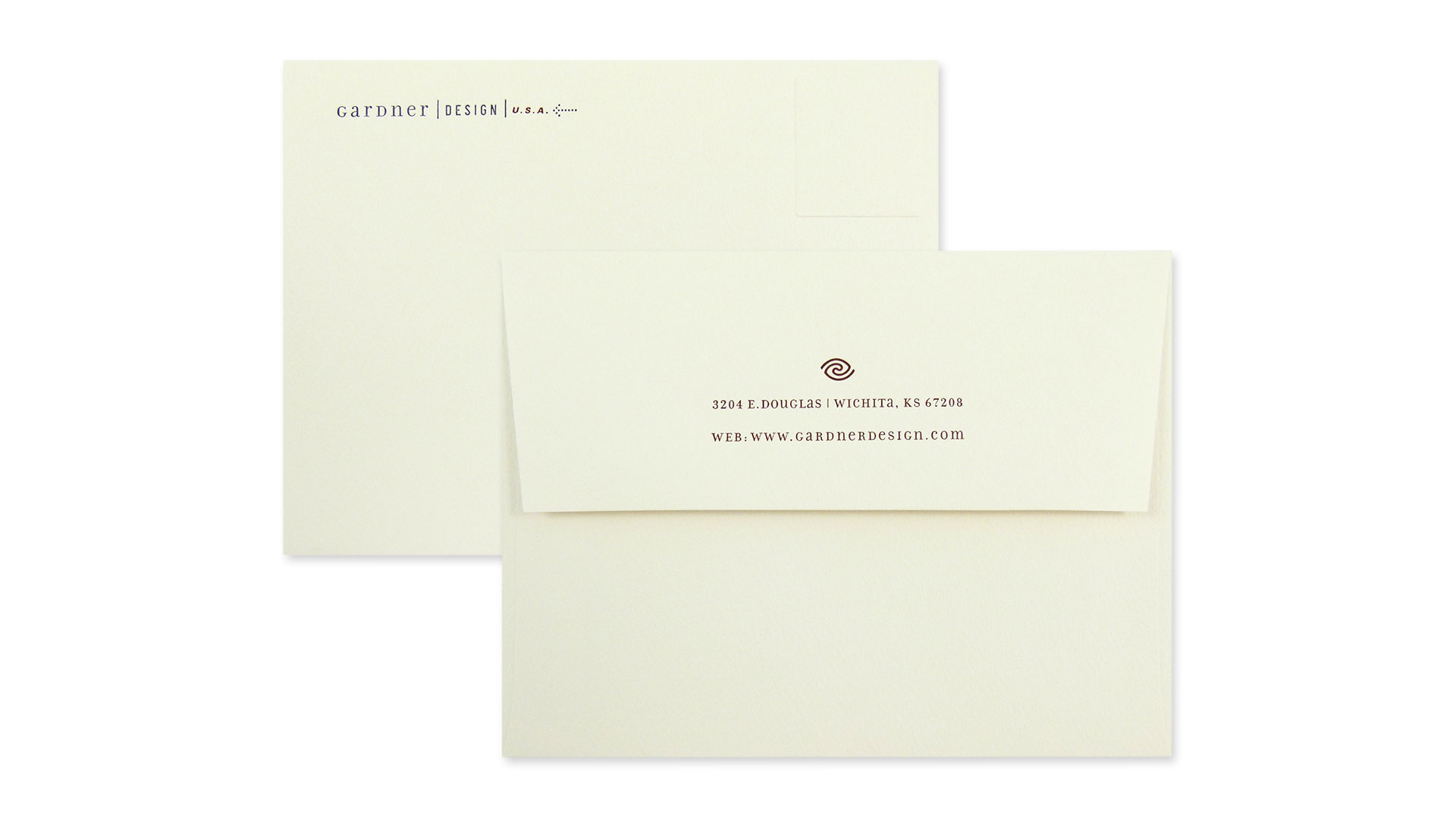
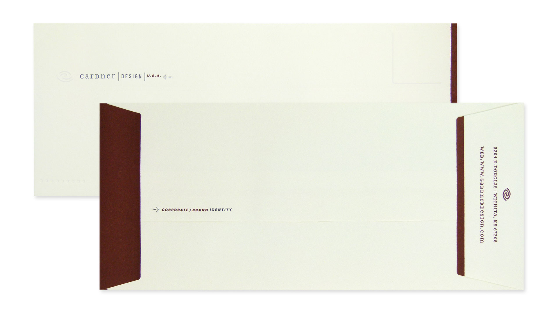
The stationery system is a tactile feast playing with die cutting, embossing and the deep impressions letterpress brings. While the company logo is blind embossed on most pieces, a dotted typographic “G” is letterpress imprinted, giving it a slight deboss feel. To round this off, a number of fake die-cut lines were added for extra intrigue. The entire system, including the envelopes, is 2-color letterpress printed on a toothy Domtar EarthChoice Tradebook Eggshell.
The biggest lesson Gardner learned was how utterly complex a project like this can become due to all the separate passes through the press for embossing, debossing, printing, die cutting, perforations and scores. This required a separate art file for each component of each piece.
“Also, as this was early in the revival days of letterpress printing, we didn’t realize the HUGE difference we would have seen if we would have insisted on higher embossing dies,” Miller explains. “We got lucky and were able to push the dies to the point where they did the job, and their imprints still always receive tremendous reactions from clients. But to this day, though, I still enjoy the reaction from every client I hand a card to. I can’t help but wonder just how cool things would be if we knew more about the options of embossing/debossing dies. Getting another 30% more impression would be pretty awesome!”
Seventeen years after the initial design, the system is still working for the company, thanks to the use of simple, non-trendy, classical typefaces, Miller says. “This was a lesson in typographic restraint while focusing more on the value of production techniques to raise the feeling of quality overall throughout this system.”