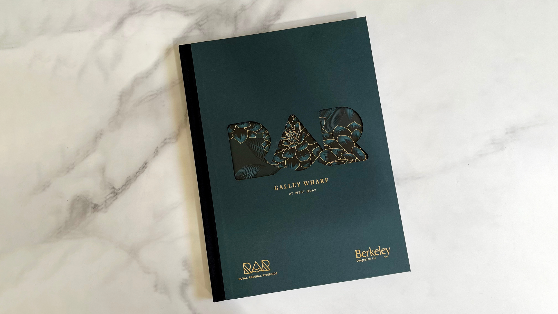
London’s Royal Arsenal Riverside (RAR) development along the River Thames boasts 3 great selling points: lush green spaces, spectacular views, and spare-no-expense luxury.
Designed by Hunter Design Associates and offset printed CMYK by our friends at Kingsbury Press [projects / website], this handsome volume, dedicated to RAR’s Galley Wharf properties, instantly communicates all 3 amenities through the use of a breathtaking Die-Cut cover, Gold foil, and a consistent botanical theme.
Let’s start with that elegant cover.
For a truly chunky, art book feel, two 350 gsm (237 lb.) duplex laminated Colorplan Ebony Black sheets are covered with 135 (90 lb.) gsm Colorplan Racing Green paper and quarter-bound with Black linen tape.
When you’re selling apartments that start around $560,000, that substantial heft goes a long way toward subtly building trust through haptics. And the use of 170 gsm (115 lb.) Sappi GalerieArt Satin throughout the interior pages only emphasizes this volume’s fine coffee-table book feel.
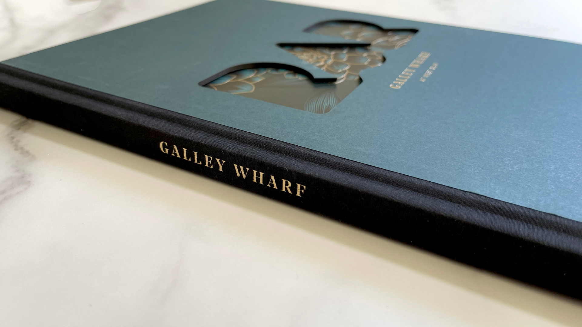
Its moody Dark Green cover also hints at the greenery surrounding the development, providing a dramatic frame for the illustrations of lush vegetation that peek out through a large Die Cut of the RAR logo.
Not only is this a clever nod to the soothing Green spaces to be glimpsed outside the apartment windows, but it’s also an impressive example of Die Cutting at its best. Cutting through the extremely thick cover provides depth and drama to our glimpse of the leafy artwork.
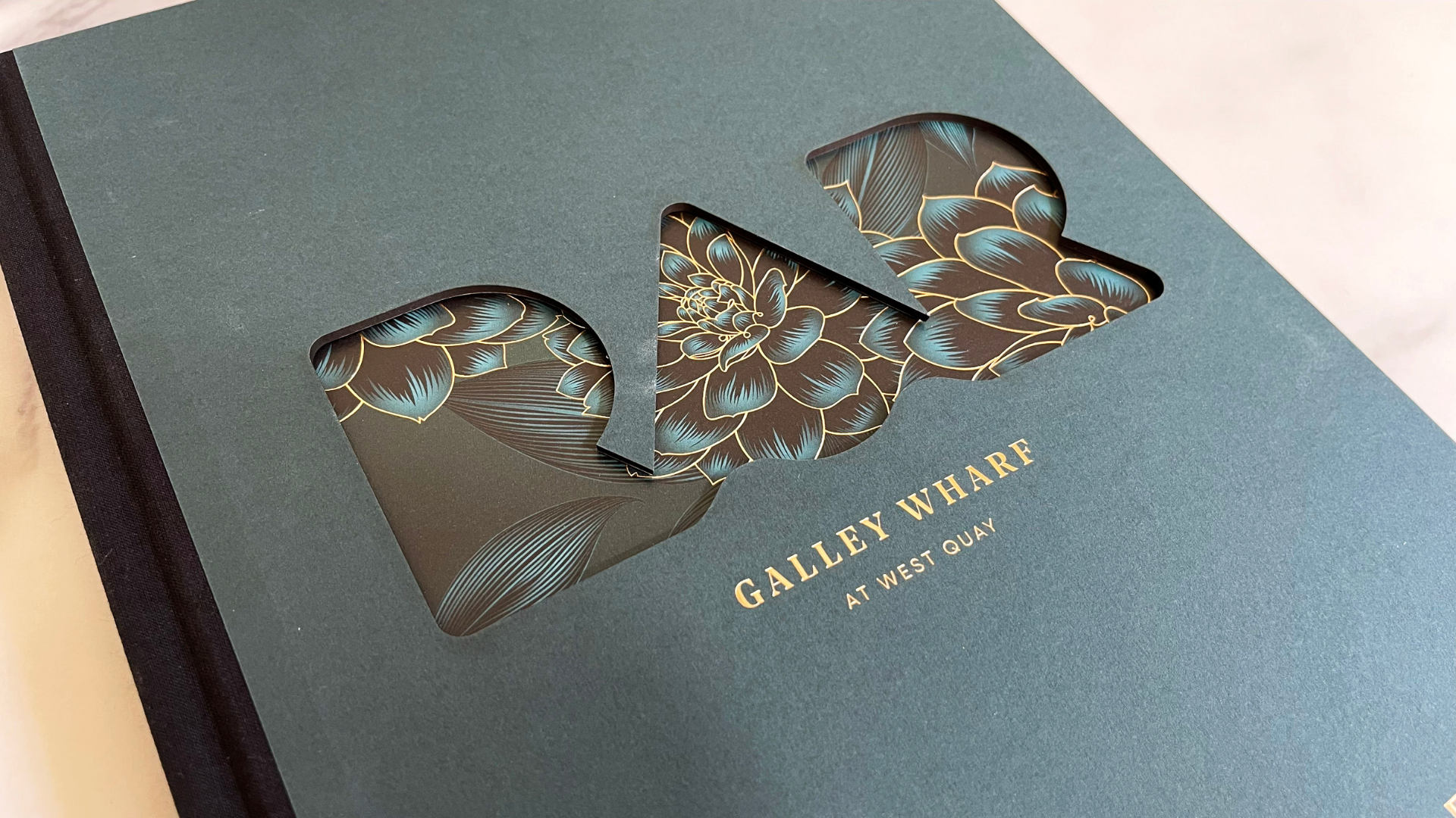
Then there’s the sparing use of Gold Hot Foil Stamping on the cover and spine, nicely complemented by the Gold Foil that marks the edges of the leaves that peek through the Die Cut.
Opening the front cover of the book reveals the full botanical artwork stretching across the endpapers – printed on 150 gsm (100 lb.) Fenner Paper Omnia – in all its breathtaking glory, the leaves outlined in Gold Foil throughout.
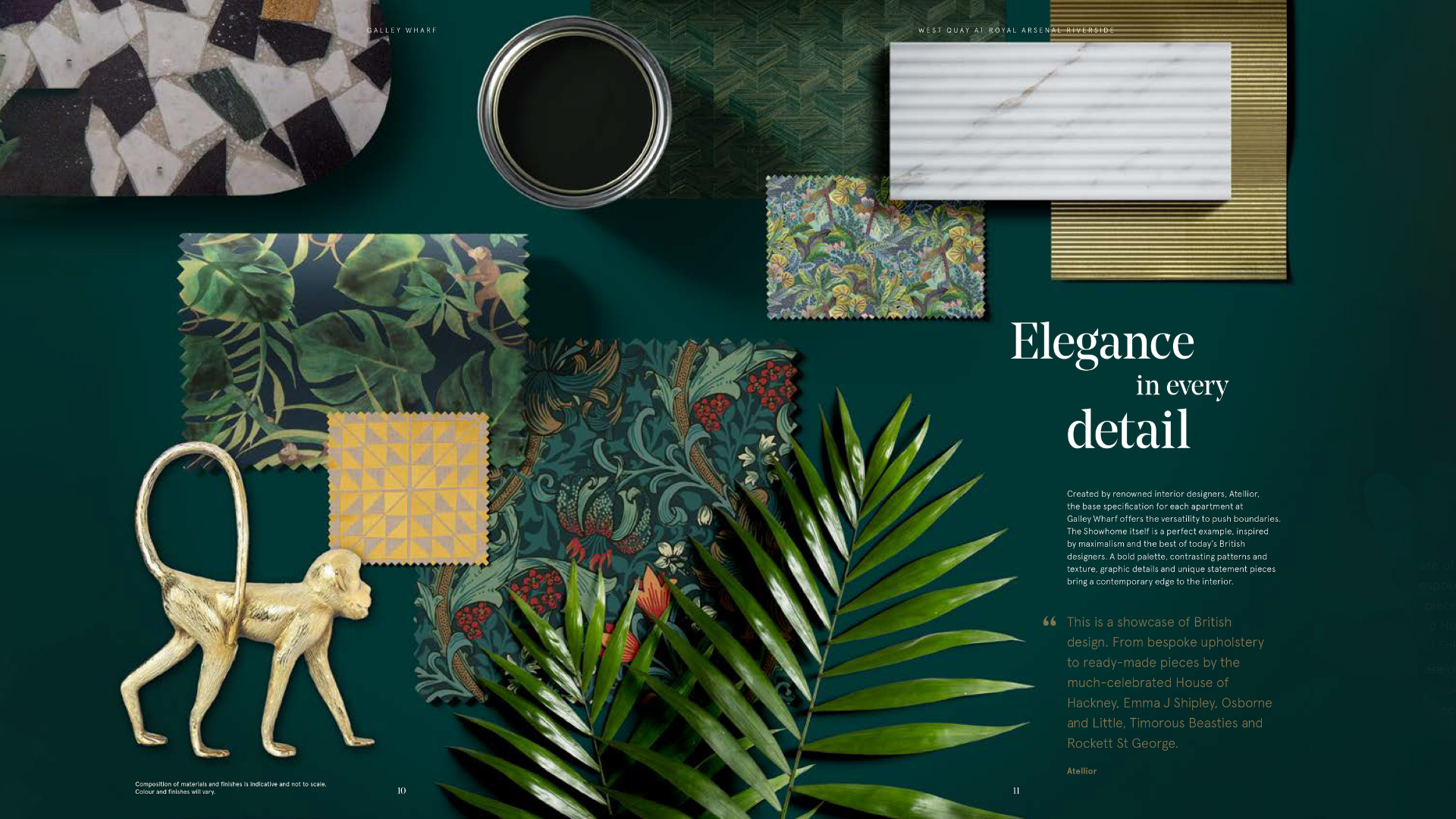
By comparing the Gold Foil stamping on the inside front cover to the Gold ink printing on the back of the endsheet, you can see just how much more shiny and intense foil truly is. The greenery theme continues throughout the rest of the book in subtle and not-so-subtle ways.
Sprinkled in amongst gorgeous photographs of the apartments, amenities and the community are architectural sketches, show-home rooms with moody Green walls, Green backgrounds for floorplans, and my favorite – a fun mood board featuring vegetation-themed colors and textures. (I do love a good mood board 😉 )
In the end this book does what print has always done so well: The design dares the recipient to dream while the book’s craftsmanship places that dream into their waiting hands.


