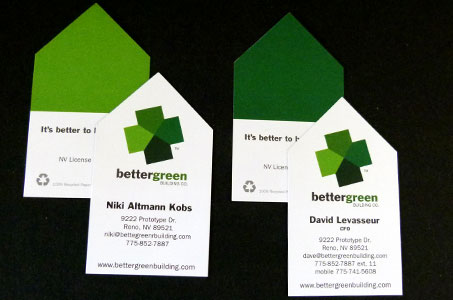
For this business card, the designer took the client’s company name and function as inspiration to create an identity both fitting and fun.
The shape is a house – five-sided with straight, square lines on three sides and angles forming the “roofline” on the other two sides. But here’s where the fun begins.

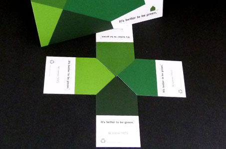
The top half of the house is shaded in the color green – each person receives four different shades of green. If you take four cards and position the various green roof angles together, it forms the company logo.
While this puzzle can be used as a conversation starter, we like the choice of the different shades of green because it gives the cross-shaped logo a three-dimensional quality. The slight turn in orientation of the logo also lends itself to imagining a building’s elevation as it sits on a piece of property.
And of course, the choice of a 100 percent recycled paper was de rigueur for a business with the tagline, “It’s better to be green.” In this case, that was Neenah Classic Crest 100 lb. Cover.