Choosing the right binding option doesn’t just allow you to keep a bunch of pages together, it enables you to create a strong first impression. And in the case of this week’s video, it helped put a winning face on the 2016 Best Dutch Book Designs catalogue. Actually, 33 different faces.
With an egalitarianism you don’t often find in design awards these days, the catalogue’s designers, Beukers Scholma, did away with page numbers and ensured that each of the 33 winners received an opportunity to be “on the cover.”
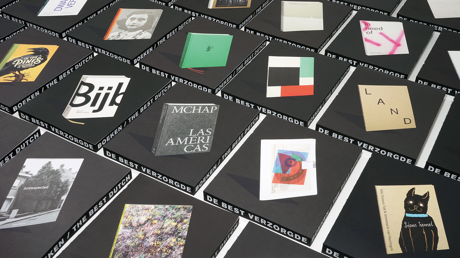
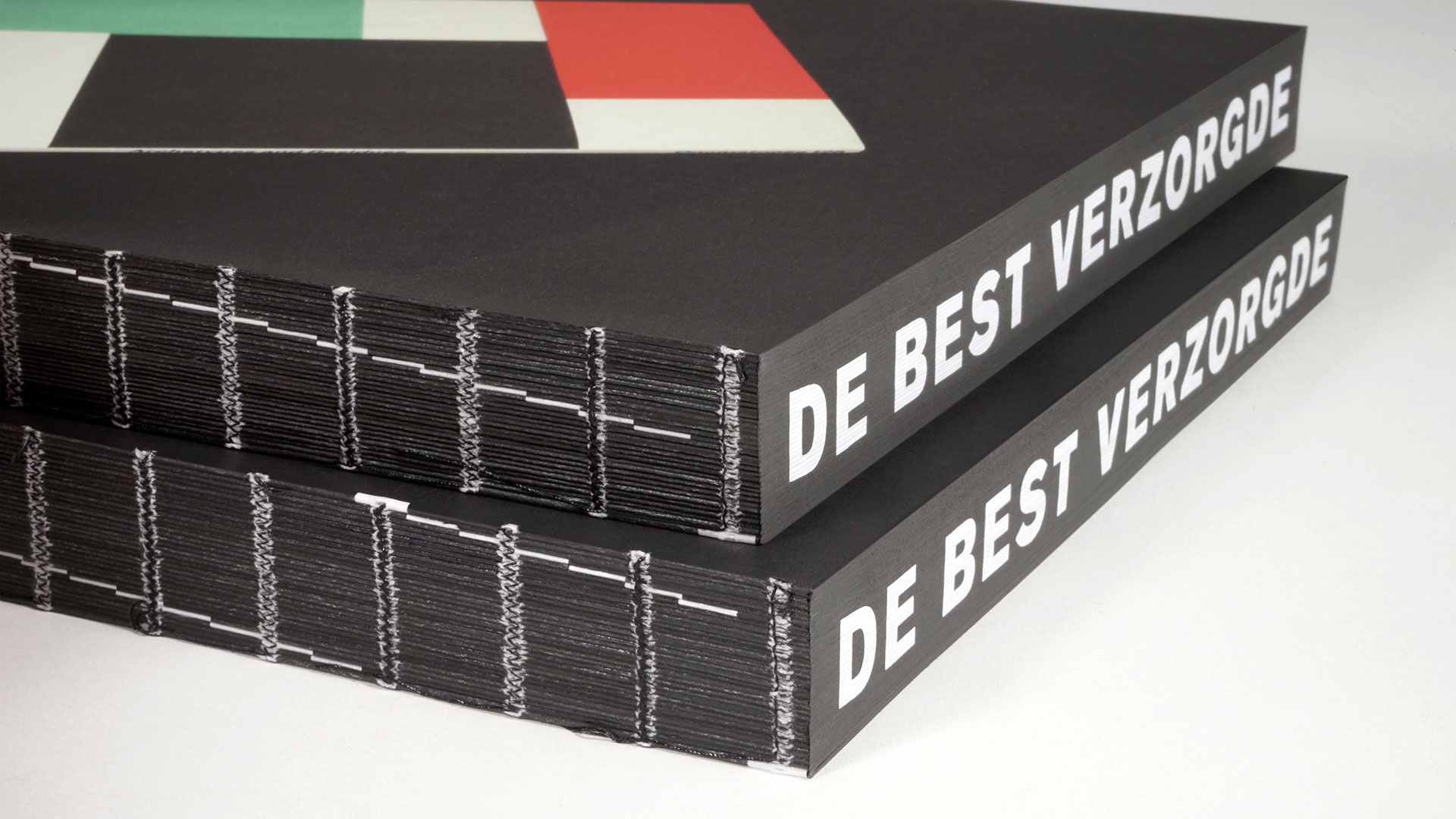
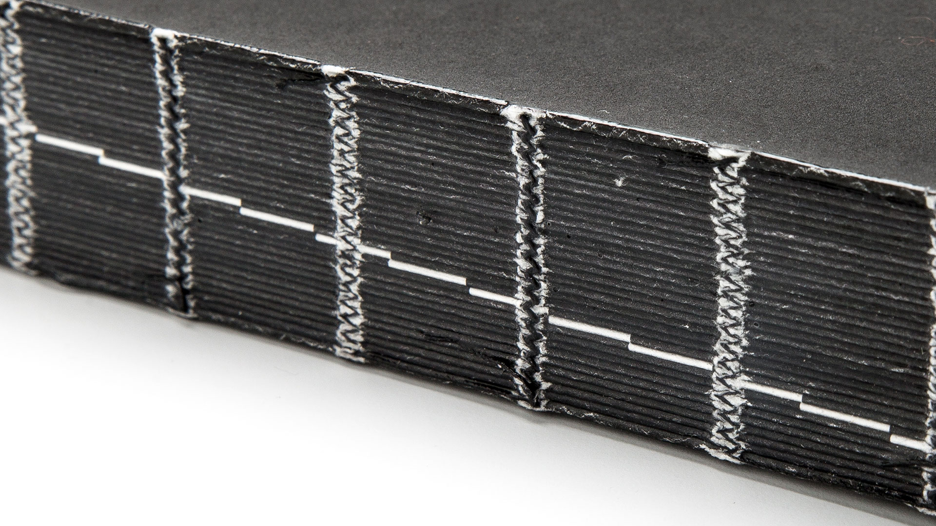
No, we’re not talking about the miracles of variable-data printing that you enjoy with digital printing. Rather, they essentially created 33 mini-publications – each getting one signature – and then Smyth sewed them all together into one large book. (The signatures are sewn together at the spine, first through the individual signatures and then, to create the final book, these signatures are also sewn together with thread.)
They then bound a few copies of the catalogue with Signature 1 as the cover project, a few copies with Signature 2 as the cover project, and so on. As a result, each award winner had the chance to be on the cover of this book at least a few times – you really can’t be fairer than that.
While the printing of each signature is very nice indeed – the eight printers whose books won awards divvied up the printing work for this project – it is the expert binding by Boekbinderij Patist that really makes this volume one to remember. The designers explain the difficult process involved:
“To guarantee the right order they must take careful note of the collating marks on the back of the folded sheets [signatures] of each section. Usually there are step marks forming a diagonal line across the spine of the book. Here the diagonal is interrupted so that the collating marks move about, revealing the hand of the binder in the varying patterns of the catalogues’ spines.”
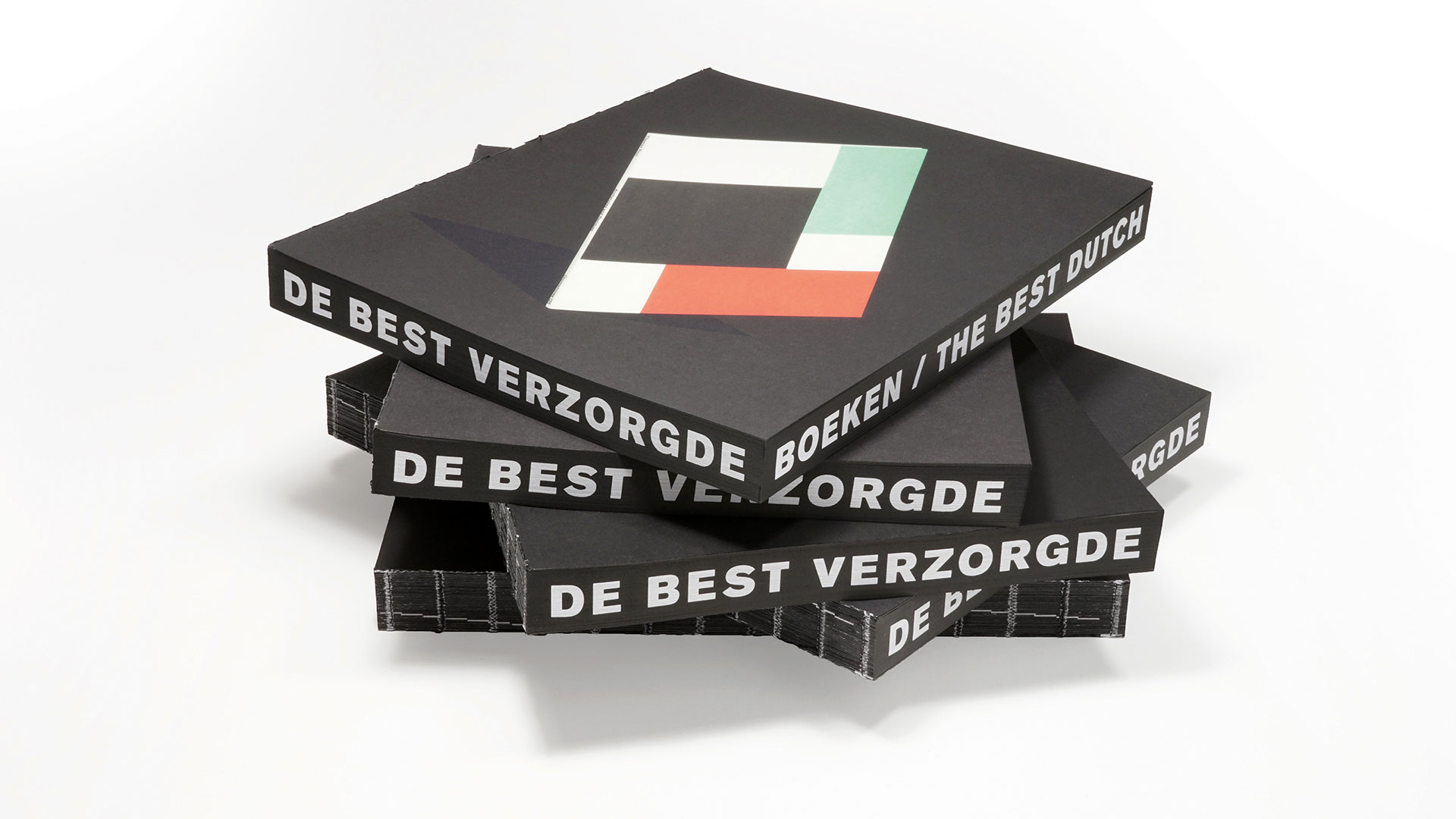
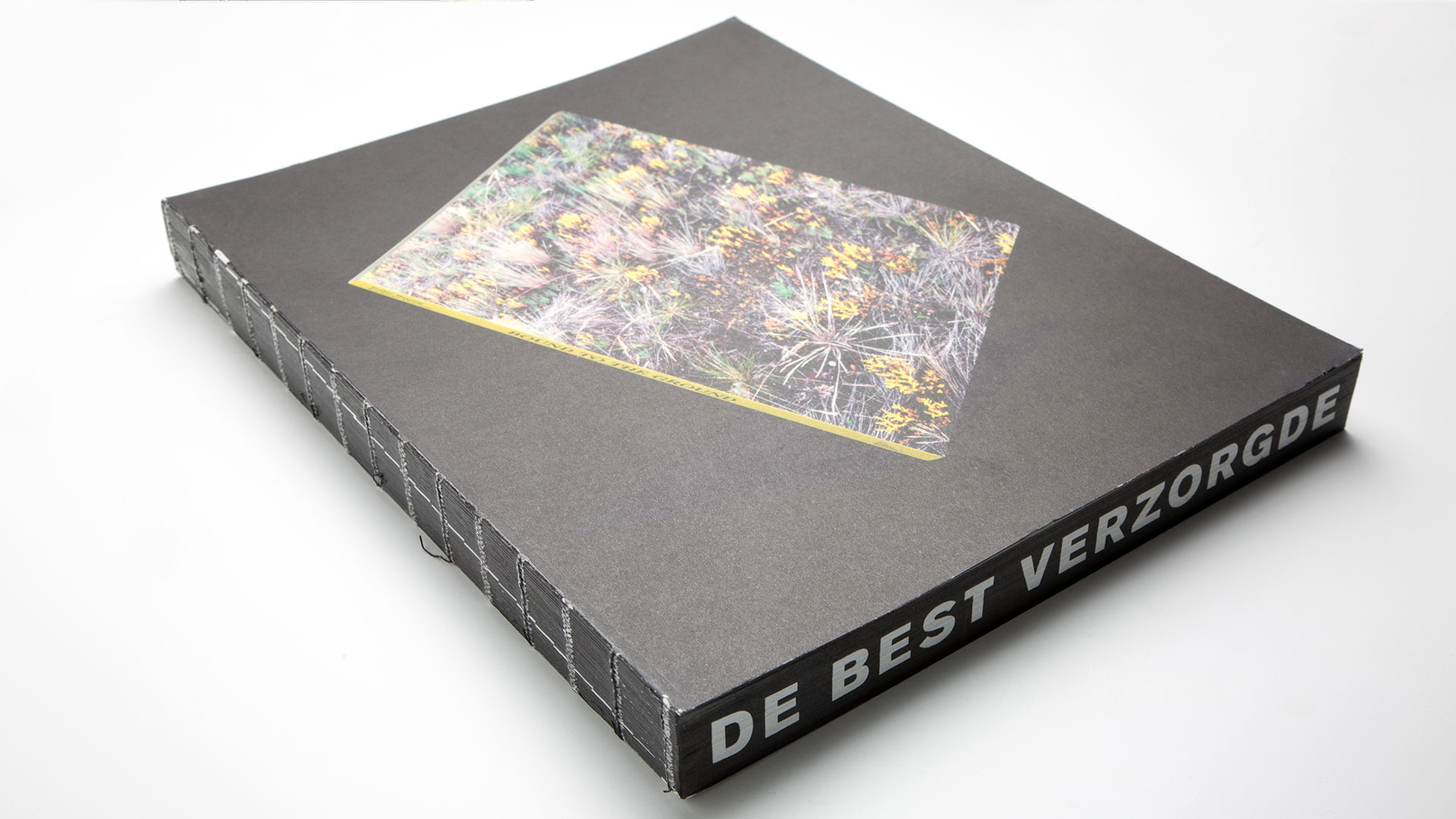
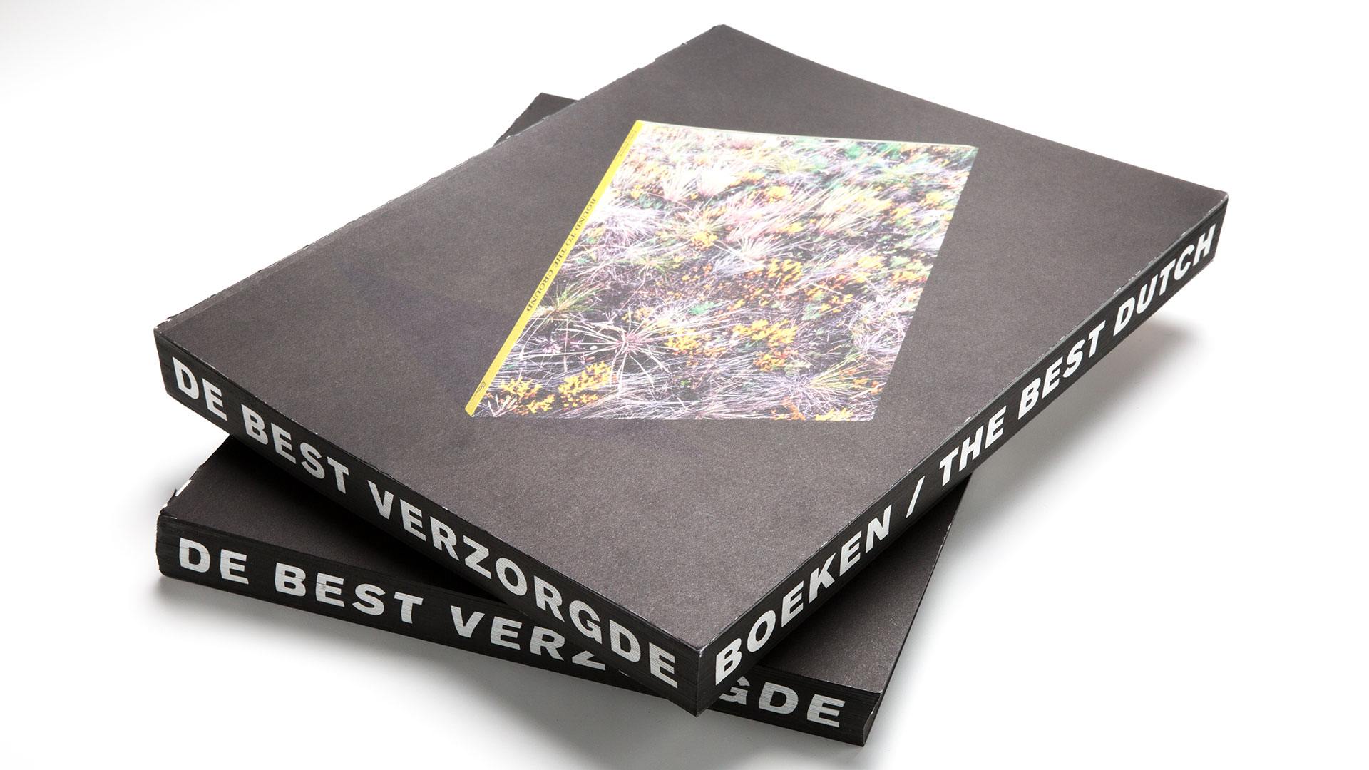
In keeping with the book’s philosophy of giving each winner a moment in the sun, Beukers Scholma avoided placing the “Best Dutch Book Designs” title on the 33 unique covers, which would have distracted from their impact. Instead, they had Aldoscreen Zeefdrukkerij screen print the title – in Dutch and English – along the edges of the closed pages so that it essentially wraps around the book.
In this way the catalogue leads by example. Not only does it showcase the best book designs, it feels like a strong contender for a Best Dutch Book Design award of its own.
PRO members, don’t forget to check out your: