Just as the taste of a wine is influenced by the region in which its grapes are grown, the taste of a fine chocolate can be shaped by the land in which its maker came of age and learned the craft. To celebrate its 5 year anniversary, Canadian chocolate bar Chez Christophe wanted to capture the spirit of their native Switzerland in its packaging. What design studio Arithmetic came up with did that and something more impressive still: It encouraged chocolate lovers to slow down and enjoy the unwrapping experience.
Bringing the Alps to the Packaging Experience
Since opening its doors in 2013, the chocolatier’s packaging had all been designed by founders Chef Christophe Bonzon and his wife, Jess; by 2018 they both thought it time for a change. They wanted something that would not only be elegant, modern and classy, but also something that would reflect the high quality ingredients that go into every confection they make.
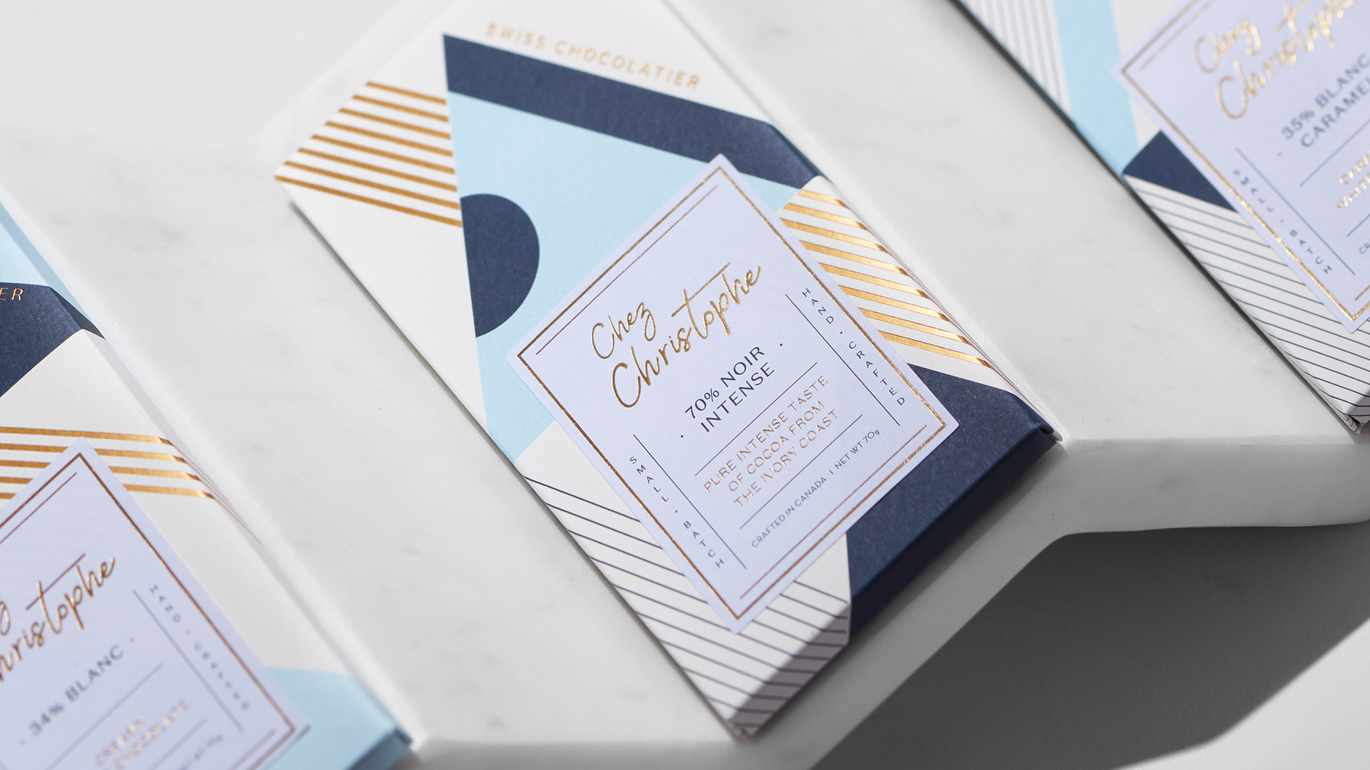
Inspired by the couple’s love for Art Deco, Arithmetic found in the lacquer designs of Swiss artist Jean Dunand (1877-1942) a geometric style that lent itself nicely to chocolate bar wrappers.
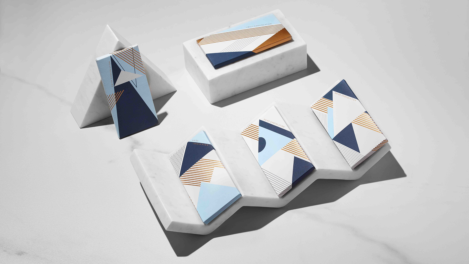
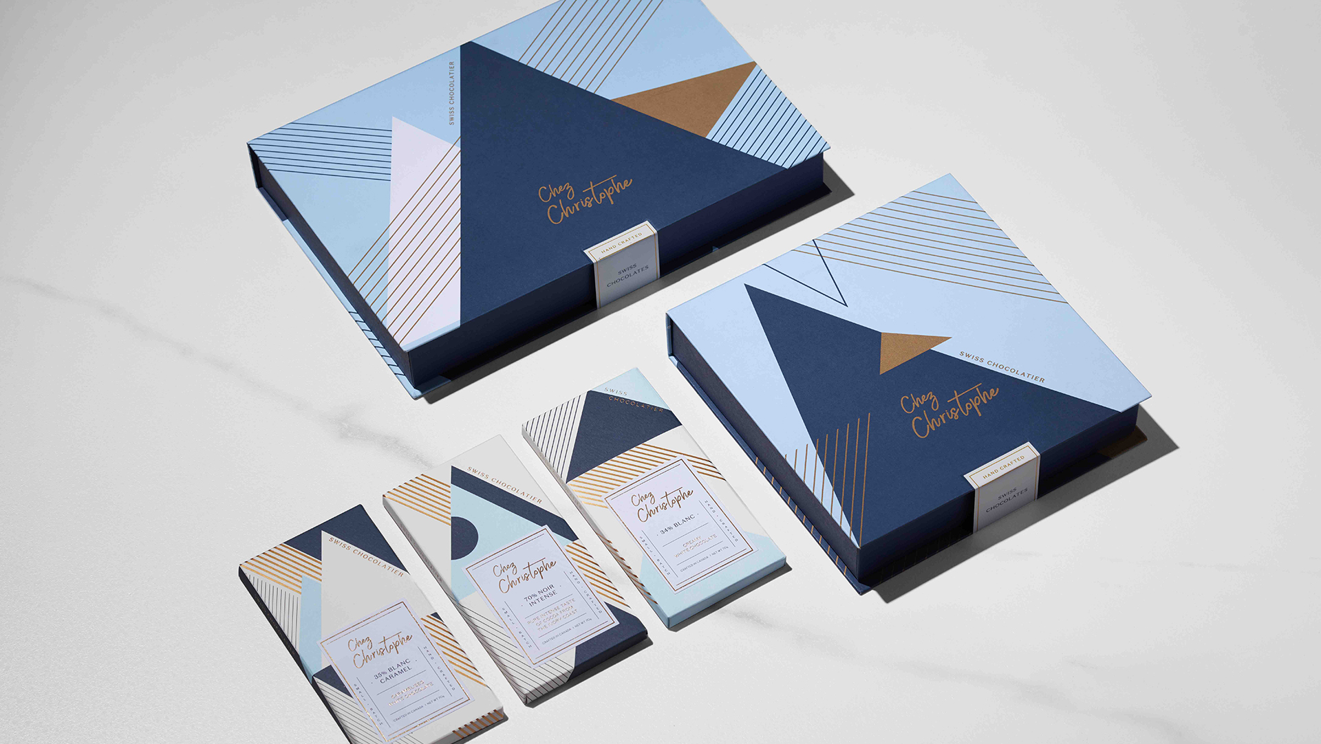
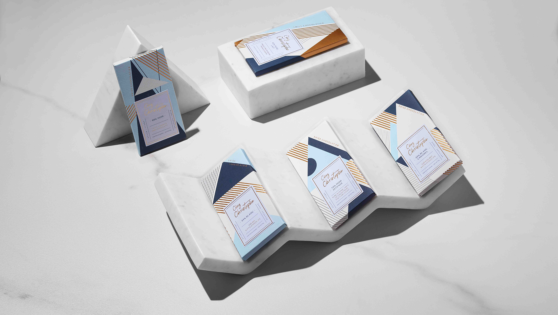
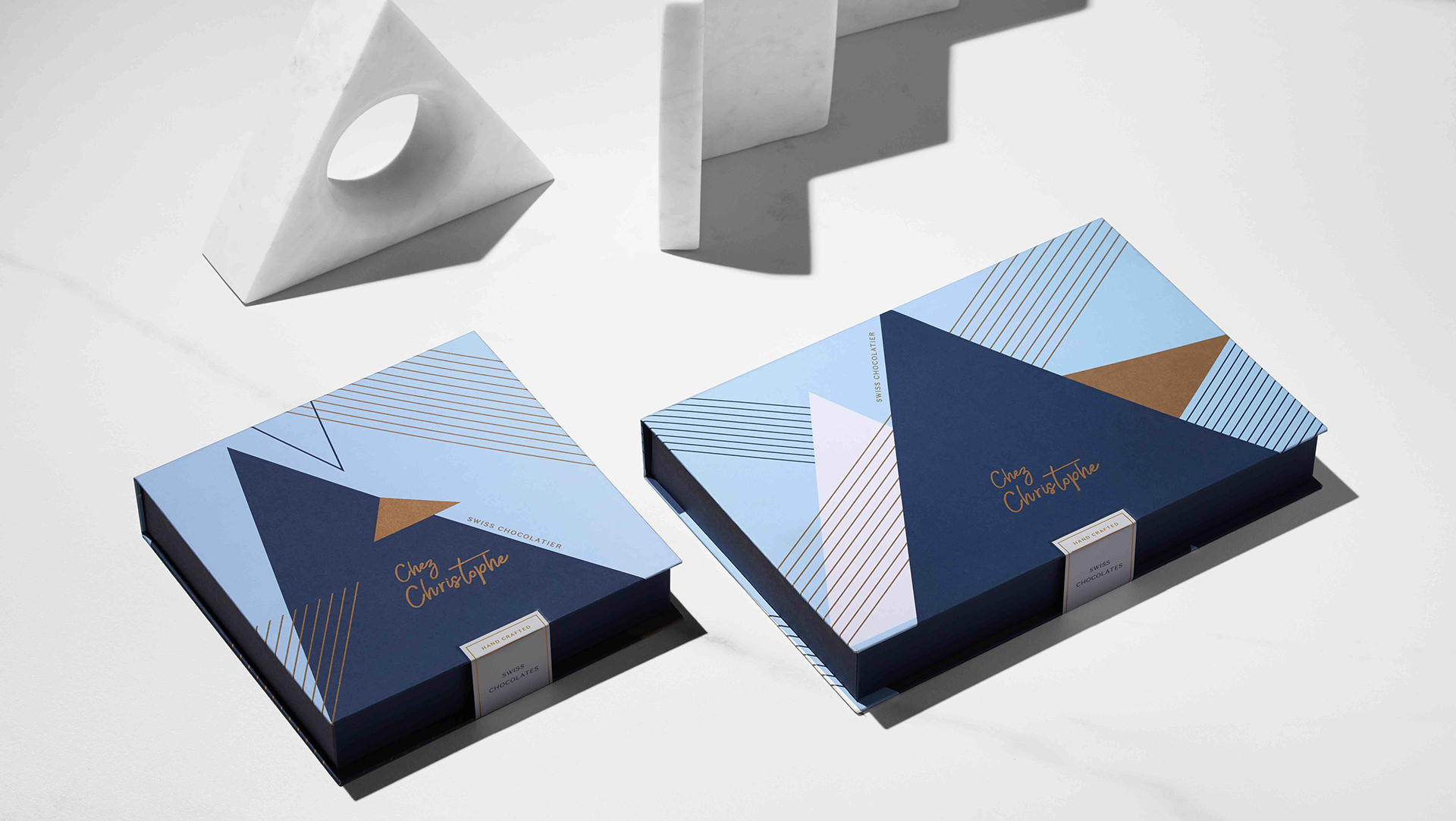
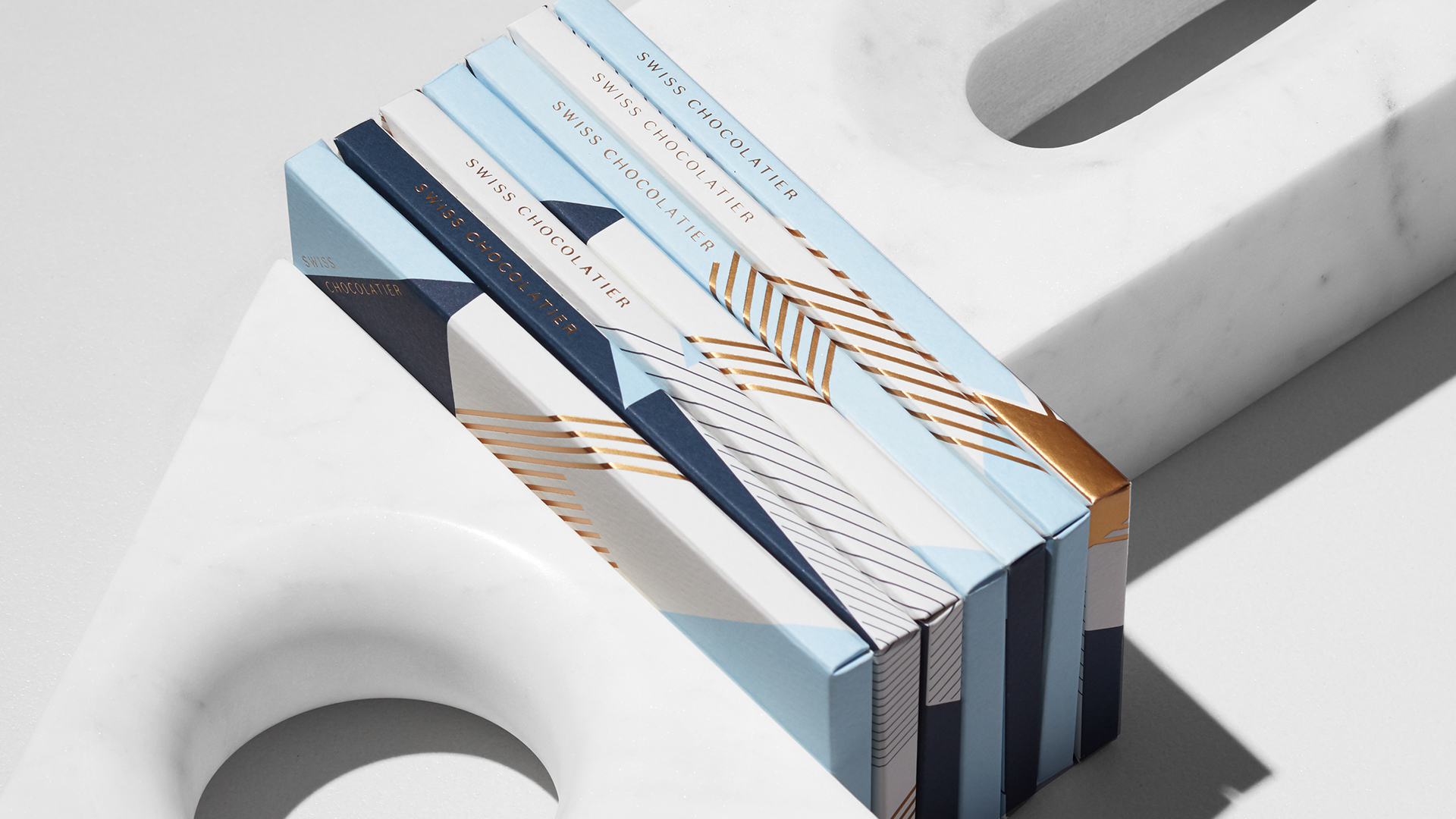
To suggest the peaks of the Swiss mountain range – a region known for producing some of the highest quality chocolate around – they offset printed triangular shapes in 2 different shades of Blue on 250 gm (170 lb.) uncoated Fedrigoni Tintoretto Neve. Hot stamped Gold foil line work also mimics the Swiss Alps. A matching label boasting Gold foil and printed details about the confection inside completes this warm, sophisticated look. Each variety of chocolate bar features a different design using these elements, which are also used for the assorted-chocolates gift boxes.
A Slow, Sweet Packaging Experience
Determined to make the chocolate bar opening process feel less like the hurried frenzy it usually is and more like opening a present, the designers engineered a die line that purposefully slows down the whole unwrapping process. In this way, the texture of the paper, the wording on the package and the scent of the chocolate all come together to make the opening of each Chez Christophe bar an experience.
One of the details I find so impressive here is the subtle use of Gold foil as part of a greater cohesive design. With so many different options from which to choose, adding eye-catching foil to your work is easier than ever…if you know the pros and cons of each. Download your free Foil Cheat Sheet now.


