[youtube=http://youtu.be/ct53PQ4rgdo]
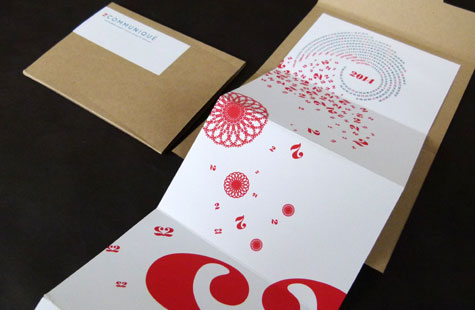
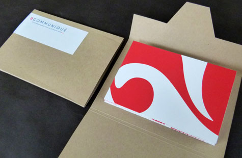
This self-promotion piece has an artful format – an accordion-folded string of six panels in an open-ended, kraft-colored paper carrier. The organic look and feel connects with potential and existing customers on all the right levels – interactively, tactilely and visually.
2communiqué creates fluid shapes that appear across the mailer. Using the “2” as inspiration, beautiful circular and snowflake graphics decorate each panel. An interesting heart shape takes form when two “2s” are placed in a mirror position.
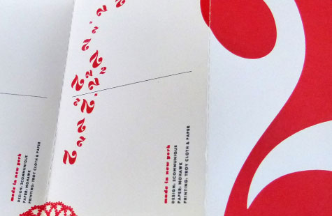
The first panel, which is glued to the carrier, is a 2014 spiral calendar meant to be kept. Of the remaining five panels, the team adds an interactive element by designing them as standard-sized postcards. The card at the very end has lines on which to write a message, and the cards in between are perforated to encourage people to tear one off and connect with others.
The smooth feel of the Mohawk paper sets up a subtle texture contrast with the slightly sandy feel of the screen printing. Red ink brings life to the overall neutral palette.
Love this piece?
Like it and share with your friends below.

