We worked to find the best combination of printed materials to make the packaging look both sophisticated and also convey the intrigue and creative character of St. Mayhem properly.
– David Schuemann, CF Napa Brand Design
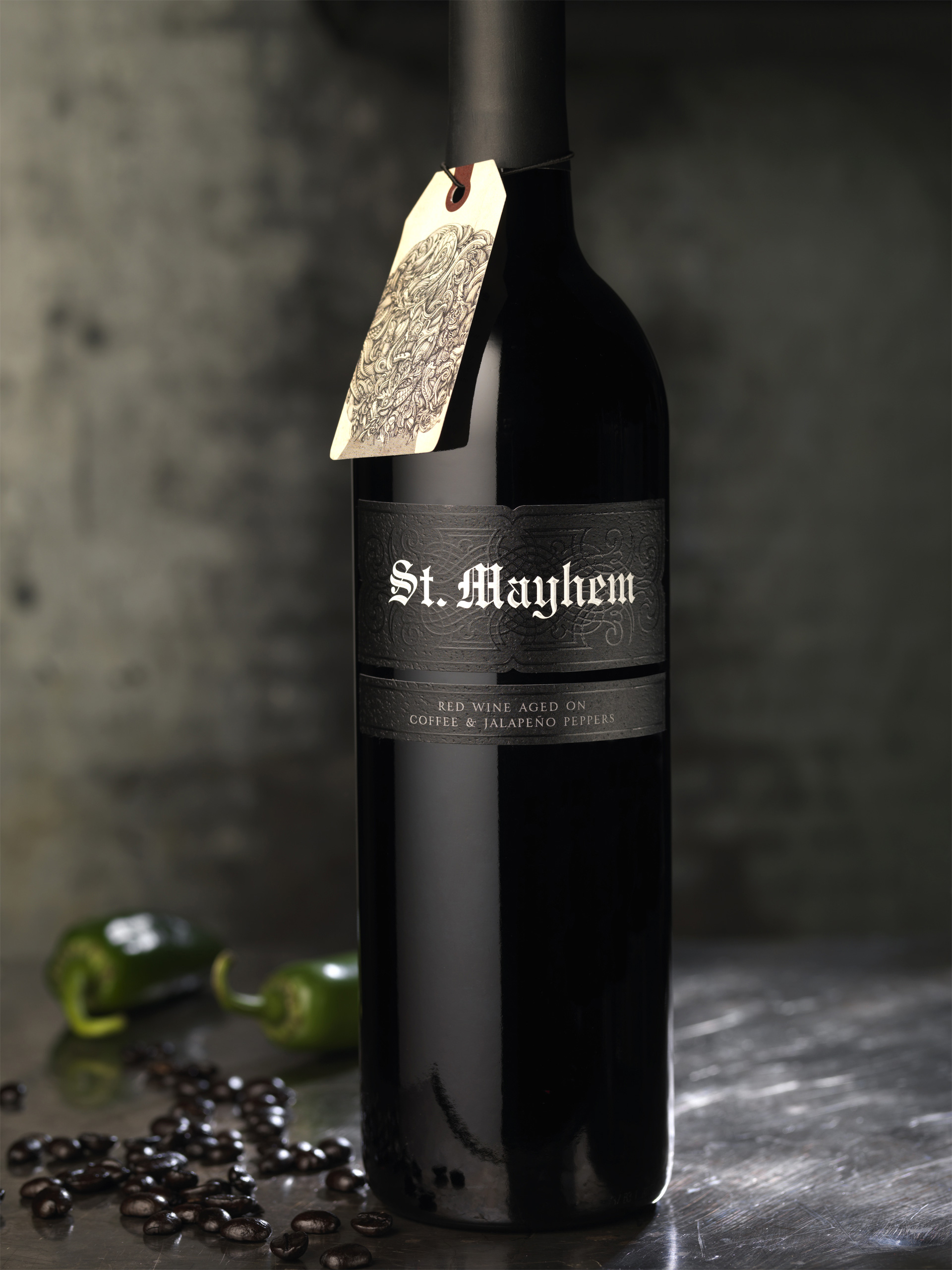
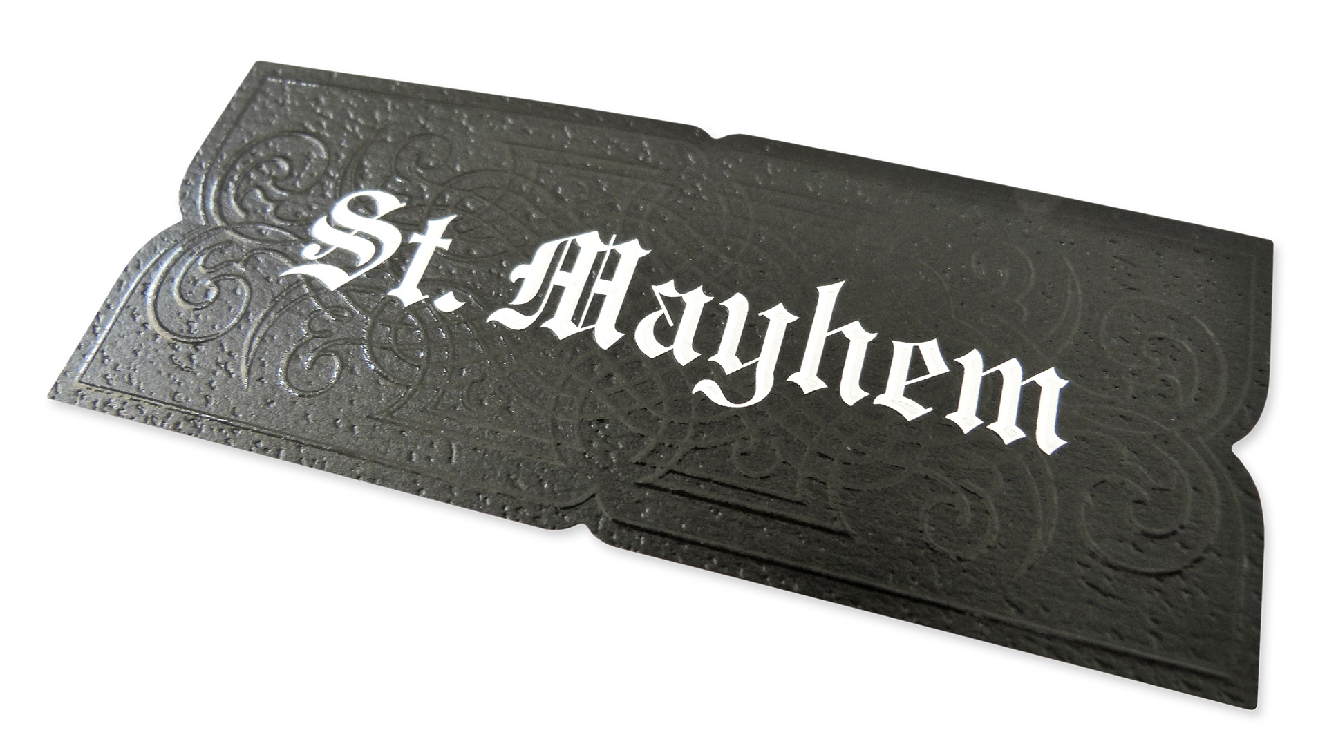
Inspired by the craft beer and spirits movement, Art+Farm Wine’s new wine brand, St. Mayhem, leverages unusual aging techniques never before used in the traditional wine category: white wines aged on ingredients like peach and ginger, and a red wine aged on coffee and jalapeno peppers. The creative team at CF Napa Brand Design wanted the packaging design for this unique wine brand to be as distinct as the wines themselves, while emphasizing the fact that they were still a serious choice for refined wine drinkers.
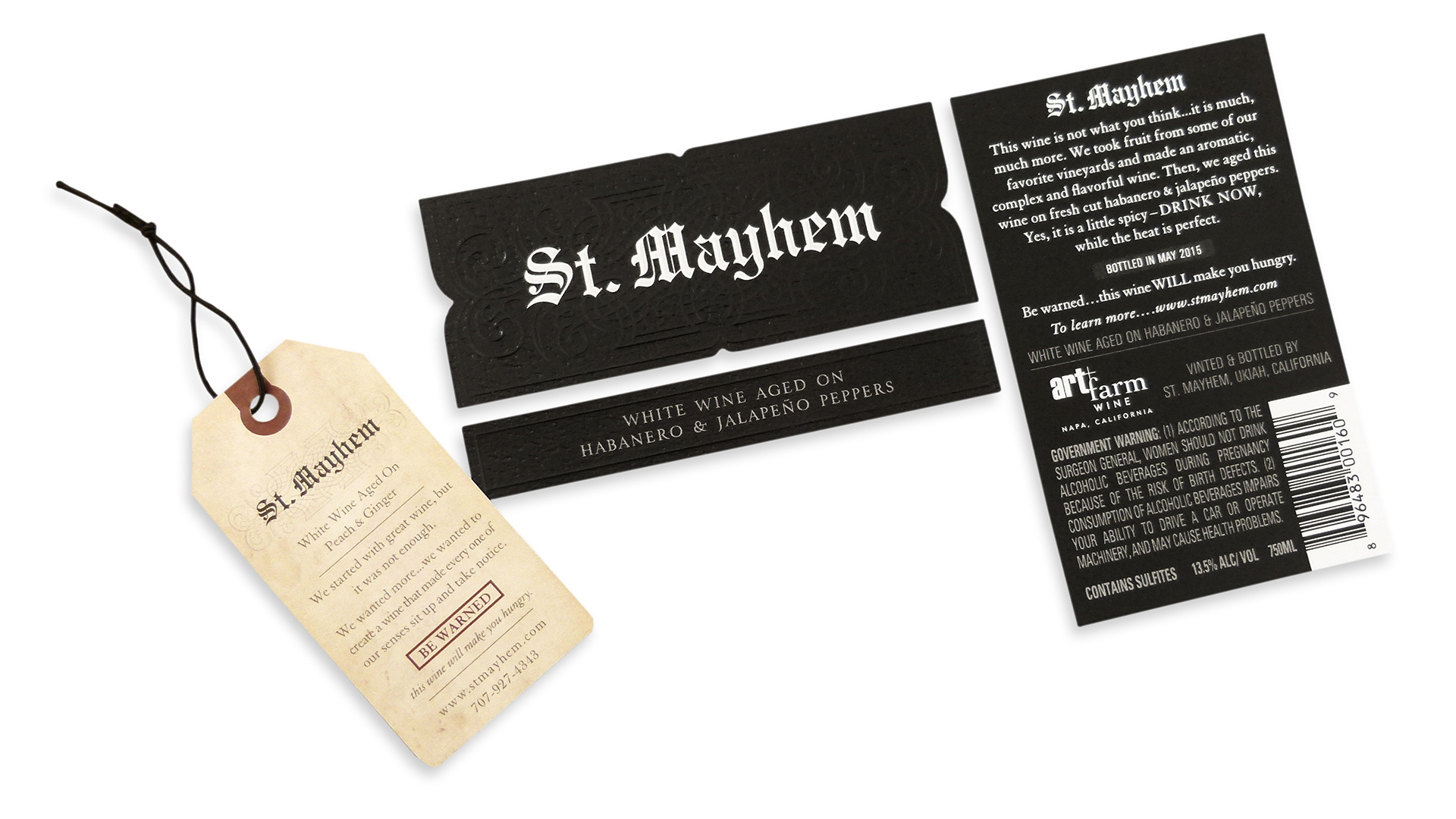
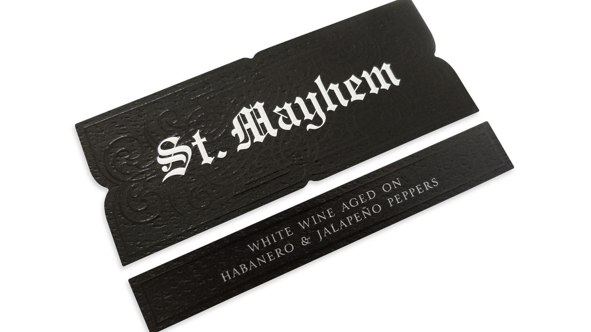
The die-cut wine label, printed on Neenah Royal Sundance Felt White 70 lb. Text [Get Swatchbook], leverages a sophisticated motif that reinforces the quality promise that Art + Farm is known for. The silk screened gloss varnish combined with the embossing on the decorative embellishments behind the wordmark subtly brings depth and texture to an otherwise simplistic design. The black on black color choice accentuates the contrast in finishes, from the matte background of the stock to the glossy flourishes in the design. The label shape follows the border of the filigree, adding to the subtle but elegant presentation.
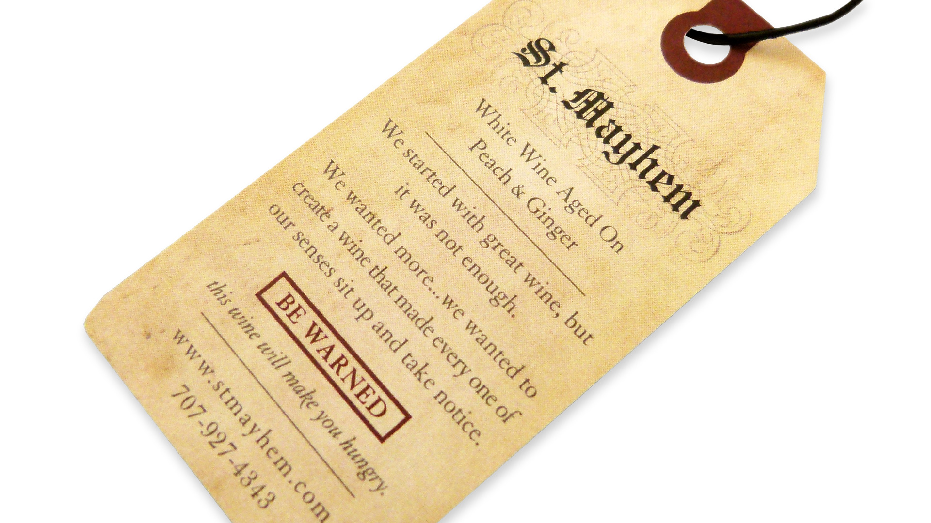
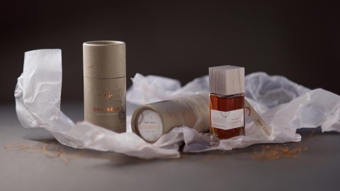
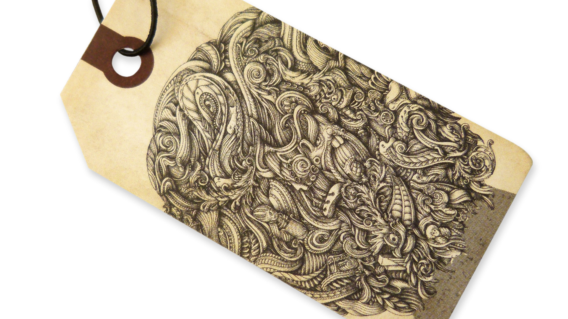
Because of the unique flavor ingredients (peppers, coffee, etc.) used to create these wines, the Alcohol and Tobacco Tax and Trade Bureau would not allow the grape varietals, vintages and growing region to be printed on the labels. So CF Napa created hangtags on Finch Fine Ultra Smooth Bright White 100 lb. Cover [Get Swatchbook] that highlight the flavors of the wines — and feature a provocative personification of St. Mayhem himself. “We needed a way to inform the consumer that these were serious wines, produced in a manner consistent with fine wine techniques, with vintages, appellations and varietals that Art+Farm was proud of,” says David Schuemann, CF Napa’s owner and creative director. “We were able to describe the wines more fully on the hangtags and help to tell the story TTB wouldn’t allow on the legal labels.”
Love this piece?
Like it and share with your friends below.