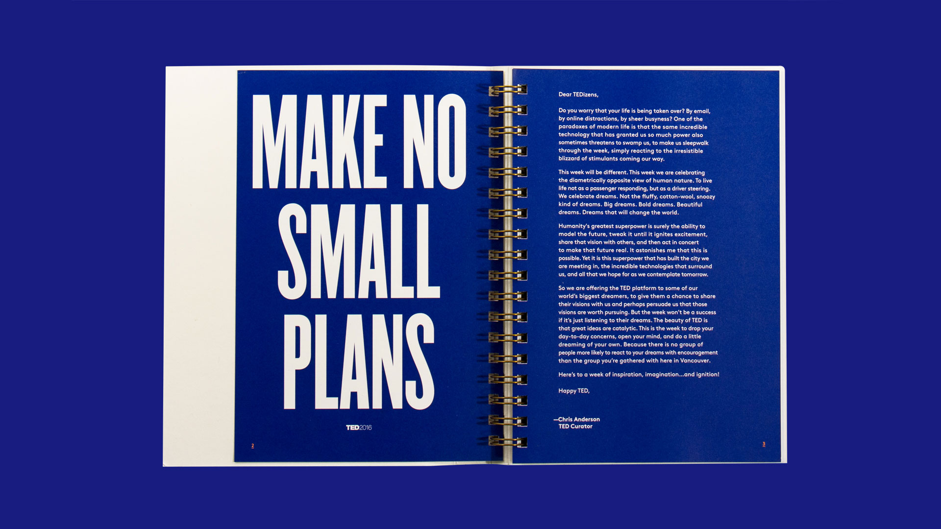
If you were to sum up the TED experience in one word, “dream” is as good as any. The program’s guest speakers repeatedly and with great self-assurance try to sell us on dreams of all kinds. The dream that we can be successful, go farther, do more, and maybe in the end even be better human beings.
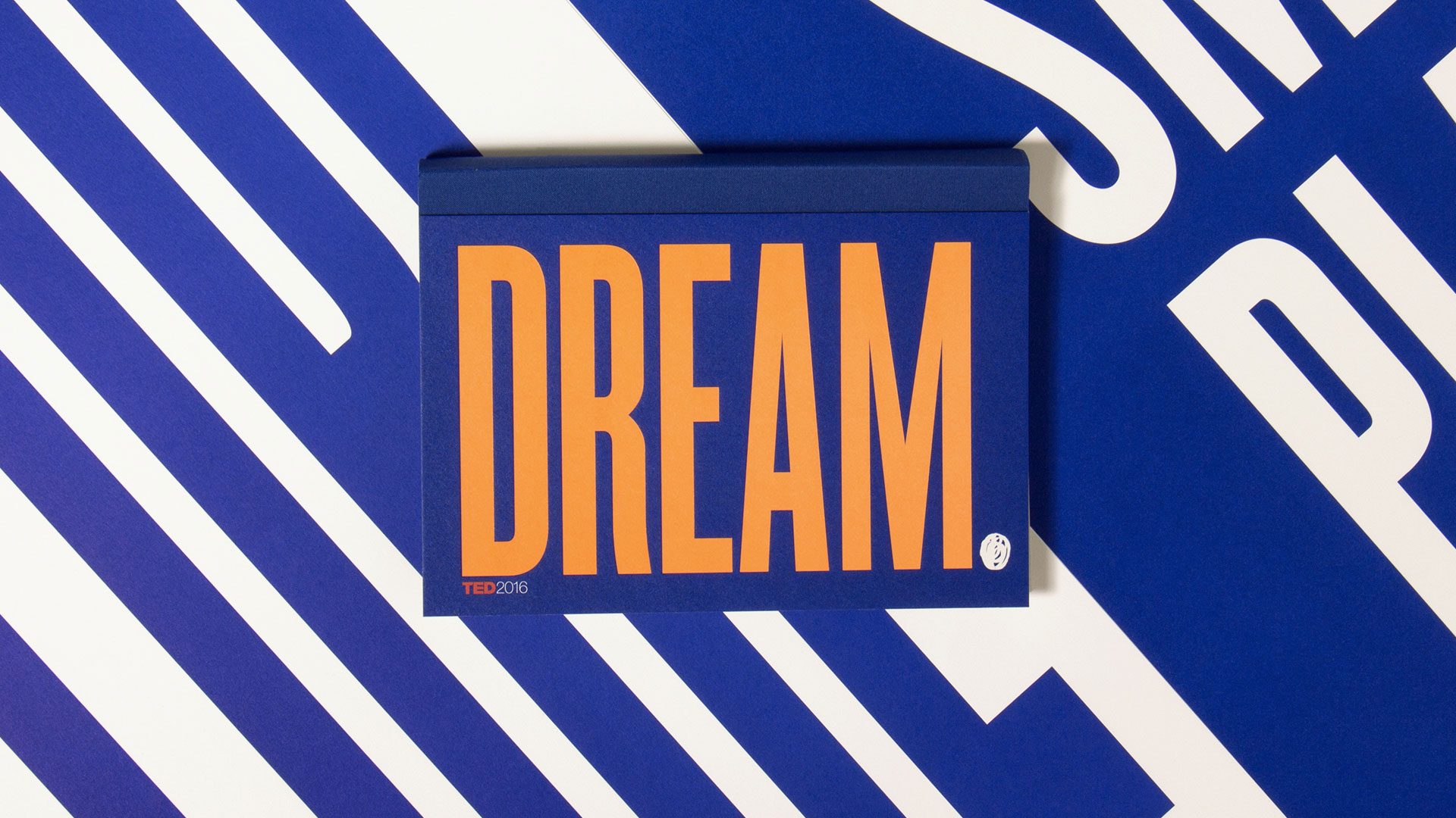
For the TED 2016 Dream conference in Vancouver last February, Hybrid Design went all out to capture the essence of the “dream” concept in visual form. From posters to event space they gave the gathering a positive, distinctive look. Nowhere was that better accomplished than in the official main stage program beautifully printed by MET Fine Printers.
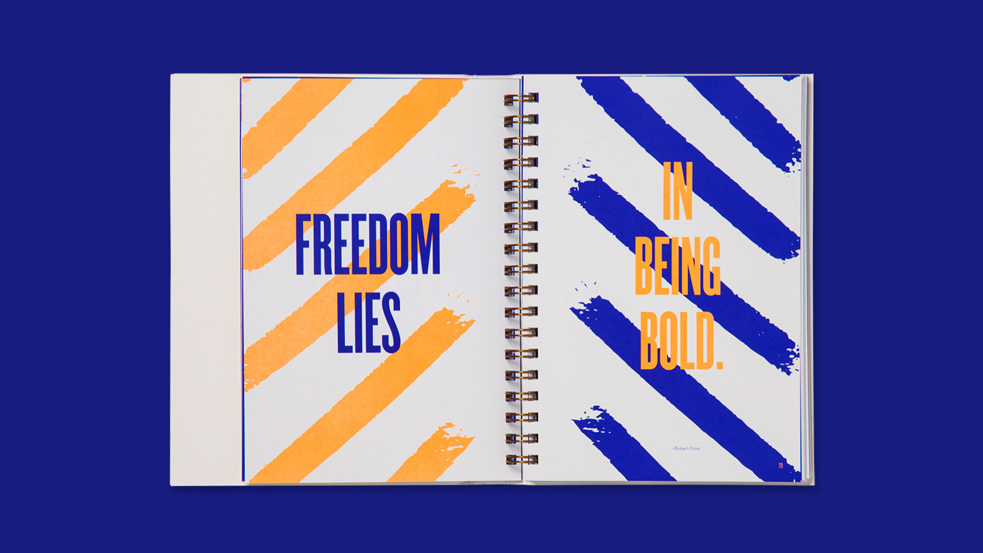
“We saw ‘Dream’ as much as a command as a process, so we began by expressing it in concrete terms: solid, impactful and loaded with potential,” says Hybrid Design Principal and Creative Director Dora Drimalas. “Massive bold typography and an electrified blue/fluorescent combination throughout vibrate, almost as if containing pent up energy.”
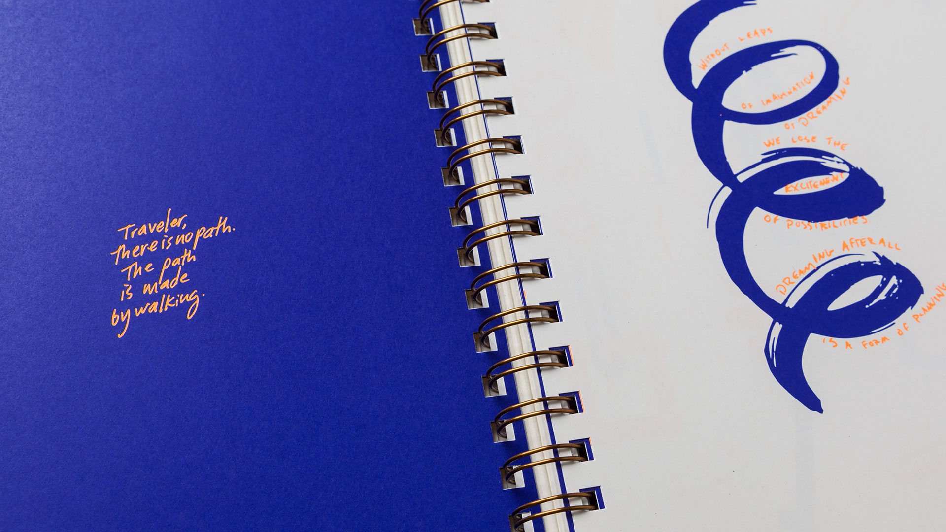
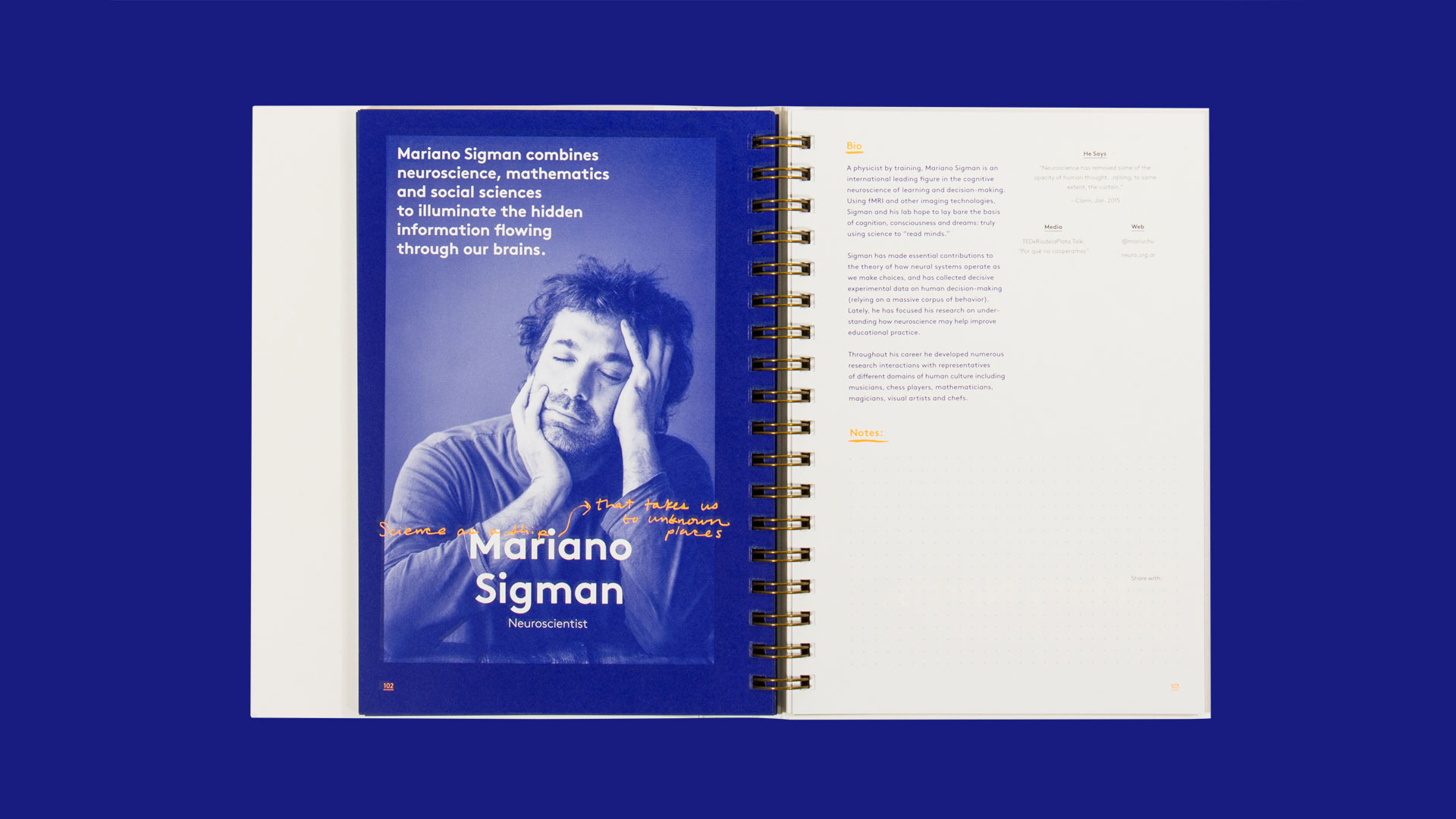
The program not only contained information about the conference itself, “it also doubled as a sketchbook for attendees and speakers alike,” says Dora. “We created a simple way for TEDsters to take notes from each speaker in a clean, transportable format which they could easily look back on, once they had left the beautiful Vancouver Convention Center. Made to survive the 5 day convention packed with events and parties, nothing is more reliable than a well-made printed notebook.”
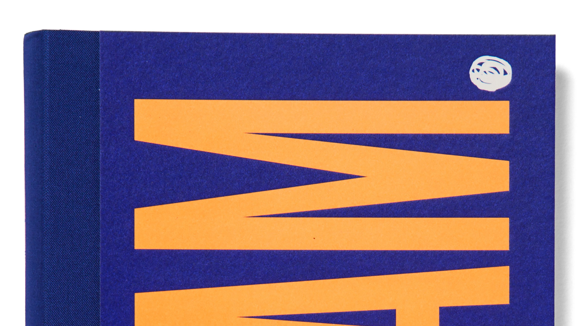
As you can imagine the delight is in the details. Take the Wire-O binding – a lay-flat option that’s simply perfect for the conference experience. Who wants to struggle against their notebook binding when they’re trying to take notes? Yet they also opted to conceal the wire binding behind an elegant cloth spine that goes beautifully with the book’s covers.
Inside, the Mohawk Options 70 lb. Text pages were a perfect choice, giving you the impression of the type of uncoated sheet you’d expect to find in a textbook, yet displaying the sharp details of a coated one.
Particularly fun is the combination of bold typography and photos with orange notes seemingly handwritten here, there and everywhere.
“The scribbles and doodles throughout the book form a more intimate perspective on dreaming,” Dora explains. “This element of process reminds the attendees that the job of a dreamer is never finished.”
All told, this tome has the look and feel of a keepsake that will sit on shelves for years to come, reminding attendees that for one short time in their lives, they were encouraged to turn off their phones, settle back, and dream.
PRO members, don’t forget to check out your:
(Not a member? Why not start your PRO membership today?)
Love this piece? Like it, share it and add your comments below.


Where can I get a copy of the the Dream Ted book?
You might drop a line to Hybrid Design – the studio that designed it – to see if they can point you in the right direction: http://hybrid-design.com/studio/contact . Good luck 🙂