As designers we all know that it isn’t just the look of a typeface that makes it a good choice for a project, but it’s also how well it can be read. This tension between what type looks like and its legibility is at the heart of this hardcover catalog for the Fabio Haag Type Foundry. Designed by Casa Rex and printed by Visão Gráfica in São Paulo, Brazil, this volume “splits the difference” between these two qualities in a unique and surprising way.
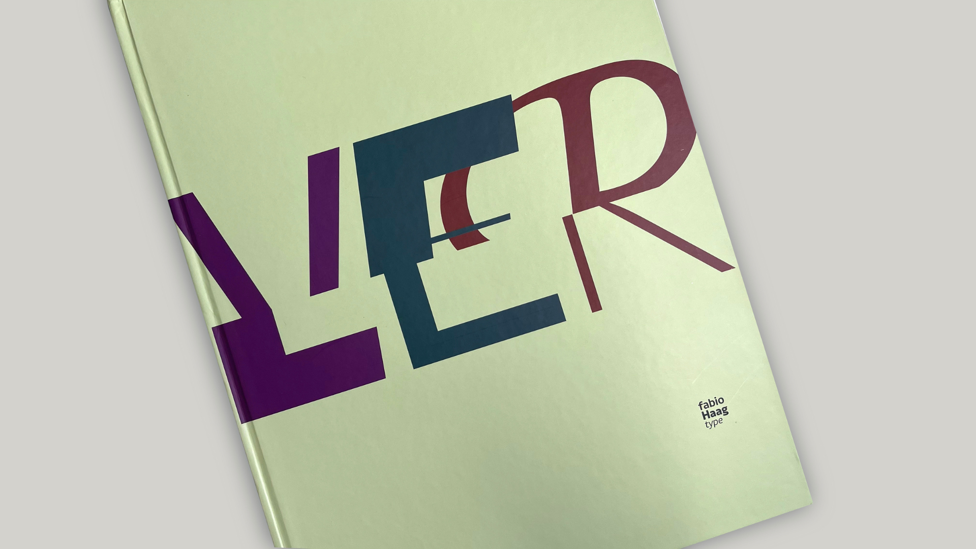
The front cover, offset printed CMYK on 150 gsm (100 lb.) coated stock, hints at the surprise awaiting us inside, merging as it does the top and bottom halves of the two Portuguese words “ler” (“read”) and “ver” (“see”) against a cool Green background.
Opening the cover instantly reveals the 64-page book’s unexpected approach to making us appreciate the way the 7 type families featured inside look and read. The interior pages have been cut in half horizontally in much the same way that some children’s books allow their readers to mix and match different illustrations through the random turning of pages.
Here, the inside pages were printed CMYK offset on 150 gsm (100 lb.) stock. The signatures were then folded and trimmed down to the text block’s final 22 cm x 30 cm (8.7 x 11.8 inches) dimensions. Only then were they cut in half to create 2 books of 22 cm x 15 cm (8.7 x 5.9 inches) each. These were then bound and inserted into the cover. (The final book with cover is 23 cm x 31cm, or 9.1 x 12.2 inches.)
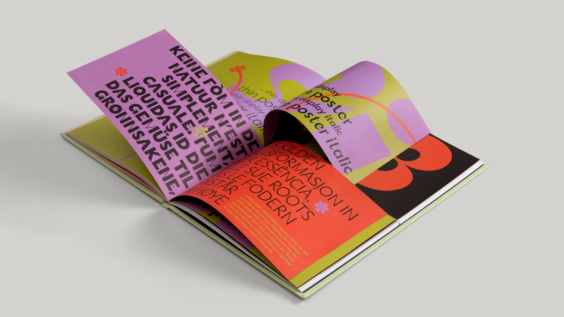
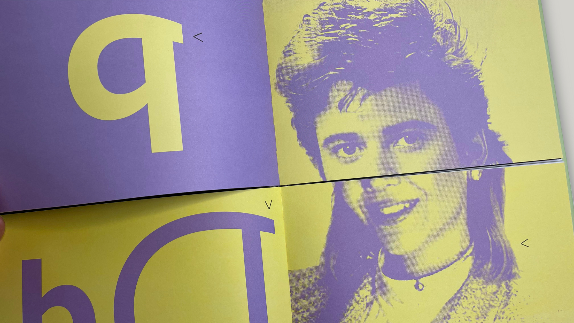
The result is a wild mashup of type and imagery in which the top of a man’s face aligns with the bottom of a woman’s, for example, while different typefaces are juxtaposed against each other – all depending on how you flip through the pages. The vast number of combinations possible emphasize the visual excitement of the type one moment, and its ease of reading the next.
The book’s split personality also comes in handy on the last pages which share details about each font featured, as well as their respective typographers in Portuguese in the top half of the book, and in English in the bottom one.
As a result, the playful nature of the piece both fires up our imagination and goes a long way toward reminding us how fun it can be to mix and match design and type elements when we’re not doing so on a computer screen and on deadline.
Smyth binding turned out to be a good choice for this book, but there are a great many binding options available to you today. To get everything you need to know about 12 of the most popular, be sure to download our free Binding Cheat Sheet right now.


