Convention and visitor bureaus – there’s one in every city and town across America. That’s a lot of competition for business and tourist dollars. Now imagine that the design brief is further challenged by the fact that the city name is exactly the same as a lot of other cities.
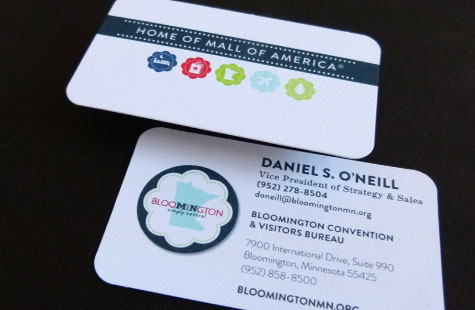
Such was the case with Bloomington (Minnesota) Convention & Visitors Bureau, but this design team created a standout identity for this special city. The tagline “Home of Mall of America” is a great component to establish location. Trust me, if you’re any kind of shopper, you know where that mall is.
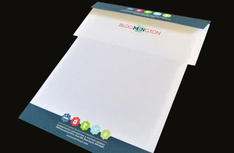
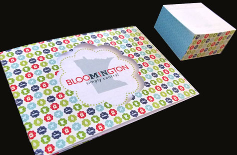
The visual language supports the brand’s personality. A “bloom” shape reinforces the name and suggests it is a fun, family-friendly destination. Unique icons showcase Bloomington’s many activities (shopping, hotels, nightlife, etc.). The logo’s “I” falling in the center of the state illustration to show location again is a nice touch.
An Eggshell finish on the Mohawk Superfine Ultra White extends that friendly feel. The palette in all its PMS glory is lively and bright and leaves you feeling positive. The design translates across all the business materials for a super-cohesive package.