Refreshing the brand of a successful, established business is a tricky proposition. The design needs to stay true to the personality that brought and kept a loyal clientele (in this case, relationships formed over more than three decades in one neighborhood) while updating the look and feel enough to be relevant to new customers.
Inspiration for this design team came from researching old business archives in the area. The community’s history was rich with visual cues from vintage logos to old sign-painted typography.
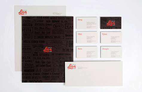
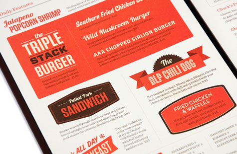
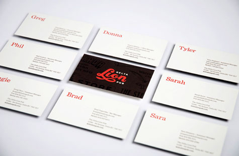
Typography is definitely king of the jungle with a looping capital “L” that ends with the tip of a lion’s tail. The treatment feels fun and authentic. Red and black make for a classic pub palette. Highlighting first names on the business cards is friendly and unpretentious.
Uncoated Classic Crest Natural White kept the identity suite warm and welcoming. The black-on-black background on the backs of stationery, business cards and coasters give the whole package some punch and remind us this pub is the place to be day or night.