Simply put, “from darkness into light” is the philosophy behind Ellie Cashman’s hauntingly beautiful floral wallpapers, cushions, fabrics and more. And design firms Studio Stephan Lerou and Nearest Neighbour captured this concept beautifully in the identity materials they came up with for her. There is a lot of darkness here to be sure. But just as with Ellie’s work, there are fine details to be found in the shadows, and (in at least one instance) pleasing bursts of color lurking within if only we take the time to look.
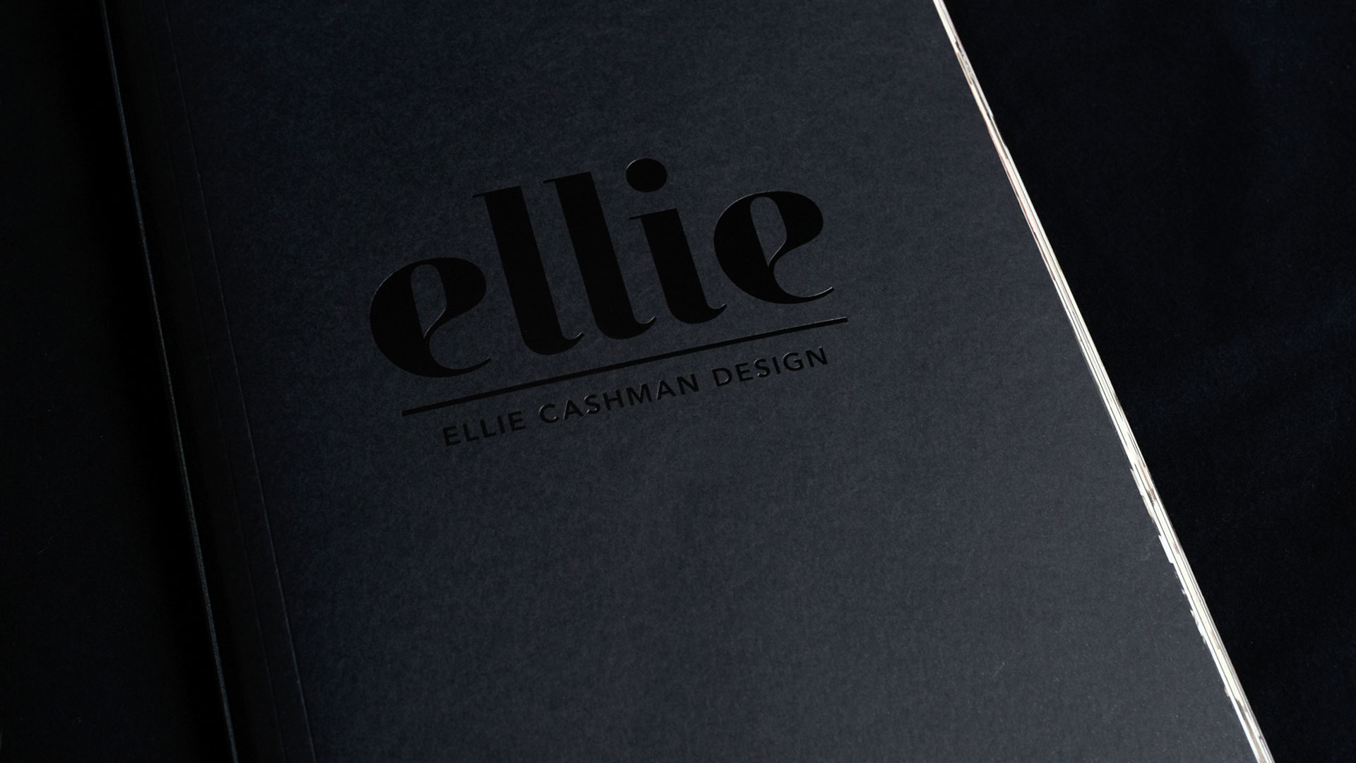
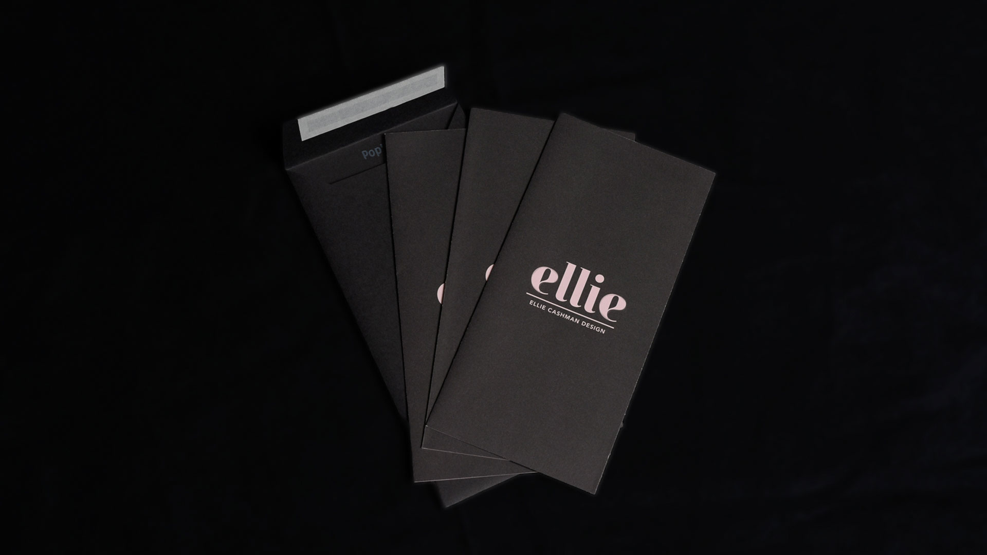
The heavy lifter here is Pop’Set Black by Arjowiggins which was used for everything except the flyers and ‘With Compliments’ card. The use of black foil stamping on black paper draws the eye in and, much like Ellie’s own work, prompts the mind to scour these pieces for every subtle detail.
To better understand these materials, let’s first hear a little more about Ellie’s thought process regarding her own floral patterns, which she creates through a combination of pencil sketches and Photoshop:
“As did the still-life painters of the Dutch Golden Age, I paint flowers in all their states, with an emphasis on those that break through this threshold from dark to light, from seed to stalk to bud to full, extravagant bloom. The shadows, and the darker states, are part of, and support and indeed exaggerate, this triumphant flower in the peak of its glory.”
Now then, let’s take a look at this philosophy as it is expressed in paper form.
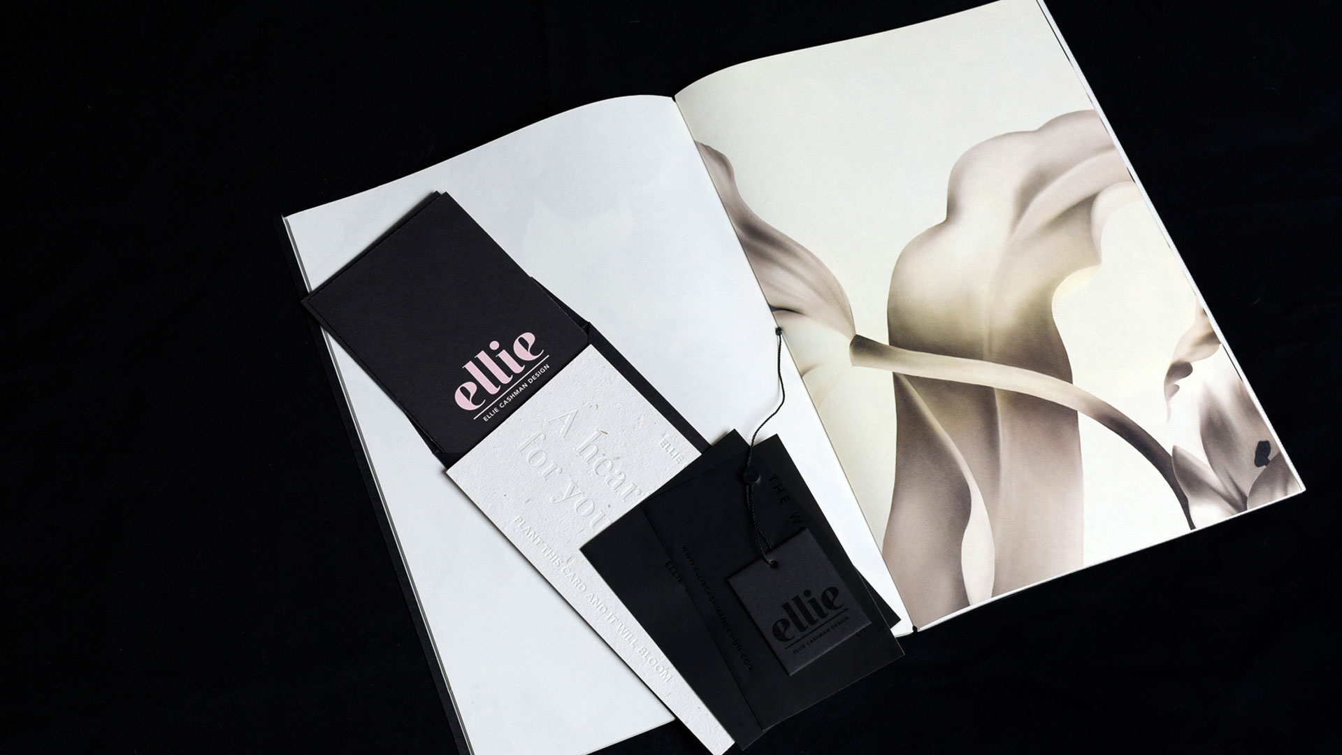
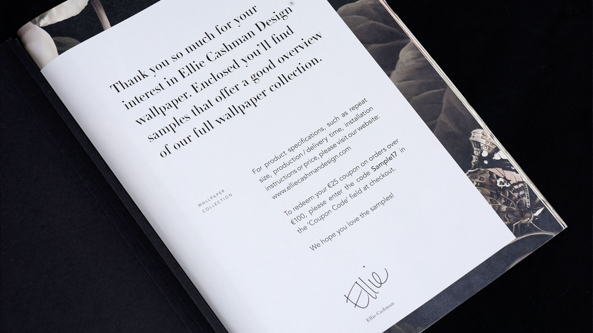
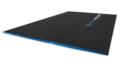
Wallpaper Sample Book
Says Stephan Lerou: “Books and flowers give a soul to a house. With this in mind, we wanted to present the samples more like a book instead of loose sheets of paper, with the ability to untie the samples, of course.”
This is my favorite piece in this identity and the one that sets the tone. The cover features the company name in black foil. Inside, large sheets of wallpaper are folded in half and held together with an elastic band. This makes it very easy to take out one or two of the samples and hold it up against a wall to get a better idea of the effect.
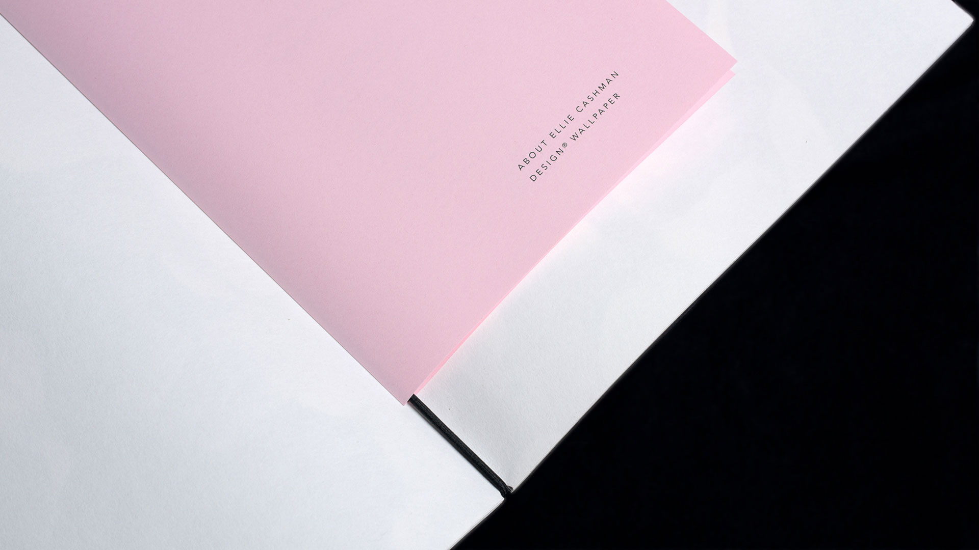
This loose binding also allows for a shorter welcome letter to be tied in at the beginning of the book, as well as an “about us” sheet in the center. To ensure the large wallpaper sheets remain in place, small half-circles were die cut at the top and bottom of the fold. You can already catch a glimpse of the contrast between the black of the cover and the colors of the wallpaper at the edges of the book.
‘With Compliments’ Card
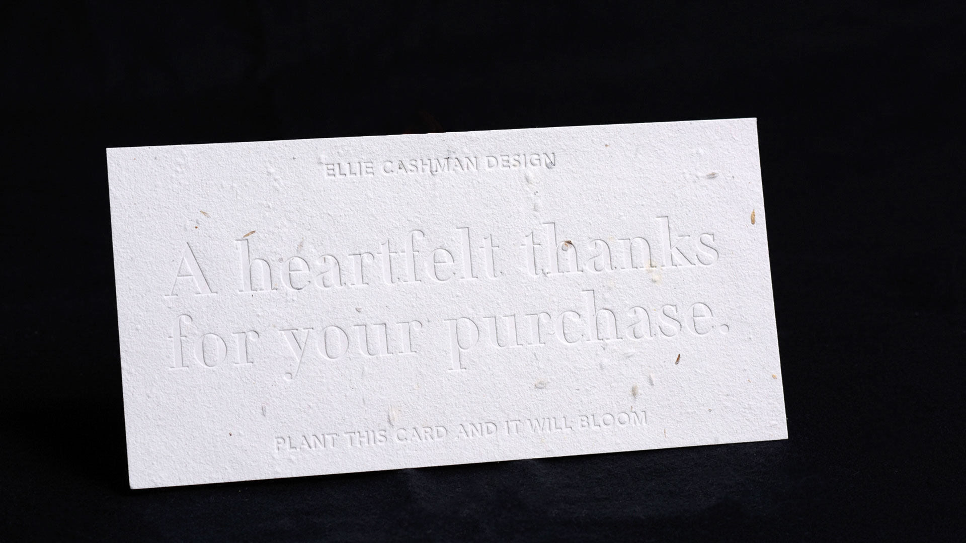
What better way to keep Ellie Cashman’s floral prints top-of-mind than with a “thank you” card that can be planted, bringing forth new flowers? The blind debossing is a nice touch that not only adds to the card’s tactile qualities, but also further puts the recipient’s mind at ease regarding its environmental impact. Says Stephan, “We spent a lot of time finding the right paper for the compliments card. There are a lot of seed-papers on the market today, all with a difference in quality. Moinho offered a good quality paper that was well suited for blind debossing. Because it’s intended to be put in the ground, we didn’t want to use ink. (Although there are eco-friendly inks, it didn’t feel right.)”
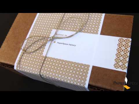
Gift/Sample Box
Subverting expectation, this black package looks more like a book than a box, and snaps shut with a magnetic closure. The blind deboss on the lid is elegantly understated. Avoiding the usual “Ellie Cashman Design” underneath the name “Ellie” gives this the personal touch, making the gift or sample inside seem as though it came straight from Ellie’s hands (which we imagine it did). They are currently at work on a larger sample box for the retail market.
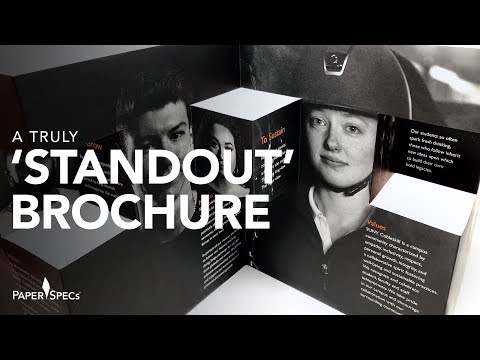
Flyers
Note the clever way they let the pink of this Light Pink sheet from the Rainbow collection by Papyrus show through in the logo on the cover of this trifolded piece, while reversing it out on the inside.
Business Cards
Simple and elegant are words that apply to all of these materials, though none more so than these cards. Once again we’re confronted with just how pleasing a pairing of black foil and black paper can be. The phrase “The Wonder in Us” on the back effectively encapsulates Ellie’s philosophy. The heavy use of black paper and foil throughout these pieces also inspires loads of wonder – black is indeed the hue of “mystery” – color us intrigued.


