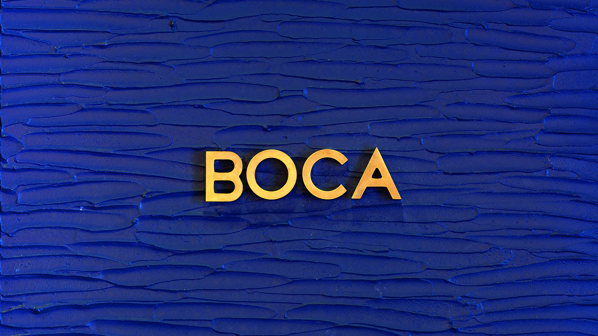
As with taste and appearance, texture is integral to the enjoyment of fine dining, particularly a scrumptious dessert. Which is why texture is celebrated throughout the branding of Boca, Mexico City’s first dessert restaurant. From textured walls to the logotype embedded in the pink concrete step at its entrance, it’s everywhere. And naturally it appears in its print and packaging materials too, but tastefully so.
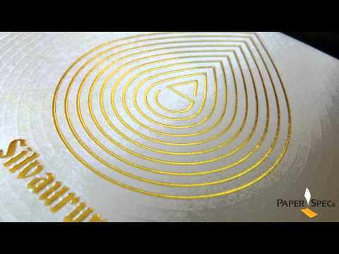
Seeking to depict the different taste sensations on offer at Boca (literally “mouth” in Spanish) as golden explosions of flavor, design firm Manifiesto developed a graphic identity comprised of Gold ink stain patterns meant to reflect the creative dishes served, and perhaps more abstractly, the carefree splashes of ingredients used to whip up its confections.
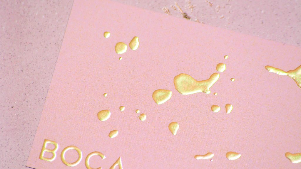
What instantly captured my attention was the way these patterns were added to the restaurant’s print pieces through the use of a polymer-based digital foiling technique. If you’re a PaperSpecs PRO member you’ll know that this technology [PRO Guide to Polymer Based Digital Foiling] not only allows you to add shimmering foil to short print runs, and even to customize that foil for each piece in your run, but it also gives you the option of slightly raising the type and graphic elements. (And be sure to download our free Foil Cheat Sheet for the vital specs on all your foiling options.)
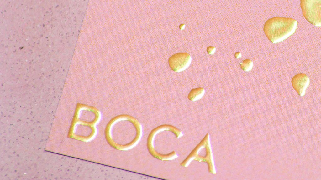
Take these handy business cards. They’re printed on 150 gsm (100 lb.) coated paper with a soft-touch laminate finish, the varying Gold foil “stains” resembling the drizzled remains of some mouth-watering sauce or glaze.
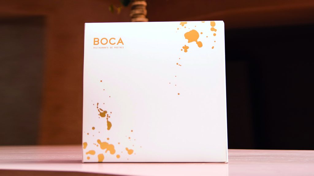
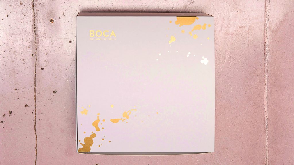
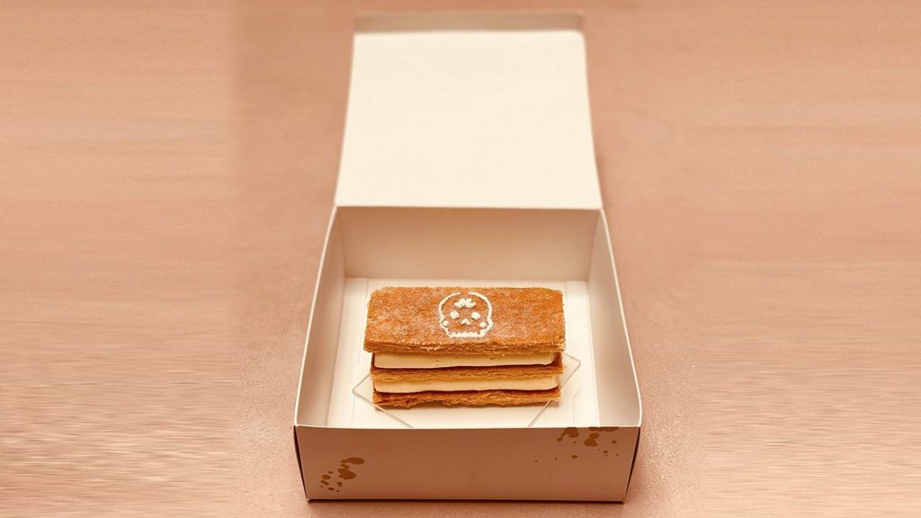
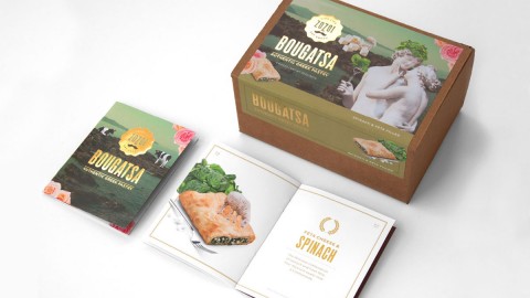
A different, but equally attention getting, effect was achieved with the to-go boxes. Originally the designers wanted to apply Gold hot foil to them, but because of their size and the quantity required, they soon realized they’d have to get creative.
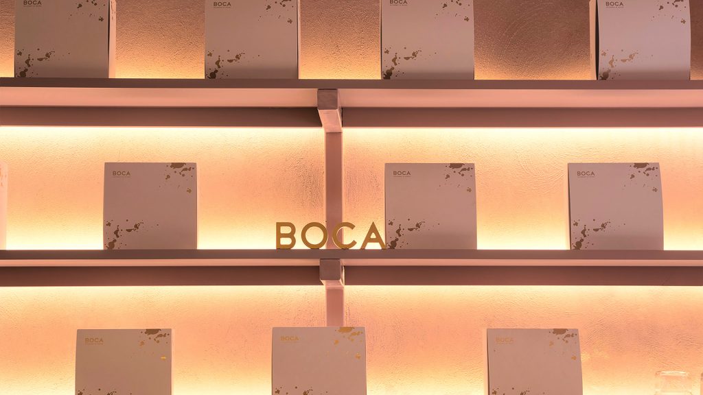
They ended up applying a base varnish to 16 pt. SBS paperboard, and then screen printed Gold ink on top of that to achieve the perfect color, as well as a spot UV finish to achieve the foil-like reflection. Not only are the packages a great advertisement when patrons bring home their favorite sweet treat, but Boca also displays them impressively throughout the restaurant, enhancing its ambience. An added bonus: The way the light reflects off them changes depending on the time of day and the angle from which they’re viewed.
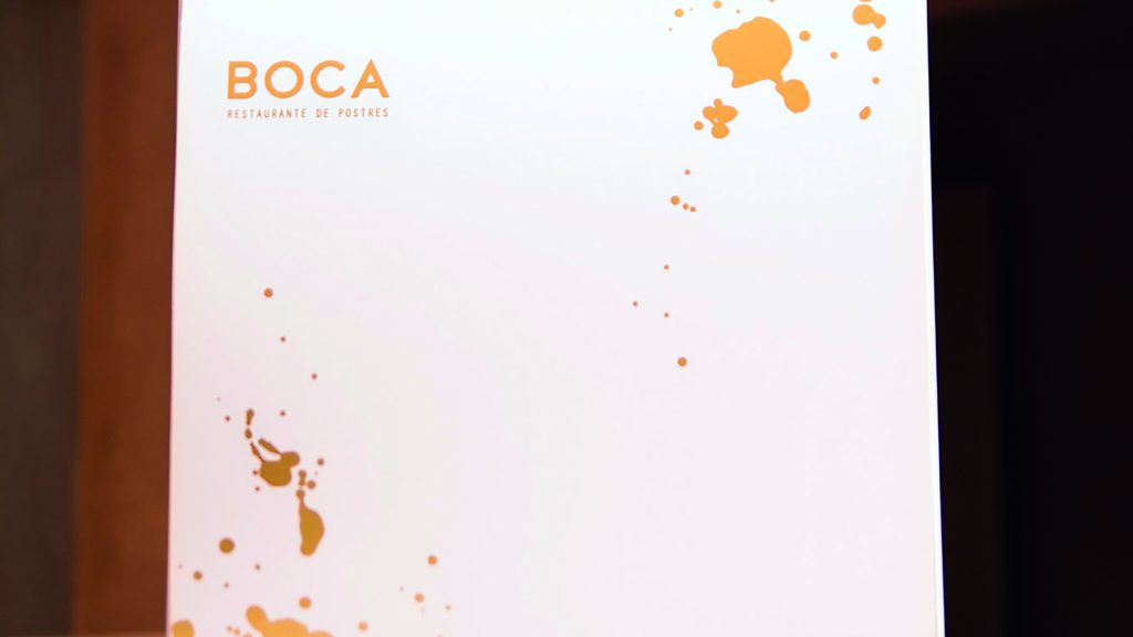
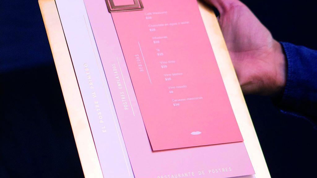
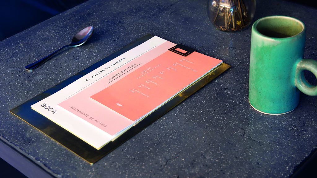
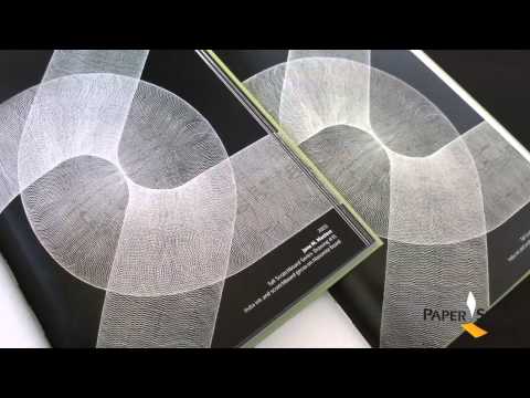
In contrast, the 3-menu suite is a little more understated, printed on 250 gsm (170 lb.) stock that features a soft-touch laminate on the front. Here, too, digital Gold foil is used, this time for some of the text on each menu. And because they used digital polymer foiling here again, the letters are slightly raised due to the amount of polymer used, giving the menus an extra tactile boost.
All of which is to say that while I can’t vouch for the deliciousness of Boca’s desserts, I can say that this is probably the best application of digital raised foil I’ve seen so far. Bon appétit!


