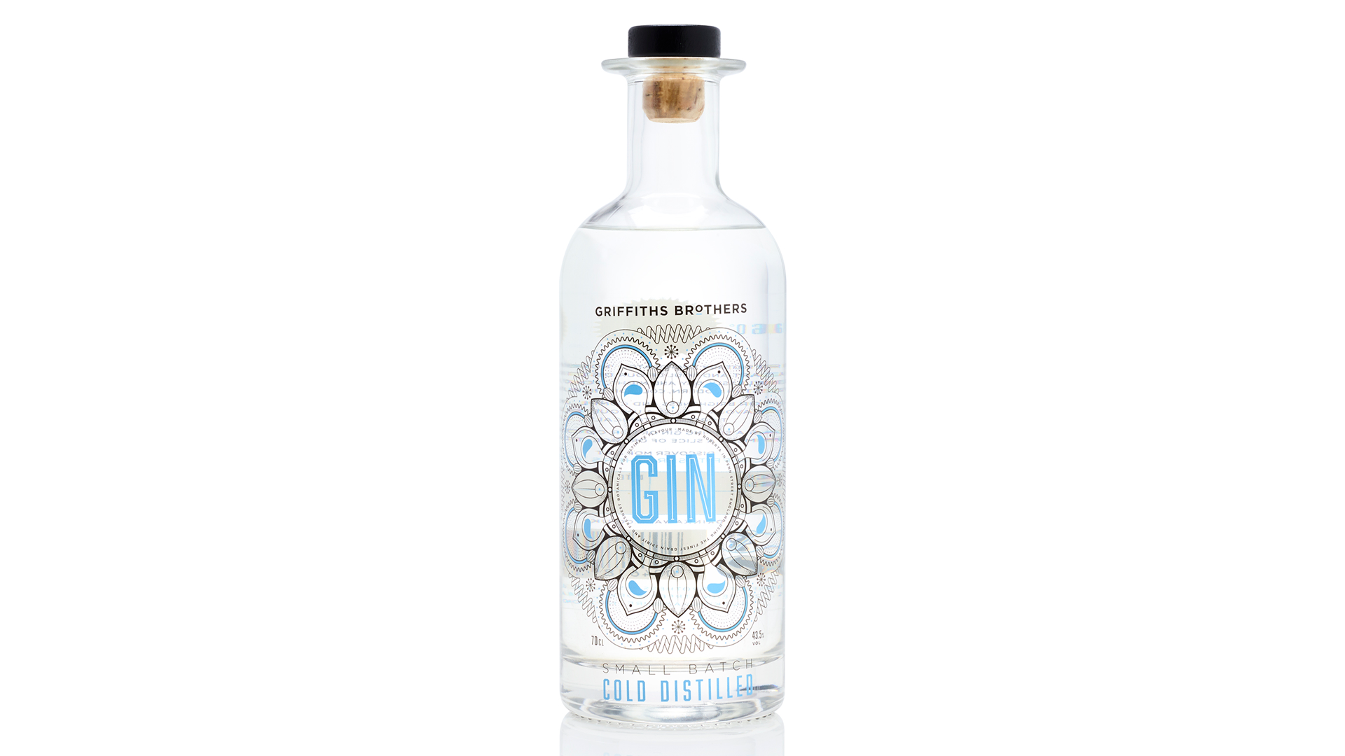
Sometimes it seems there is no end to the number of super-creative wine and spirit labels out there. While I adore the way so many designers have used color, die cuts, and even embossing and engraving to make their clients’ products stand out, occasionally I have to wonder “Where do we go from here?” And that’s when the bottle of gin on the table quietly reminds me that it’s time for it to be returned to the freezer.
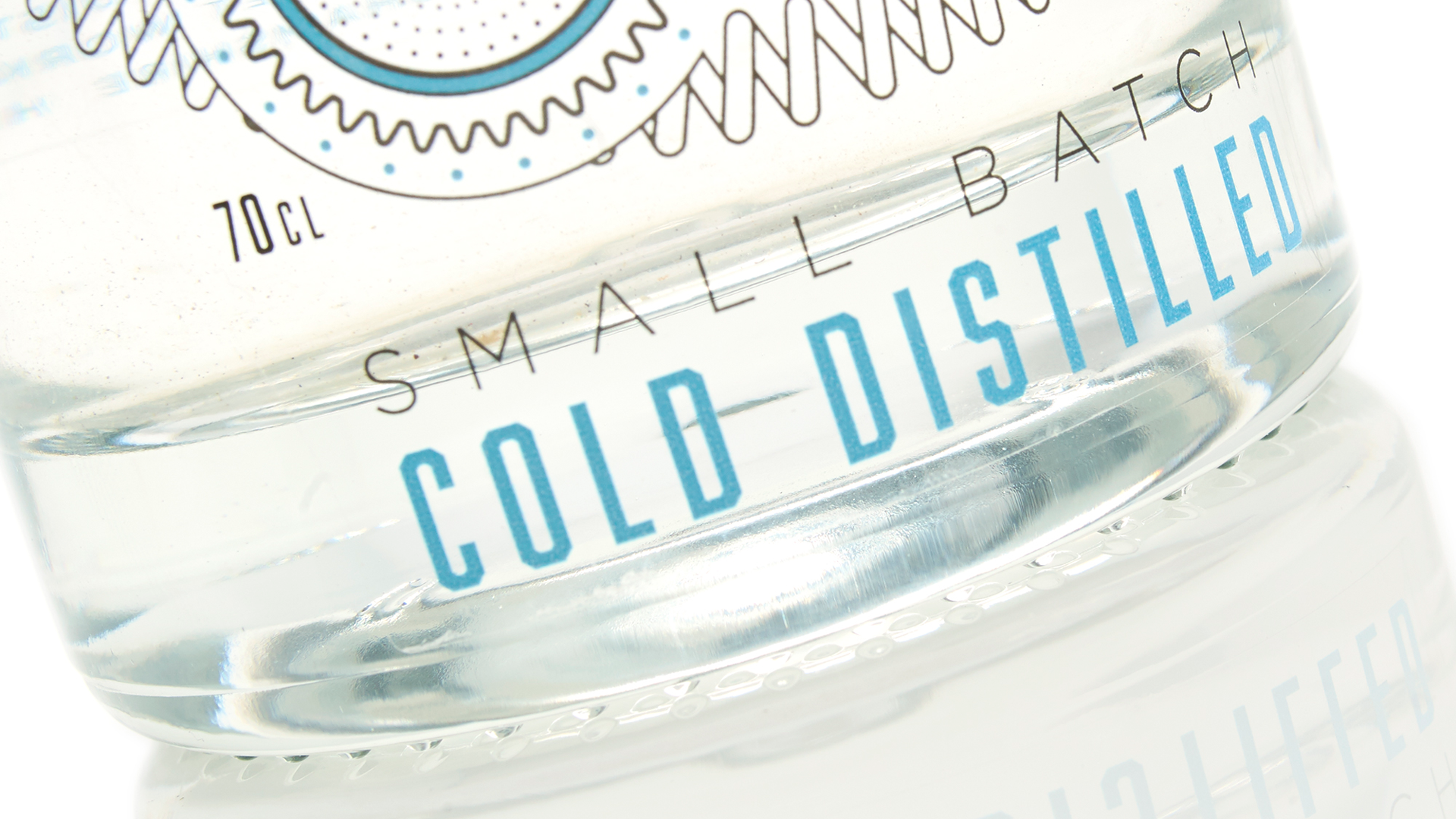
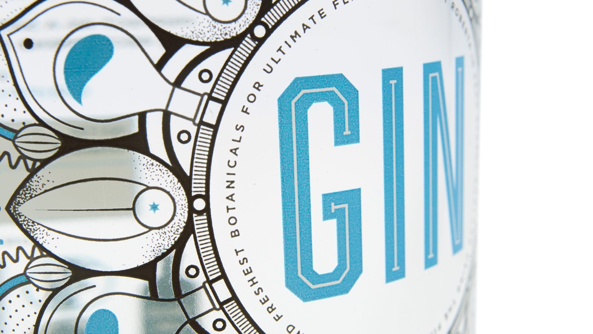
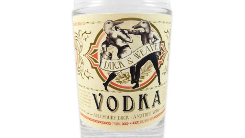
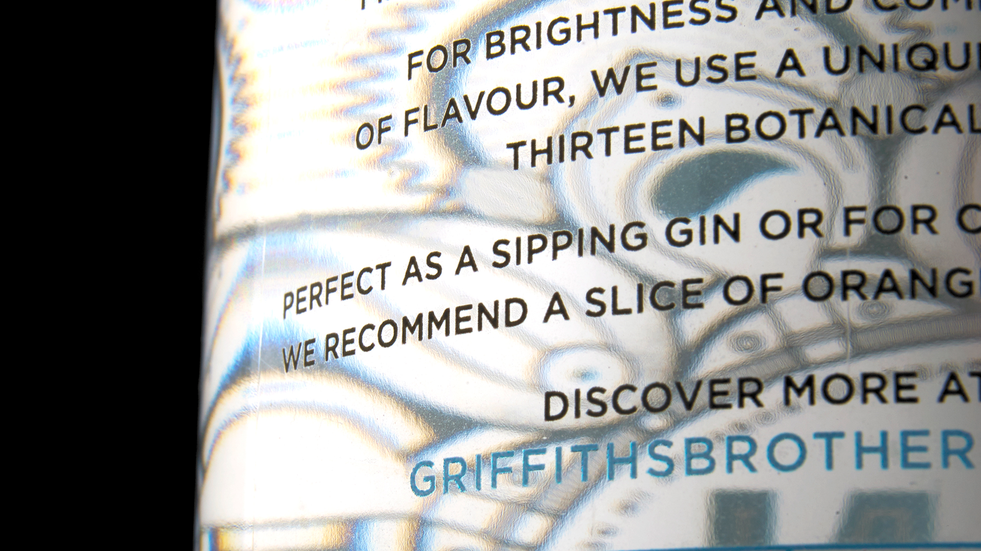
Yep, the award winning Griffiths Brothers Gin actually tells you when it is cold enough to drink. Thanks to a thermochromic (heat-responsive) varnish, a section at the back of the label turns blue when reaching the optimum temperature. As the label warms up, that blue fades until you return it to the ice box to chill down once more.
(Another interesting use of this technology can be found in the Agatha Christie stamps issued by the UK’s Royal Mail a couple of years back –co-designed by Jim Sutherland – in which mysterious goings on were revealed through the application of body heat and UV light.)
Though impressive, this gin label’s color-changing capabilities might be dismissed by some as the printing equivalent of a parlor trick, if not for the fact that it serves to reinforce the key selling point of this premium gin. Unlike traditional distillers, Griffiths Brothers created this gin using cold distillation, the better to capture the flavors of the botanicals used in its making, and ultimately making for a cleaner, brighter taste.
Miracles of printing and finishing technology are everywhere today – what’s infinitely rarer are printers and designers who use them to further the message of their marketing materials and packaging as successfully as this.
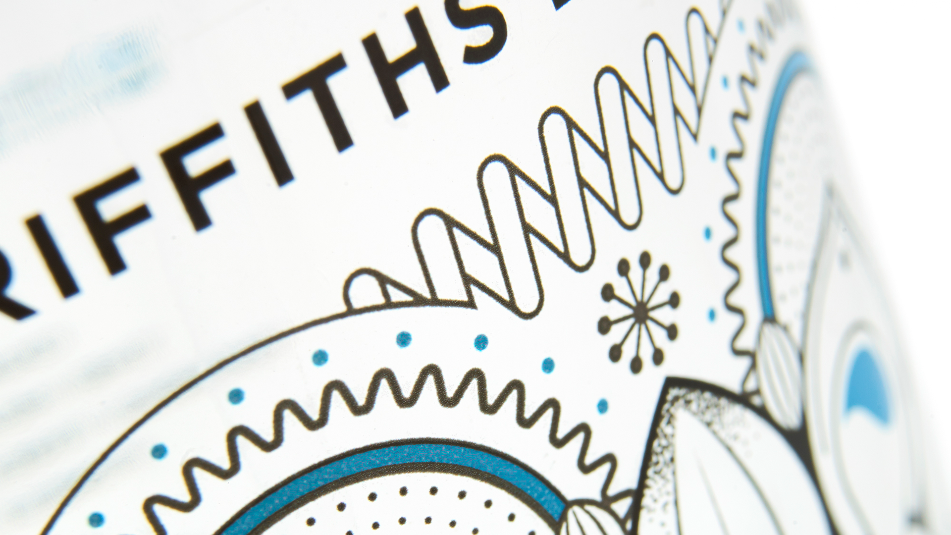
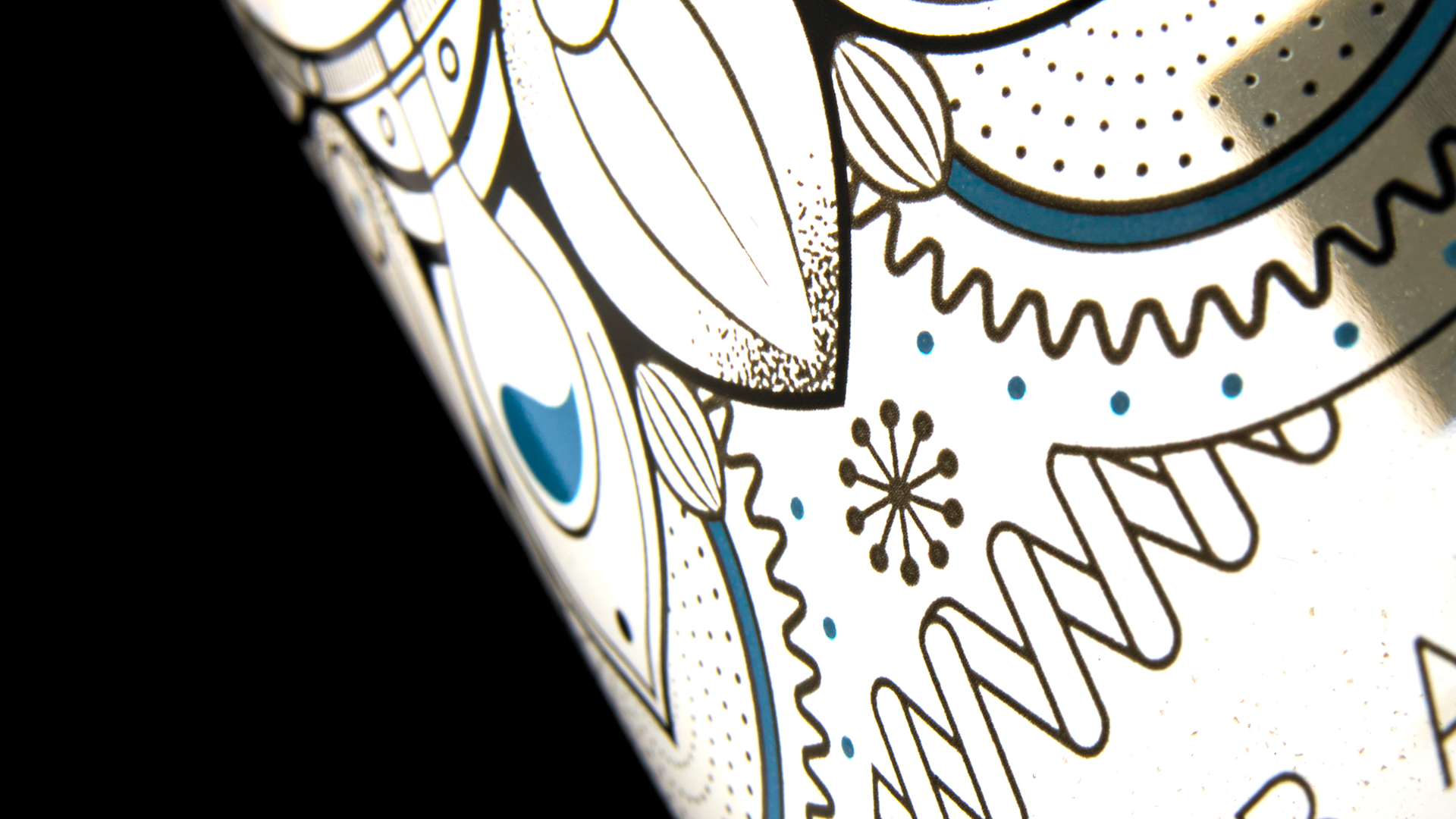
Designed by Milestone and printed by Royston Labels, the Griffiths Brothers Gin label is also an excellent example of digital inkjet printing. CMYK + White were printed on 50 micron Fasson Clear polypropylene (PP) film, with the white going down first to provide a neutral background for the vibrant blue and some of the leaf details. The vibrant Blue ink was then applied via flexo to the name of the gin and as an accent color.
That you can print labels for gin bottles that are bound for the freezer (and the occasional ice bucket) using high-speed inkjet – a technology that essentially sprays ink on a substrate – is arguably just as amazing as varnishes that change color with the temperature. The ever-so-slightly raised ink on the label is a byproduct of inkjet printing, and gives the label a pleasing tactile aspect.
PRO members, also don’t forget to check out your: