Thanks to the digital revolution everything we do today, from answering emails to shopping for new homes, we do at breakneck speed. Realizing that this leaves little time for investors and home buyers to reflect on the impact their decisions have on others, Virani Real Estate Advisors produced a lavish book titled, appropriately enough, “Reflections.”
Using finger-pleasing debossing, clever positioning of a Silver film, and print’s own unique ability to slow readers down long enough to savor the moment, this book also emphasizes the company’s core belief: that clients, employees and members of the global community all belong to one big family.
Though based in Vancouver, Virani boasts properties all over the world, with offices in London, Beijing and Seattle. To emphasize this market strength, the covers of this book, designed by Elevator Strategy, are comprised of a super-thick 18 pt. board wrapped in a scuff-free, matte laminated 100 lb. White Coated stock.
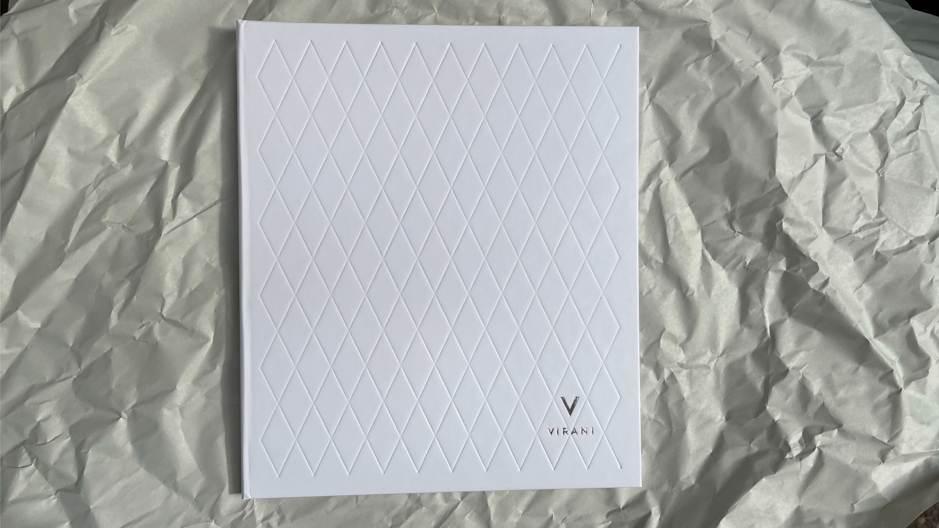
The front cover draws you in with a repeating, deeply debossed “V” pattern that’s perfect for making a strong tactile, as well as visual, impression. In the lower right corner, the Virani logo shimmers tastefully with Silver foil, which has also been used to impress the book’s title, “Reflections,” along the spine. On the back cover, the Virani logo appears again, larger this time, thanks to another deep deboss.
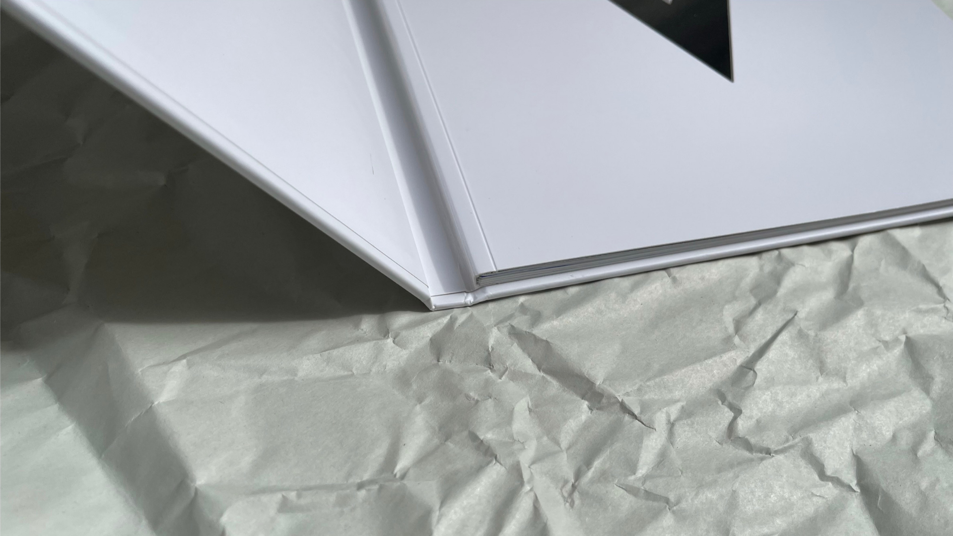
Opening the cover reveals the first big surprise – this coffee table book is actually Swiss bound! [PRO members, discover how you can get this look with our exclusive PRO Tip.] This means that the text block is mounted to the inside back cover only, leaving the spine free and visible.
Usually Swiss binding is paired with Smyth sewn binding to reveal an exposed spine. In this case, however, the book has been perfect bound and scored, with all binding performed beautifully by our good friends at Roswell Bookbinding [projects / website].
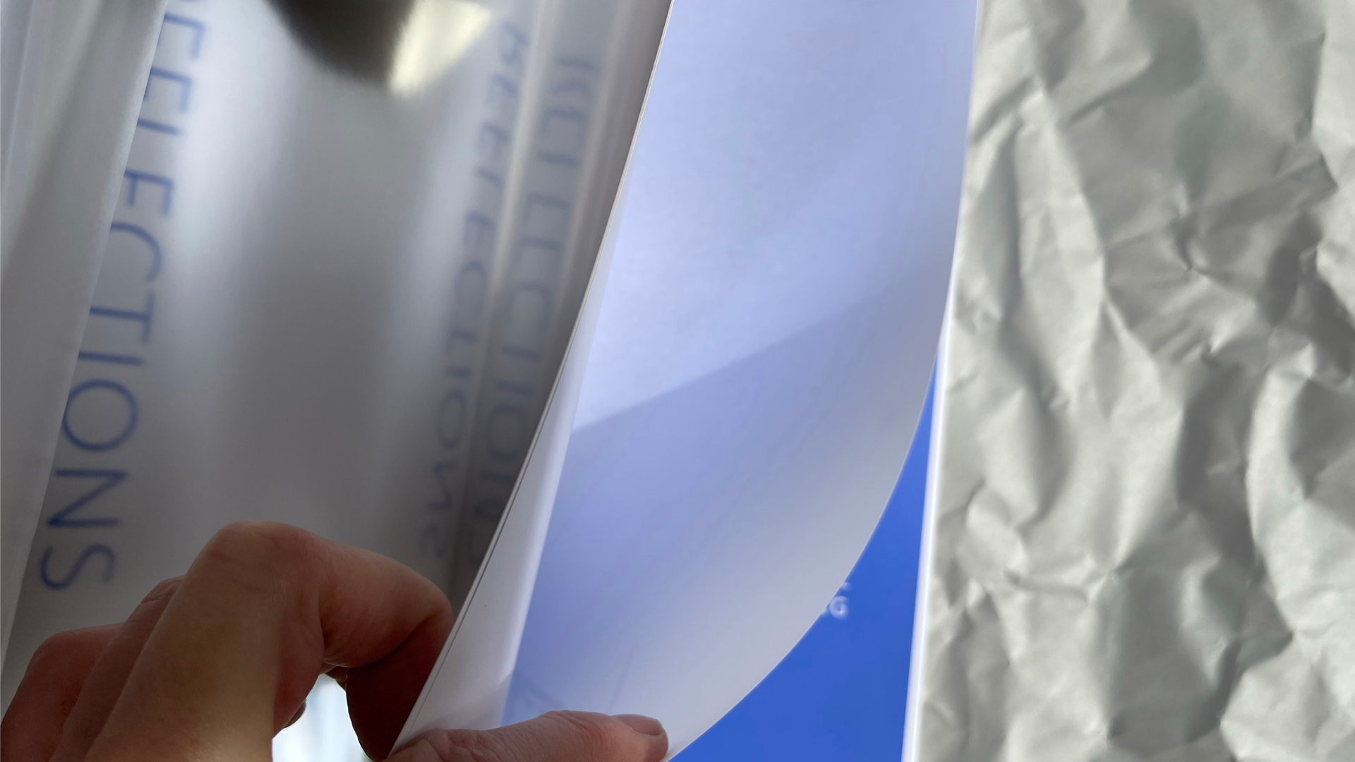
Made from Spicers Topkote Gloss Cover FSC, the cover of the text block features an enormous die-cut “V” at its center. Lifting that cover you discover the word “Reflections” is literally reflected back at you again in the Silver film.
What seems like magic – as the words magically appear the right-way around – is thanks to the word “Reflections” being printed backward in Blue on the inside front cover, thus reflecting the word onto the Silver film on the facing page. That page has been duplex laminated to one of the 100 lb. Spicers Topkote Gloss Text sheets inside.
Not only is the effect impressive, it’s an unforgettable nod to the book’s title.
Inside, the words and images are printed CMYK UV + 1 PMS color, and with strikethroughs throughout, by our good friends at Hemlock Printers [projects / website].
Fly sheets – each containing a printed illustration and covered with a Satin Varnish – start off each section of the book. All of these lushly tactile and visually appealing elements come together to do what print does best – encourage its audience to settle back and “reflect” on all the possibilities.
Swiss binding turned out to be a unique way to add a little surprise and sophistication to this coffee table book, but there are so many other binding techniques available to you today. Want to always have vital information about 12 of the most popular options within easy reach? Then be sure to download our free Binding Cheat Sheet!


