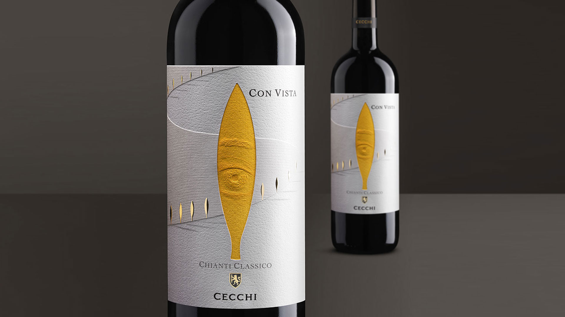
Every day I’m amazed at the creativity and imagination on display on today’s wine and spirit shelves. Yet the look Spazio Di Paolo created for the Con Vista Chianti feels like we’ve reached a whole new level of label creativity. Through the expert layering of papers and a haunting example of a sculptured emboss, they’ve crafted something that wouldn’t look out of place hanging on the wall of a modern art museum.
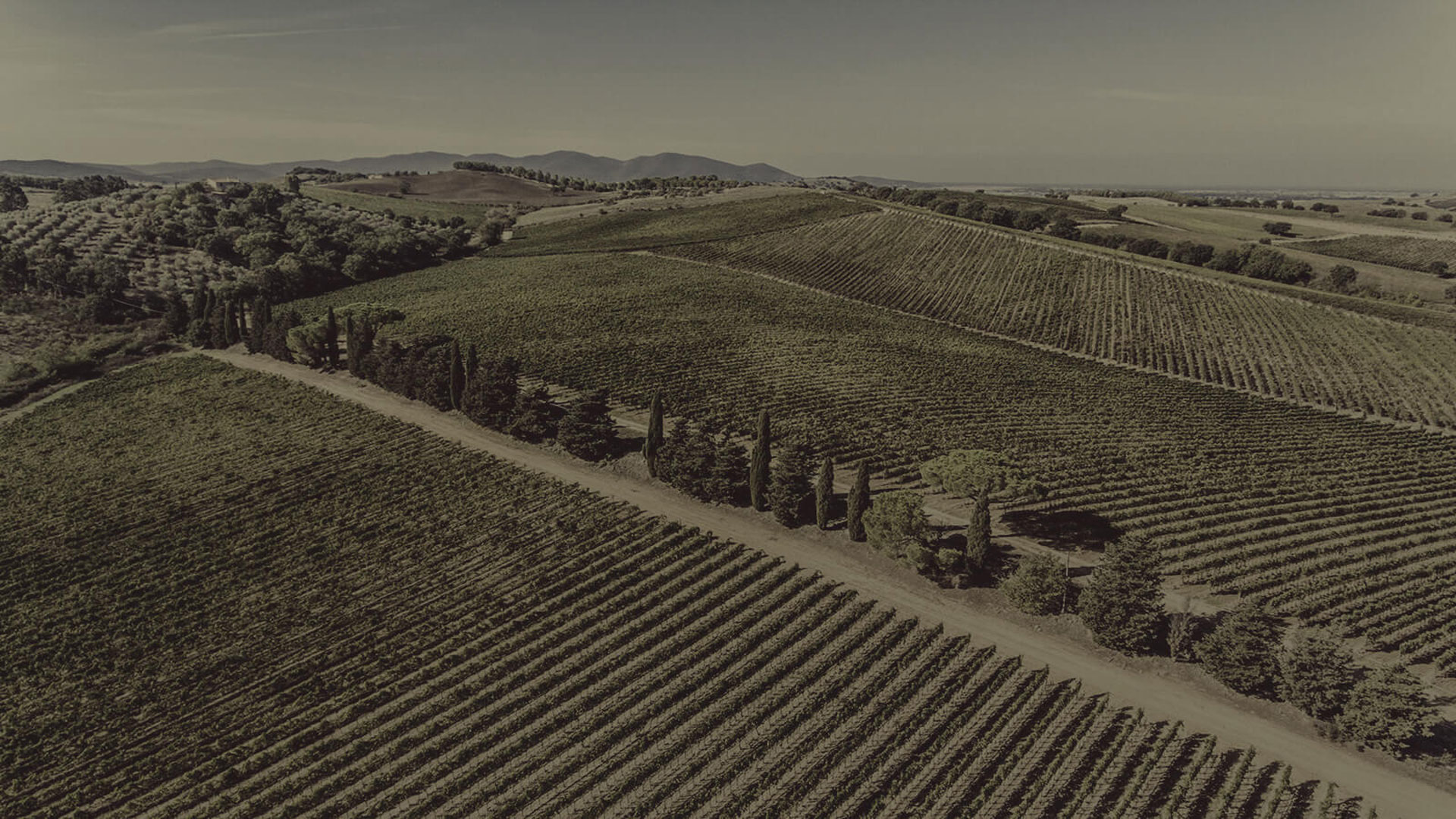
Taking as their inspiration the beautiful Tuscan countryside in which the Famiglia Cecchi vineyards are located – and that family’s claim to be its “keepers” – the designers magically captured that landscape in their label. It’s all here, from the distinctive flame-shaped cypress trees to the rolling hills and gravel roads. Take a peek at the photo below and see for yourself.
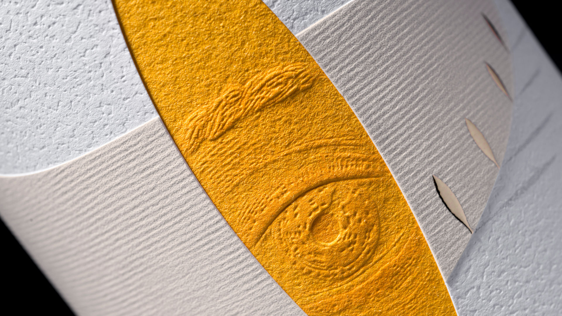
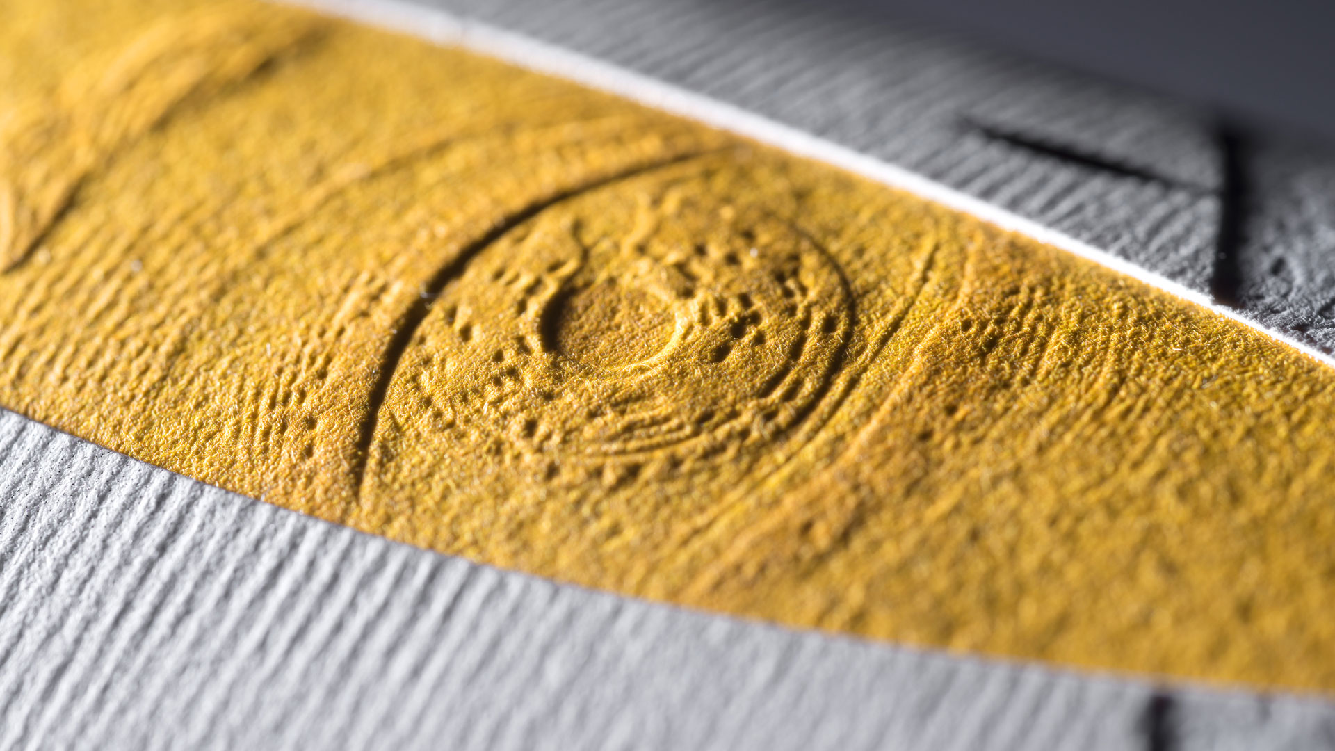
Of course what really captures our attention and doesn’t let go is that fabulous, three-dimensional eye staring back at us, daring us to unravel the mystery of the label’s construction. As the designers explain, “The simplified cypress silhouette recalls a lock of an imaginary door, of which the key is in the possession of the Cecchi Family, as they are the only custodians.”
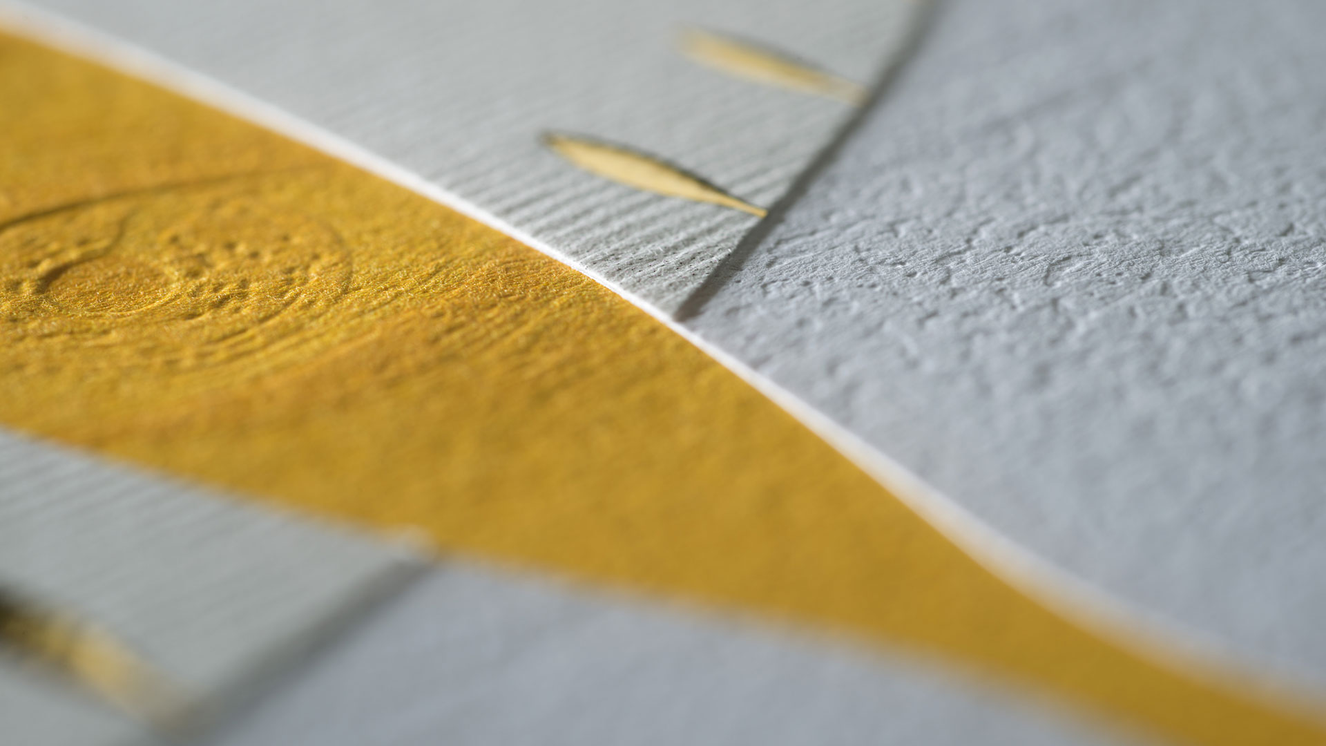
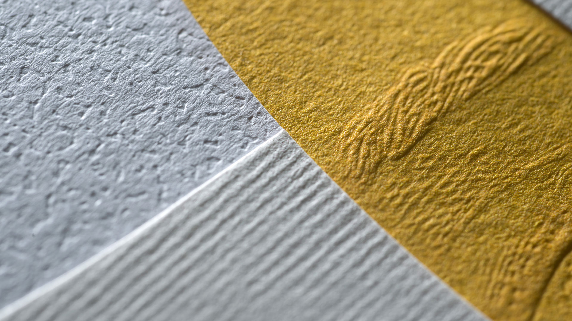
It’s difficult to know where to begin with this one really because rather than one paper, this label is comprised of three, each with its own distinctive look and feel.
Top layer. Printed on 110 g (80 lb.) Arconvert Acquerello Bianco, this was die-cut into a wing-like shape reflecting the Tuscan hills, and features tiny gold foil details in the shape of the vineyard’s cypress trees. There is this feeling – a presence of light in this landscape – that is enhanced by the trees’ digitally printed shadows. The felt finish also resembles the neat rows of grape vines at the vineyard.
Middle layer. This 92 g (60 lb.) Arconvert Ipanema Embossed White label boasts most of the printing including the wine and vintner name. The paper’s embossing also is a clever nod to the vineyard’s gravel roads.
Bottom layer. This is the one that baffles and intrigues – the medium for that amazing sculptured embossed eye. Starting with a 100% cotton 140g (100 lb.) Arconvert Cotone Bianco, printer Perruccio flooded the sheet with a sunny yellow and then used a sculptured emboss to give it that real-life dimensionality.
All three layers of the wine label were digitally printed, then die cut. They were then overlapped and glued together with every layer in perfect alignment –using a machine custom-built for the job by Perruccio.
Closely examining the places where all three papers meet not only reveals how precise a process this was, but further adds to the wonder and mystery of an already enigmatic work of art.


Lovely, sophistocated design. Makes you want to feel it and enjoy the texture & then the wine! Nice!
Very interesting piece without being able to deconstruct my best guess is after the embellishments were applied to the two white sheets those were then mounted together and then die cut and stripped then mounted to the sculptured embossed yellow flood sheet. Wine labels create a unique challenge due to damage during shipment of the product.