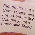
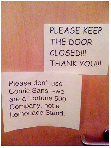
 Shed a tear for Comic Sans. The amount of contempt directed toward it is out of all proportion to any harm that it does. Or is it?
A recent piece in The Week did an excellent job of reviewing the various bits of research into the effect of typeface choice on the presentation of information. Needless to say, Comic Sans didn’t come out very well.
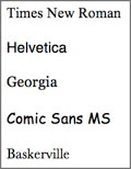
The most fascinating detail came from an online experiment Errol Morris ran in The New York Times. At the end of a short article, he asked people whether they thought a particular claim in it was true. What readers didn’t know was that the mini-quiz had been crafted by a psychologist, and was presented in different typefaces to different readers: Baskerville, Computer Modern, Georgia, Helvetica, Comic Sans, and Trebuchet.
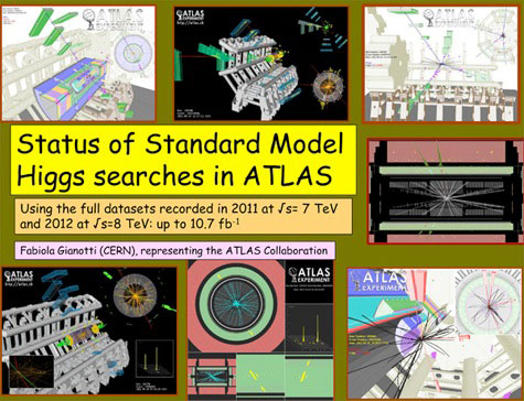
 Morris’ conclusions, based on responses from about 45,000 people, was that the very use of Comic Sans made people suspicious about any information that it conveyed. (Something highlighted last year by people’s reactions to the Comic Sans chart CERN scientists used to present their findings about the Higgs boson particle – see graphic at the top of this page.)
But Morris was even more interested in finding Comic Sans’ opposite – the font that engendered the most confidence. That font was Baskerville.
According to Cornell Psychology Professor David Dunning, the reason for this was this: “The word that comes to my mind is gravitas. There are some fonts that are informal — Comic Sans, obviously — and other fonts that are a little bit more tuxedo.”
Or maybe we just @!# hate Comic Sans.


Comic sans is easier to read for dyslexic people