Correspondent Nancy Scola asked graphic designer Michael Bierut to dissect the design sense of this year’s U.S. presidential campaigns.
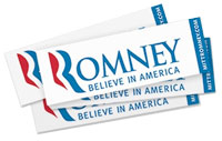
Says Bierut: “…that’s supposed to be an ‘R,’ right? So next to that is in, I believe, a font called Trajan — a favorite font of disaster movies, actually, oddly enough — he’s got “OMNEY” written next to it. The problem is that you’re counting on people reading through from this abstracted ‘R’ to the regular letterforms you’ve put next to it, so the chance is that it reads as something-OMNEY. Even if you assume that the people coming to the site know the name of the candidate, it’s still dumb.”
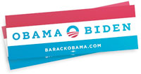
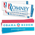
“He did something thrilling to designers. He went back to the guys who designed the font that he made famous, Gotham, and he had Jonathan Hoefler and Tobias Frere-Jones do a custom version of it that had what we call slab serifs, which means it has feet on it…. But Obama for 2012 redrew the typeface so now it has serifs on it….The Obama letters are really big and robust, and they’re familiar to most people because that’s exactly how a lot of sports uniforms look. The University of Michigan — that ‘M’ is drawn just like the ‘M’ in Obama. So it’s meant to be kind of forceful and brawny and athletic and strong-looking.”
Great…partisan typography.


