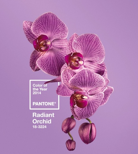
 Pantone, that monetized esperanto of the color world, has opened the envelope, cleared its throat, and announced its color for the new year: Radiant Orchid (Pantone 18-3224). For those not in the know, this is a blend of fuchsia with pink and purple undertones. But do let’s call a spade a spade: it’s purple orchid. Pantone 18-3224 is a warm, enticing blend that’s formal enough to know which dinner fork to use, and saucy enough to know its way around a well-thumbed copy of 50 Shades of Grey.
“Radiant Orchid inspires confidence and emanates great joy, love and health,” said Leatrice Eiseman, executive director of the Pantone Color Institute, in a press release. “It is a captivating purple, one that draws you in with its beguiling charm.” More or less what we said above.
Here’s a fun fact: Apparently the root of the purple orchid flower is called “Adam and Eve” root, and was allegedly used by witches in love potions. We’re not sure why this was left out of the release, but don’t forget to point this out to your clients when explaining your color choice.
Perhaps most interesting of all is how the Pantone Color the Year is chosen. Again, from said release:
The color of the year selection requires careful consideration and, to arrive at the selection, Pantone quite literally combs the world looking for color influences. This can include the entertainment industry and films that are in production, traveling art collections, hot new artists, popular travel destinations and other socio-economic conditions. Influences may also stem from technology, availability of new textures and effects that impact color, and even upcoming sports events that capture worldwide attention.
So, to be clear, Pantone’s Color of the Year is influenced by all of these trends in different parts of society. Makes sense. But then the next paragraph reads:
For more than a decade, Pantone’s Color of the Year has influenced product development and purchasing decisions in multiple industries, including fashion, home and industrial design, as well as product packaging and graphic design.
So Pantone looked at society, noticed a trend, and named a color. Couldn’t the designers have been influenced by the same aspects of society that influenced Pantone?
What’s that? Yes, you’re absolutely right, of course – we’re clearly over thinking things here. Christmas is fast approaching, and the Pantone Color of the Year is just the type of news we can handle at the moment.
So go forth in the new year, and paint the world radiant orchid. Until then, take a peek at previous Pantone Colors of the Year.
|
|