 More pixels have been spilled on the political intrigue surrounding this weekend’s Winter Olympics in Sochi, Russia, than on the games themselves. Naturally, the anti-gay sentiments of the Putin administration paired with the usual corruption scandals that plague any Russian enterprise have dominated the headlines. Yet we were gratified to see that The New Yorker, at least, dedicated some space to the one facet of the games that appeals to us most: the logo.
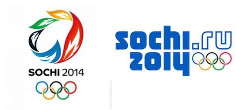
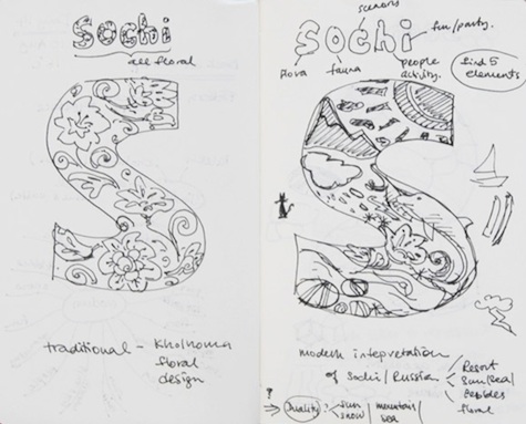
Frankly, after the seizure-inducing nightmare of the London 2012 games identity, we’d begun to wonder if Olympic logos had become a back-of-the-envelope afterthought. We needn’t have worried. Christoph Marti, a Swiss member of the design team at Interbrand Agency, shared with The New Yorker some pages from his notebook depicting the thought process that went into the Sochi games logo.
Though one of the few Olympic logos to forego the use of illustration, the final product does boldly flaunt something others have not: a Web suffix (“.ru”) at the end of “Sochi”.
However, an infinitely more dynamic design by Moscow’s Studio Transformer (below left) was passed over, if it was ever under consideration at all. When compared side by side, the official identity looks not so much “classic” and “refined” as some have described it, but staunchly conservative. Considering the nation’s rapid backslide into Soviet-era crackdowns, corruption and jailing of dissidents, it may be the most appropriate logo after all.