It’s been a quiet week on Lake Wobegon. Sorry, wrong intro. It’s been a crazy pre-holiday week in print design as we’ve seen a comic book teach us about making modern radio, a big-name design firm craft containers for a hip-hop star’s personal brand of weed, and Sephora continue its long-standing tradition of making its packaging every bit as desirable as its products. (Previous Cool Designs of the Week can be found here.)
‘Out on the Wire’ Book Design
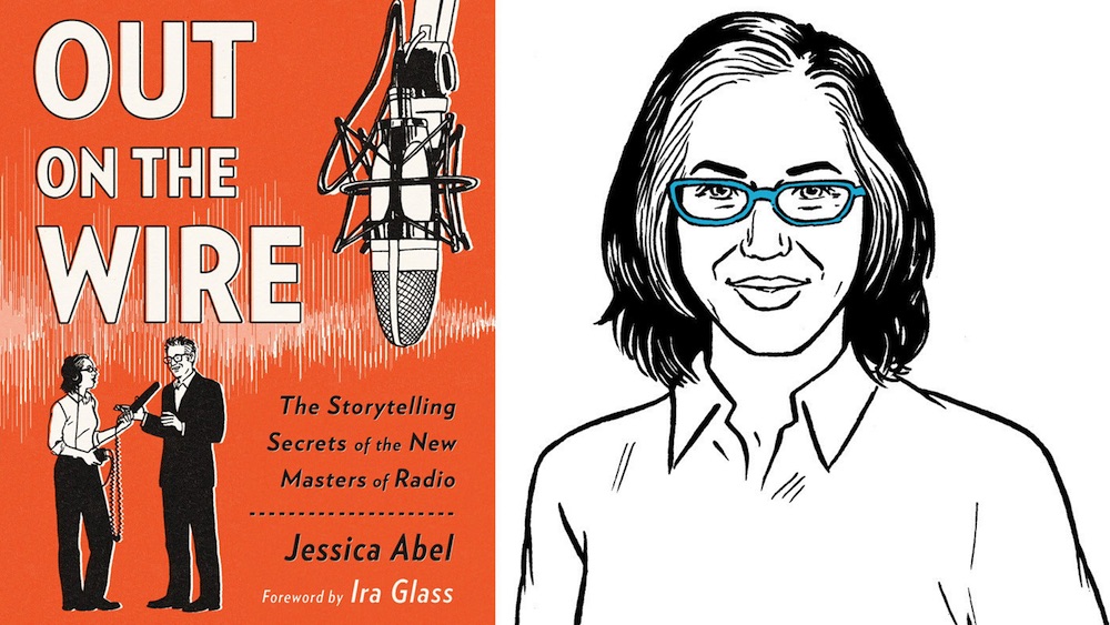
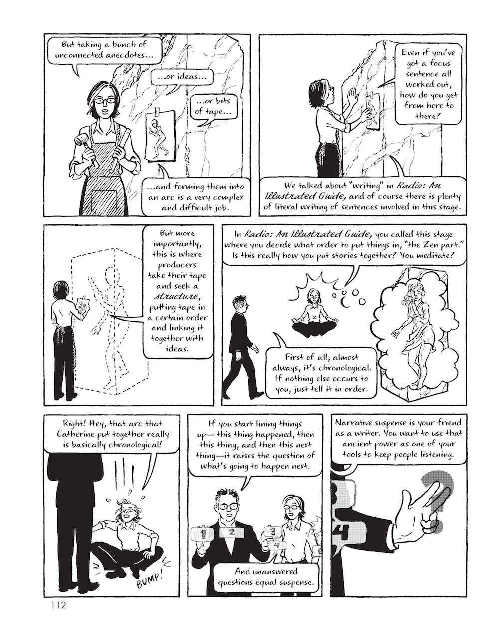
With all the various media competing for our attention, you could be forgiven for not realizing that audio storytelling is currently enjoying a bit of a renaissance. From the poignant true-life tales of public radio’s “This American Life” to the recent podcast phenomenon “Serial,” people by the millions are rediscovering an art form that hasn’t enjoyed its heyday since the ’40s and ’50s. Intrigued, cartoonist Jessica Abel interviewed the various personalities behind this trend for her new graphic novel “Out on the Wire.” It sounds like the setup to a joke: a book of hand-drawn interviews with personalities that are never seen because they work in an aural medium. The result, however, somehow recreates the intimacy listeners often feel while tuning in to these admittedly niche programs.
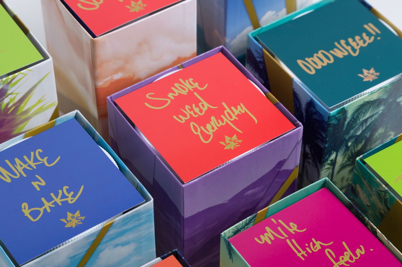
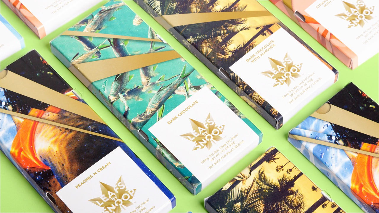
Design for Snoop Dogg’s Line of Pot Products
Let’s gloss over the surreal gut-punch that is living in a world where we’re talking about the open sale of still-techicnically-illegal drugs and go right to the next two OMGs of this project: 1) Notorious reefer hound/ rap star Snoop Dogg is selling his own brand of weed, and 2) Rock star design firm Pentagram is handling the packaging. Kudos to FastCoDesign for actually talking to the chief designer about the thought behind their branding for “Leafs By Snoop”:
“During testing, the aesthetic that Snoop ended up gravitating to was one Pentagram is calling “California cool”—patterns plucked from the sights of the Golden State, like palm trees, swimming fish, birds flying, and cloudy skies, dipped in pastels and outlined with gold. “Snoop was naturally attracted to imagery that was more personal to him,” Oberman says. The boxes all have patterns that look almost like shirts Snoop would wear pool-side.”
The packaging also remarkably sidesteps the products’ unsavory connotations with designs that could easily embrace herbal soaps, tea, or pretty much anything you might find on Whole Foods’ shelves. Whether it will soothe the tempers of the nation’s grammar guards over the whole “Leafs vs. Leaves” debate is another matter.
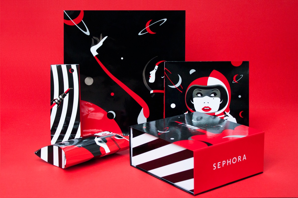
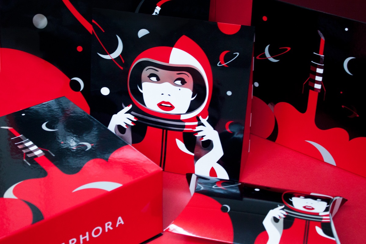
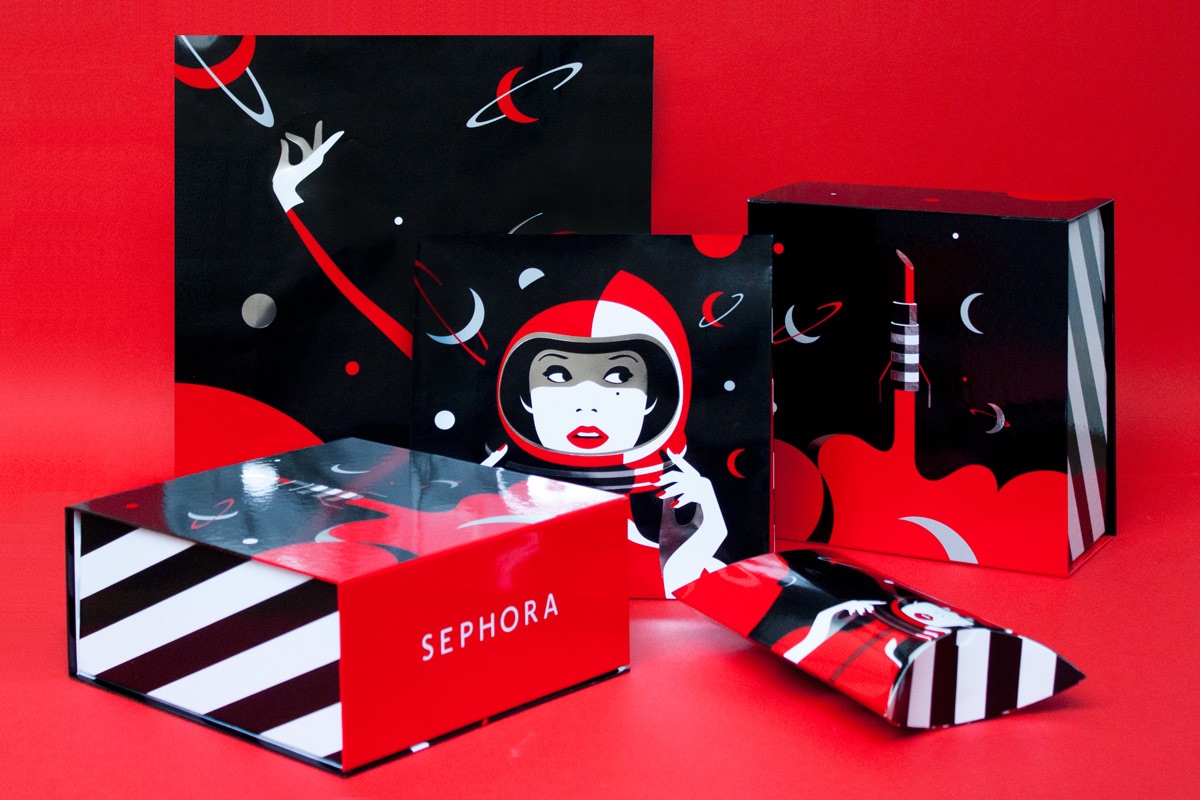
Sephora Holiday Packaging Design
Malika Favre’s “Galaxy” packaging for Sephora is so intense, it feels as though it fulfills a need we never realized we possessed. We don’t know what coveted Sephora products lurk within, and honestly we don’t care. Excuse us now, please, as we really just need a moment to sit in a quiet room and stare at it a bit longer. (Cancel our 1 O’clock…)