Do you have enough whimsy in your life? Here’s how to tell: You can never have enough whimsy in your life. It is the bubble wrap that stands between you and the rough handling the world holds in store for you. This week, we let our hair down and sample three projects that are appropriately whimsical by design, including a wedding invitation suite with a storybook flair, a handy chart for everyone’s favorite show about nothing, and the return of a book series that arguably inspired a publishing craze. (Previous Cool Designs of the Week can be found right here.)
Storybook Wedding Invitation Design
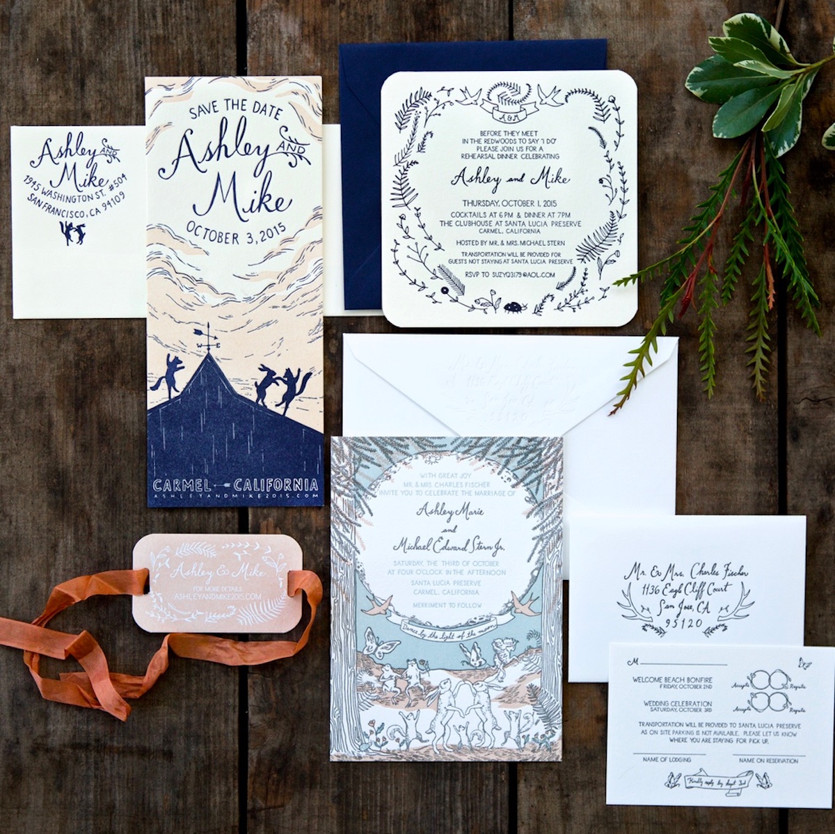
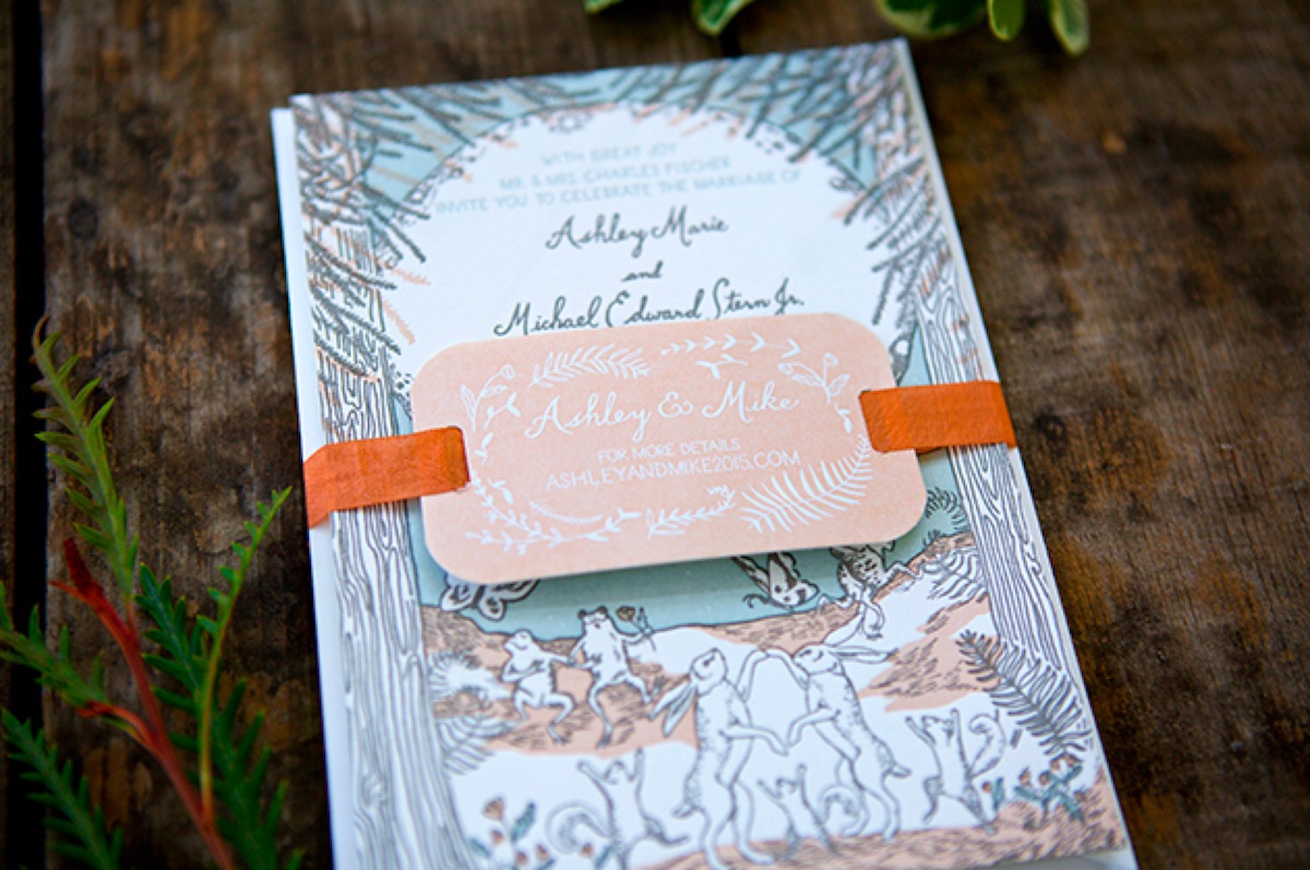
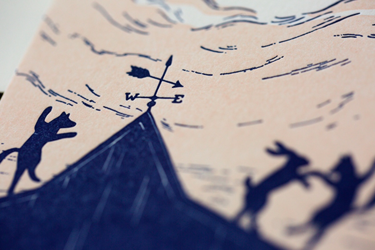
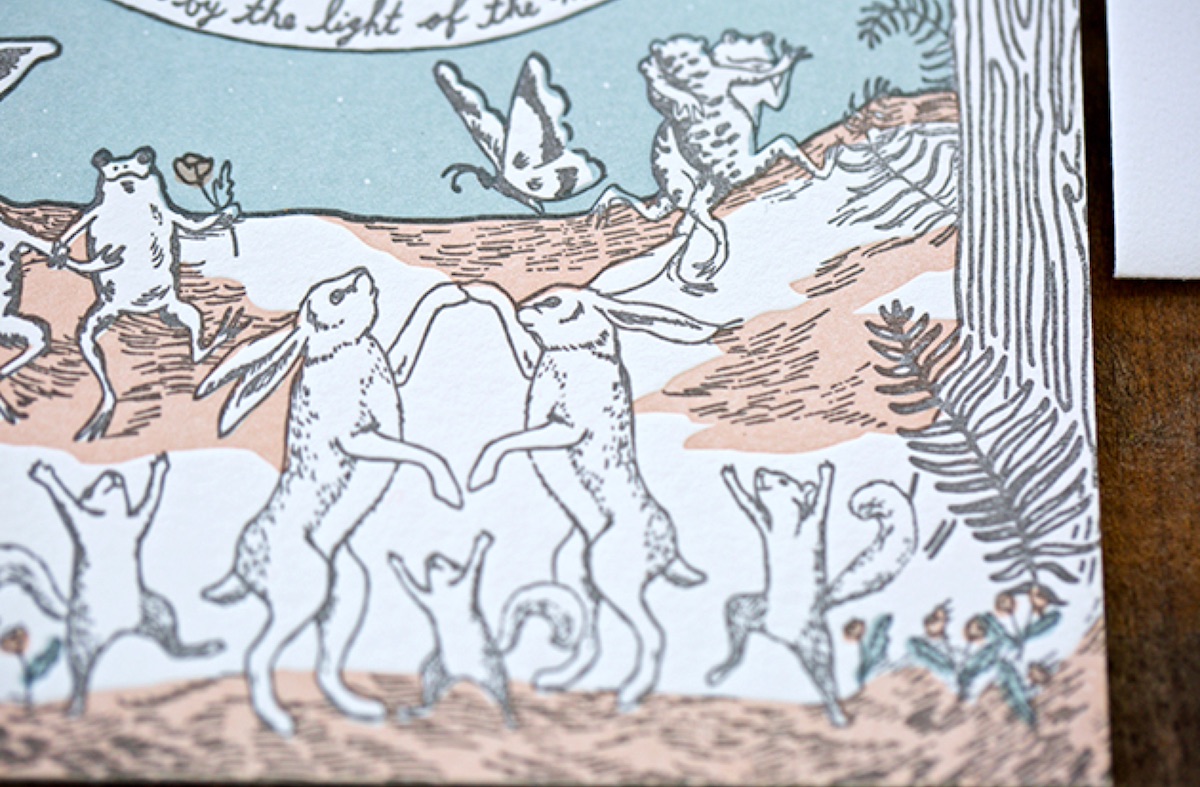
Before you reach for the Tums this exquisite suite was not designed in the “weddings are magical” spirit, but as a tribute to a particular place the bride and groom went many times together: Bemelmans Bar in New York. As Jen Kruch of the invitation’s designer/letterpress printer Shipwright & Co. told Oh So Beautiful Paper:
It “is named in honor of Ludwig Bemelmans – creator of the Madeline children’s books. The walls are covered with his illustrations, featuring many animals frolicking in the woods. Ashley and Mike wanted to capture that magic and whimsy of those illustrations in their invitations, and we were super excited to oblige as we are big fans of classic children’s book illustrations.
“The save the dates capture the animals dancing at dusk on the barn where Ashley and Mike tied the knot, and the invitations move into a nighttime world, layered in three colors with the handwritten text filling up the full moon. These pieces are all about the details. Each animal and plant was chosen especially for each spot.”
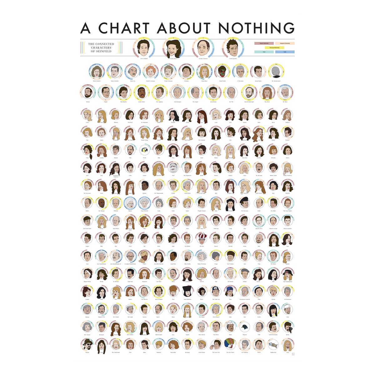
‘Seinfeld’ Chart Design
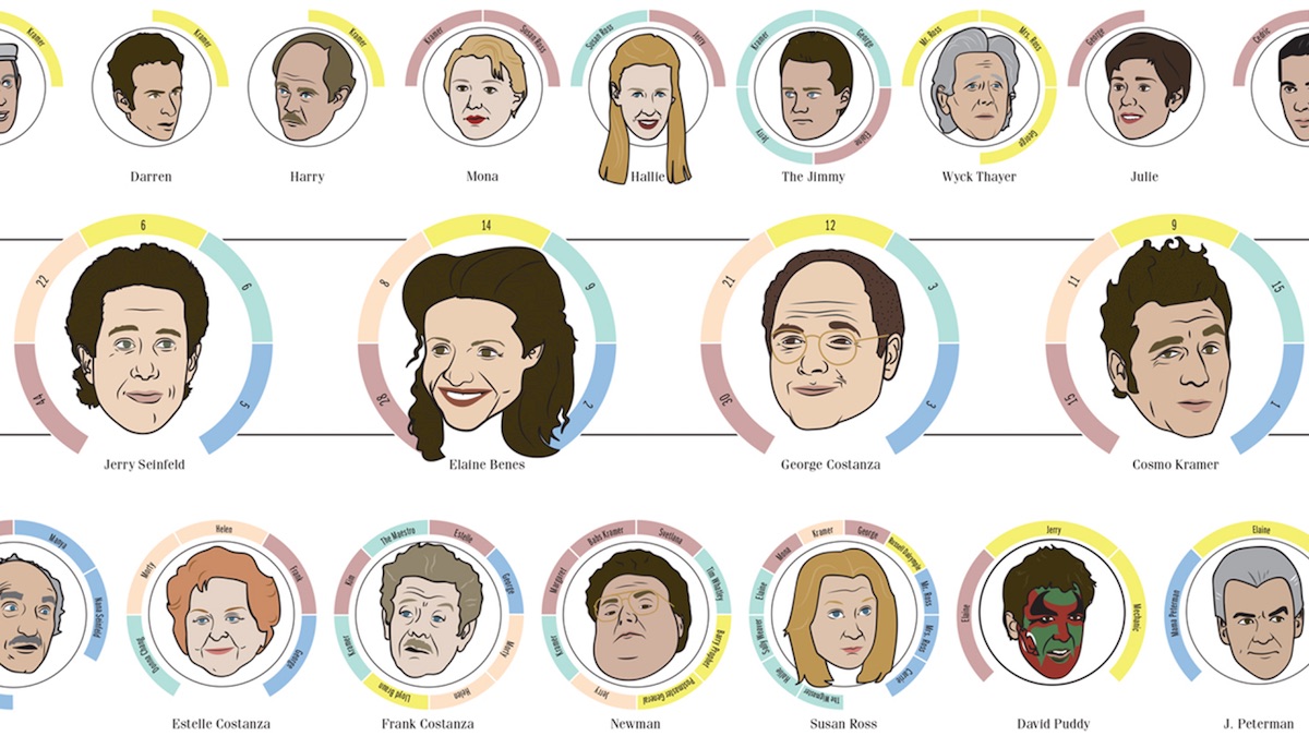
Pop Chart Labs has carved out a very particular niche for itself – it produces affordable prints that in some way categorize those things about which people are passionate. (Not always the same people, mind you.) In the past they’ve released prints about beer, shoes featured on “Sex and the City,” and different graphic design styles. Their most recent effort? “A Chart About Nothing: The Connected Characters Of ‘Seinfeld.'” As FastCoDesign points out quite rightly, this isn’t quite up to their usual standard of sophistication, but (as they also suggest) its “total lack of ambition perfectly suits its choice of subject matter.” That said, it does feature illustrations of 230 characters, each featuring a little corona indicating which other characters they’re somehow connected to, and what type of connection (friendship, romantic relationship, etc.) that happens to be. All in all, not a bad way to spend $35.
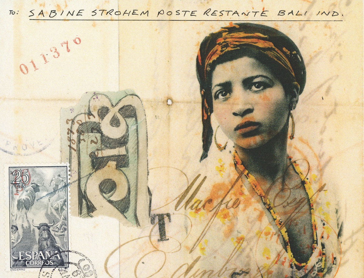
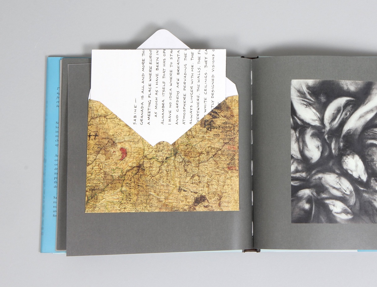
New ‘Griffin & Sabine’ Book Design
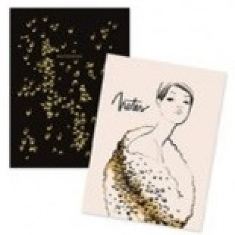
Long before the various “vault” and other books that feature ephemera that can be removed from their pages, there was 1991’s “Griffin and Sabine: An Extraordinary Correspondence,” the first in what came to be a series of novels told entirely through postcards and letters between the titular characters. This month, Chronicle Books has brought out the latest volume in the saga: “The Pharos Gate: Griffin & Sabine’s Lost Correspondence.” If you are an habitué of the world of this peripatetic pair you’ll find the plot thickening and the postcards exotic and occasionally disturbing. (If you’ve never made the acquaintance of Griffin and Sabine, you really do need to begin with “An Extraordinary Correspondence” above to make heads or tails of this series’ often shambling plot.) More than that, however, you’ll feel a slight pang in the ol’ gut as the books continue to subtly remind us of just what has been lost with the near death of handwritten correspondence.
Author Nick Bantock already had experience in making pop-up books when he began the series, he told Quill & Quire. This degree of hands-on design is something he contributes to this day:
“All his art is created by hand, then scanned and reduced down to postcard- and stamp-sized pieces for the page. The original works range in size depending on the source material (the endpapers for The Pharos Gate are actually a nine-by-four-foot oil painting). He constructs the collages using multiple layers of found images, and is never sure exactly how they’ll turn out until he’s done. ‘The whole essence of collage is that you find things that work and you start putting them together, and create some chaos, he says. ‘I have no idea what it’s going to look like at the end. To some extent, it becomes a process of listening.'”