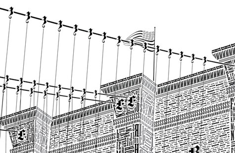
 “Hello there! My name is Cameron, and I re-imagine buildings and structures as if designed entirely with type…” What sounds like a 12-step-program self-introduction is actually the opening lines to a Kickstarter campaign that a) is already funded, and b) is pretty cool. Florida designer Cameron Moll has actually carved out an extremely niche niche for himself: designing letterpress prints of noteworthy pieces of architecture composed of painstaking typography.
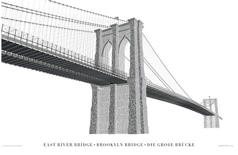
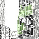
Earlier, it was the Roman Coliseum and the Salt Lake Temple. Now, it’s the Brooklyn Bridge. Moll visited bridge, absorbed David McCulloch’s 562-page opus on the subject, and then researched typefaces that “were designed or in use during its construction from 1869 to 1883.” Oh, and he took a Pantone deck with him on the bridge to get the right color samples. Here’s Moll on his design process:
The artwork is designed in Illustrator, and it’s incredibly tedious. Some sections can be copied and pasted, but 70-80% of the characters you see in the artwork are positioned, sized, and rotated one by one. I generally can do only an hour at a time, as my eyes (and brain) go bonkers if I stretch it out any longer.”
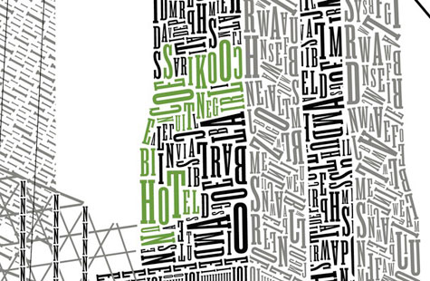
You get the picture. The 24″-x-16″poster will be printed on Crane Lettra Pearl by Bryce Knudson of Bjørn Press in Provo, Utah, who’s done Moll’s other two posters. Only 1,500 will be made.
Though the project was launched as a Kickstarter, rest assured that it’s more than met its funding target of $10,000, with some 485 backers already kicking in more than $50,000 to date. (There are still 17 days to go at the time of this writing.)
Cameron Moll, we salute you and your gentle madness. (Taking a Pantone deck to the Brooklyn Bridge, you crack us up…)