We’re sure someone will pull us up about this later, but for the moment we can’t remember the last time we saw a magazine cover that truly let us have it with both barrels. We don’t mean a beautiful cover – check out Take Note Award winner Gather Journal for a fine example of that. Beauty in magazine design is certainly not in short supply today.
No, what we mean is a cover that falls in love with its own content, chucks the rule book out the window, and follows whimsy wherever it may lead. And for that, can there be a better example than the 16 Magazine of the ’60s?
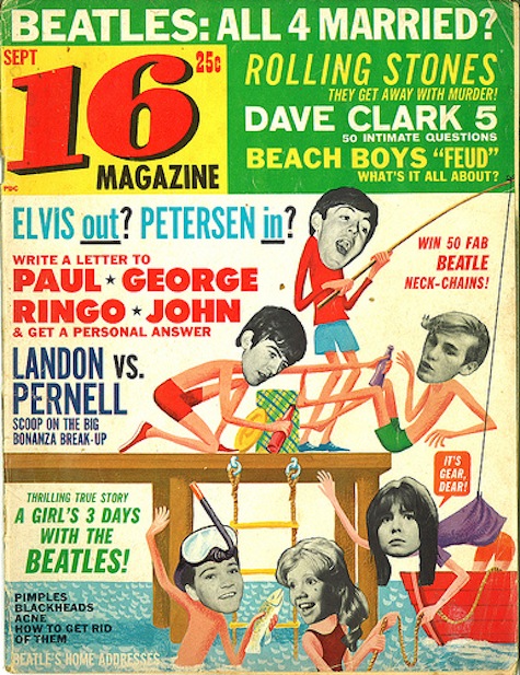
Not being of a certain age, we knew that the magazine had probably been around for a while, but had never glimpsed their covers until we came across this piece.
While part of the appeal is the ridiculously fawning call outs on the cover (“Sajid: Kiss away his tears” reads one), the covers themselves are masterpieces of handout-photo repurposing. Fun is always the prime directive, even over the egos of those covered.
More covers here.