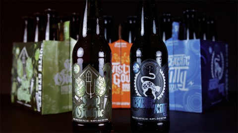
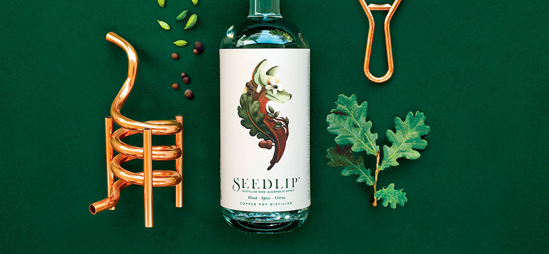
A creative director at Pearlfisher New York, Hamish Campbell has been involved in a host of exciting branding projects, some of the most interesting being the rebranding of existing ones. One great example is the unlikely rehabilitation through design of Wild Turkey from budget whiskey to something you would order at a trendy bar. And going one step further, Hamish and Pearlfisher helped to successfully carve out a whole new market with Seedlip, the world’s first non-alcoholic distilled spirit. Bottoms up!
1. What other designer or designers truly inspire you?
There are so many talented new designers emerging at the moment who are doing some incredible work, but when I get stuck, I always look to the gods of design, especially Bob Gill, Alan Fletcher and Jonathan Barnbrook. Their simplicity and consistent use of powerful ideas always keeps me from overcomplicating an idea, and lets the clarity and boldness speak through.

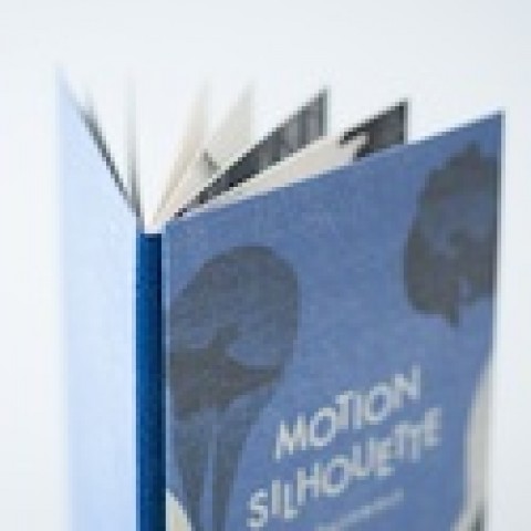
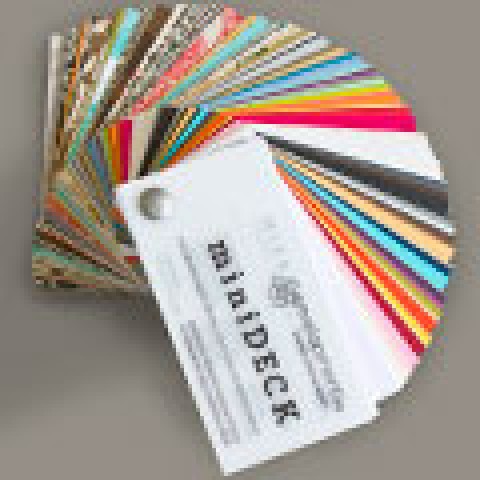
2. Of all the different papers out there, what is your absolute favorite?
I have to say I’m always a sucker for anything with soft touch, but I also love the Colorplan range.
3. When the ideas just aren’t coming, do you have a particular thing you do or place you go to get the creative juices flowing?
When I get stuck, the key is to stop. You won’t come up with a good idea if you are forcing it. You need to change what you are doing and the space you are in. I get out and explore, go for a run or a walk around, even just find a new bar. I find my best ideas come when I’m doing something completely different.
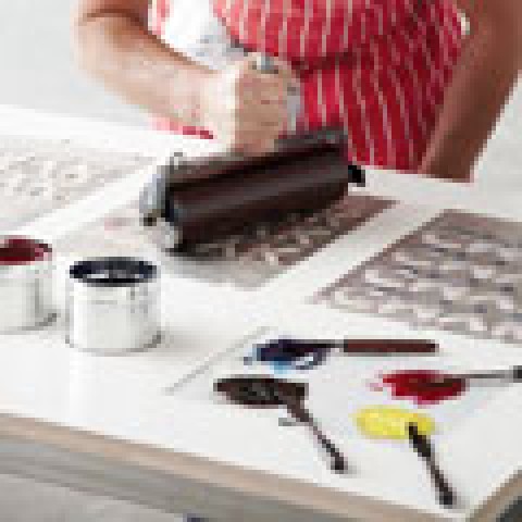
4. What is your favorite printing technique?
Screen printing or letterpress; there is something about the tactility that I really love.
5. If money were no object, what printing or finishing technique would you love to experiment with more?
Foil on foil on foil.
6. Do you have a favorite type of project to work on?
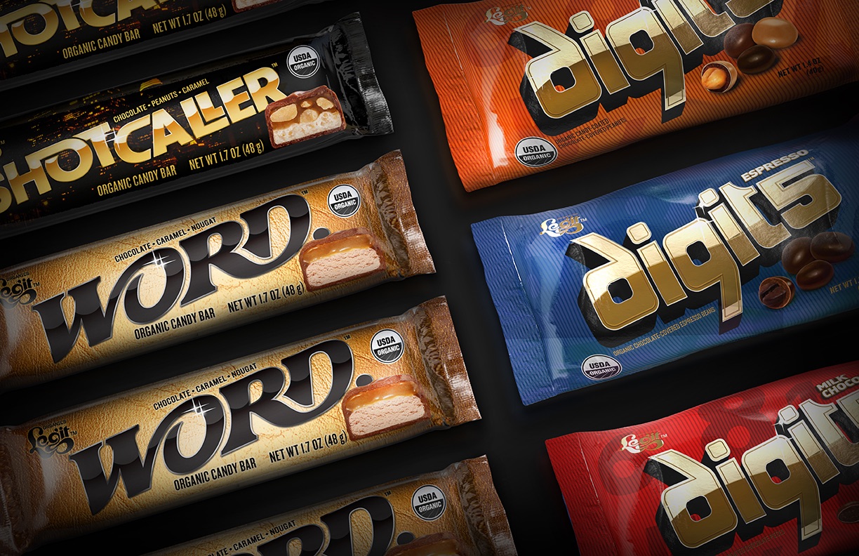
It’s no secret to the people I know – my favorite projects are liquor jobs. The craft and storytelling that is involved is what I really enjoy.
7. Is there a piece of packaging that you’ve come across that you absolutely love?
It’s very hard to pick just one piece. I was recently in Japan and their attention to detail and subtlety of design was very inspiring.
8. What is your favorite binding technique?
I think perfect binding – which probably sounds like the missionary position of binding.
9. Is there a productivity tool or piece of advice that you would recommend to other designers?
Always keep it simple and trust your gut. If you’re questioning some work you’ve done it’s probably the wrong answer.
10. If there was a fire in your office, what non-living item would you grab on the way out the door?
That’s a tough one – probably my notebook. I’m forever sketching my thoughts, so without it I would be lost.
Bonus questions:
11. What is a favorite saying or mantra you live by?
I’ve always liked the Arthur Schopenhauer quote “Talent hits a target no one else can hit. Genius hits a target no one else can see.” It pushes me to always try a different approach to my work.
12. What is your favorite color?
Grey and Copper.
This “Top 10” with Hamish Campbell was originally published as a members-only exclusive for our PaperSpecs PRO members. PROs receive a number of perks including:
- The latest swatchbooks…free!
- The latest paper mill promos…free!
- Exclusive PRO Tips
- Personalized paper help.
- Much, much more!
(Not a member? Why not start your PRO membership today?)