 Font nerds, already known for their poor self-control (praise Comic Sans in their presence, I dare you), might wish to sit on their hands for this one.
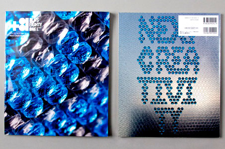
When Tokyo culture magazine +81 was looking for a way to express the theme of its September issue, “next creativity,” it turned to Spanish design studio lo siento (Spanish for “sorry”).
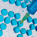
Lo siento used a syringe to inject blue colored water into individual bubbles in a sheet of Bubble Wrap to spell out “next creativity.” The result is something elegant in its simplicity, reminiscent of a neon LED display, and fully in keeping with the studio’s experiments in multidimensional typography.
For one 2011 art show, lo siento designed “4D” letters and numbers that look the same no matter which angle you look at them from. Let’s see you put THAT in your font suitcase!

