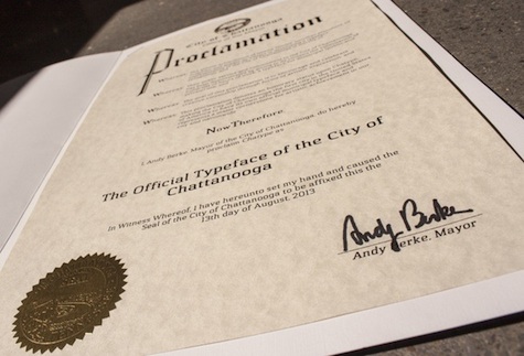
 While one doesn’t usually look at a municipality and say “The trouble here, friends, is that you’re just not branding yourselves properly,” you have to admire the various forces that recently came together to create Chatype: the official typeface of Chattanooga, Tenn.
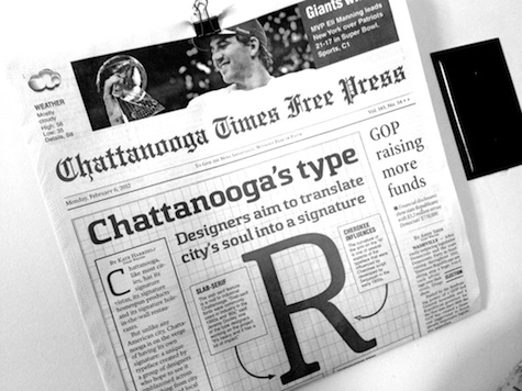
It took four designers, a Kickstarter campaign and old-fashioned political haymaking, but Chatype, released on Oct. 31st, offers an interesting test case for proving how important (or not) type can be to a city.
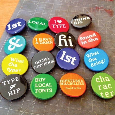
Certainly there’s no question that when the local government and local merchants adopt one official typeface (which has already begun to happen), you create a more unified looking area. And the public itself has been lured into participating more in local affairs by attending forums for the fine-tuning of the font.
Still, one wonders if the type designers and city fathers are placing a tad too much pressure on their newborn Chatype, not even a month old yet. As The Atlantic explains:
At the moment the tangible results are difficult to measure, but the folks behind the font hope it’ll lead to profits for local businesses, PR buzz in creative and tech communities, increased tourism, and talent relocating to Chattanooga. Dooley also hopes that Chatype will raise Chattanooga’s profile, making it a more visible center of innovation and design, which opens new markets and attracts the creative talent.
It probably took a fair while for people outside the state to know that Chattanooga wasn’t a type of train…they might need a little while yet to even notice everyone in your city is singing from the same typographical hymnal.