By Deborah Corn
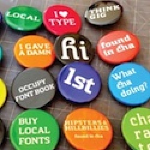
In courtroom dramas we are often reminded to never ask a question we don’t already know the answer to. In marketing, there is not such a clear line, but certainly if you ask a designer for their opinion, they will give it to you straight.
When I set out to gather opinions from designers in several design-community groups on LinkedIn regarding trends in 2012, I imagined the consensus was going to be the rise of digital print. It’s a big topic, and certainly one that has effects on design from color process to paper selection to the press used and printer chosen. However, I was quickly reminded that being a print producer skewed my view, and designers see things quite differently.
To QR or not to QR
That was not the question, but it certainly became the most popular answer. Whether it was a QR code or a plethora of “follow me” social-media buttons, the designers felt the incorporation of such elements into their work was the biggest trend in 2012. And this big trend often occupied small spaces – like business cards.
With QR, having to incorporate those black-and-white boxes into their designs was the most popular trend response, and hating them the most popular emotional response. They even started sharing anti-QR stats and articles about their demise.

I had no clue it was such a hot design topic. It’s no secret I am way over QR codes, but my issue is they don’t often work, and what they link to more often than not is useless as a value add. Designers had more issue with, well, the design of the code itself, the minimum size it needs to be, and overall being told to stick them on everything!
It’s worth pointing out that QR magic DID strike a few times last year in the form of creative use. Linking to the digital world was a HUGE trend in 2012, and will be even bigger in 2013, with more options to get there. Here are some executions that stood out to me:
- QR Code Created By Shadows Boosts Sales 25% During Lunchtime: “How do you create lunchtime sales? How about a perfectly positioned QR code that only shows up at noon with special offers?”
- Zoo Records “Hidden Sound” QR Code Campaign: “Images of animals, which are actually QR codes, are scattered around Hong Kong. People point their phones at any part of any of the animals and they receive songs by an independent artist. In addition, they can share these songs and buy directly from their phones.”
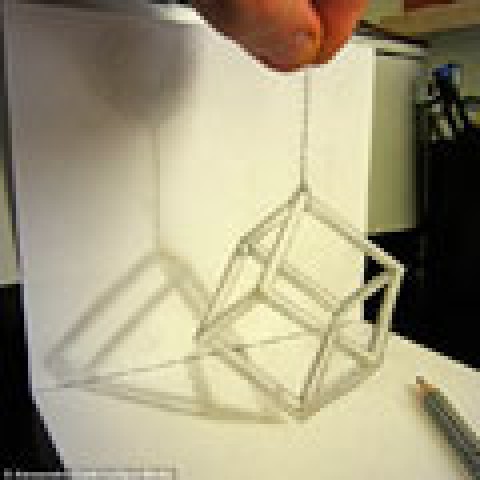
- Ad Agency Rethinks Coffee Cup Sleeves as Newspapers: [See image above] “When customers bought a cup of coffee, the baristas would place the coffee cup sleeve into a special printer. The printer would pull tweets from the Gulf News Twitter account, and print the latest headline of the hour, with a short URL and QR code onto the cup sleeve.”
- Volkswagen Proves a QR Campaign Can Work: [See image below] “To assist with the unveiling of their new car model, Volkswagen activated a very unique way to get the word out. They employed the ‘mother of all vehicle wraps’ in a QR campaign that created buzz with interested drivers around Germany…”
Infographics: ‘Bar Graphs for Dummies’?
Another trend designers pointed out was the popularity of infographics. I happen to love these things, though some designers felt they are like “bar graphs for dummies.” That really surprised me since I find most infographics to be super creative, a total design puzzle left to the artist to work out, and about 1,000 times more interesting than a bar graph.
Here are a few I shared on PrintMediaCentr last year that are worth a look, and might just sway a few designers to rethink their anti-infographic stance:
- The Last Infographic You’ll Ever Need: PRINT IS BIG: “This is a collection of facts and statistics about the U.S. and worldwide printing industries.”
- Infographic: The State of Graphic Design: “This infographic reveals what the graphic design pros place emphasis and importance on. Whether you’re starting out in the field of design or you’re a seasoned art director, you will find the information useful.”
- Bold and Justified: A Typography Infographic: A whirlwind of statistics on everybody’s favorite subject – typography!
- The Psychology of Colors [infographic]: A rainbow of facts about color and color choice.
And this one I actually made: [Infographic] Print vs. Digital: Who Survives the Zombies.

Rise of the Soft Touch
Lastly, I am going to mention a trend that was pointed out by printers who responded to my posts, but stems from the design side of things: a significant rise in the use of Soft Touch aqueous coating in 2012. They didn’t elaborate on why, but as someone who buys print, I do have some thoughts on that.
With rising paper costs and smaller production budgets, we all need to be a bit more creative sometimes with finishes to add tactile life to our projects and help them stand out. Soft Touch aqueous is a great solution for this, especially for direct mail and promotional materials.
Working with your printer or paper merchant to determine the best paper deal of the moment, you can start with a “house sheet” since the coating will transform it. I know I have been able to print at higher quantities and/or with more frequency using that method. The important thing to remember is not all papers are equal, so make sure you have a discussion with someone before printing and, if possible, get samples of Soft Touch on that sheet.
There is an old joke in advertising that goes “How many designers does it take to screw in a light bulb?” The response: “Who said it has to be a light bulb?” That is why you have to love designers, and why asking them questions you don’t know the answers to is always an illuminating experience!
I’d like to wish you all a Happy New Year and thank PaperSpecs for inviting me to blog again in 2013, so I guess I’ll be seeing you around!
………..
 Deborah is the Intergalactic Ambassador to The Printerverse for PrintMediaCentr, an industry speaker and blogger, and a contract print production and integrated project manager at PrintProQuo, providing 23 years of experience in print production and advertising agency management. She is the founder and cultivator of Print Production Professionals, the largest independently owned and operated print-related group on LinkedIn, with almost 47,000 members. Deborah also works behind the scenes with printers, suppliers and industry organizations, helping with their cross-media marketing and social-media endeavors.
The Printerverse is a trademark of PrintMediaCentr LLC.