 You’ve got to love creatives. Ask members of any other profession to drop what they’re doing to work on something (probably for very little pay) purely for the joy of doing it, and they’d show you the door before you ended your sentence. Then again, if you asked them to contribute to a celebration of one of the 20th century’s most iconic musicians, they just might surprise you.
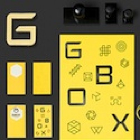
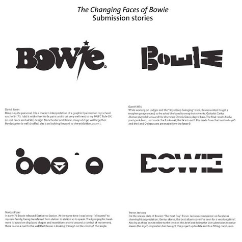
That’s what 101 designers and design firms did for “The Changing Faces of Bowie,” an art print specially commissioned as a companion piece to the Victoria and Albert Museum’s “David Bowie is” exhibit. Each designer created a unique typeface to write “Bowie” or to otherwise evoke ol’ Ziggy Stardust. For example, Harry Heptonstall went with a maze-like rendition evocative of Bowie’s turn as the king of the goblins in Jim Henson’s 1986 film, “Labyrinth.”
 The print was created by Mark Blamire (aka “Blam,” probably best known for his poster campaign for the movie “Trainspotting”), and features the work of The Chase, Spin, Nom de Strip, Build, Stockholm Design Lab, Monocle, Paul Belford, Corey Holms, Pentagram, Studio NMO, Crispin Finn, Anthony Burrill, Wallpaper, Martyn Atkins, The Designers Republic, and many others.
The 20” x 20” limited edition print itself – which costs about $52 – is screen printed matte white onto rainbow holographic, 240 gsm Mirri sheet.