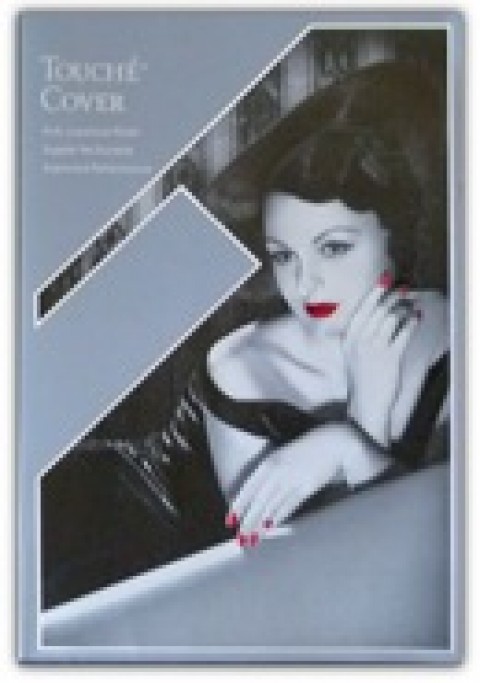
 You never really realize how few risks organizations take in design until you see one that pushes the envelope slightly, and walks away the better for it.
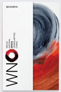
Hat-Trick Design recently overhauled the magazine and other identity materials for the Welsh National Opera (same singing, fewer vowels), all based on a painted brushstroke “O” by artist Howard Hodgkin. The concept was introduced to the public through a book touting the new opera season, which featured a close-up of half the “O” on the right half of the cover, and the whole one as the “O” in “WNO” on the left (see below). Yet it was the ways Hat-Trick incorporated the aspects of the new logotype into the WNO magazine that really impress.
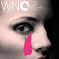
 Elements of the brushstroke in various colors were worked into each magazine cover, acting as a type of shorthand for the raw emotion contained in various operas. “Manon Lescaut” sports a large maroon smudge of a tear beneath her eye (top), while Anne Boleyn smiles demurely as a white stroke slyly crosses the neck that famously gave way to King Henry’s displeasure. Inside its pages, the trend continues with various photographs getting the suggestive-yet-simple brushstroke treatment.
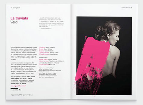
“The brushstrokes are key to the visual identity, and are used through[out] to transform images and reflect the passion and stories of the operas,’ Rebecca Sutherland told Design Week. (Sutherland and Sarah Harrison were tasked with transforming Hodgkin’s painting into design elements. More on how Sutherland did this here.)