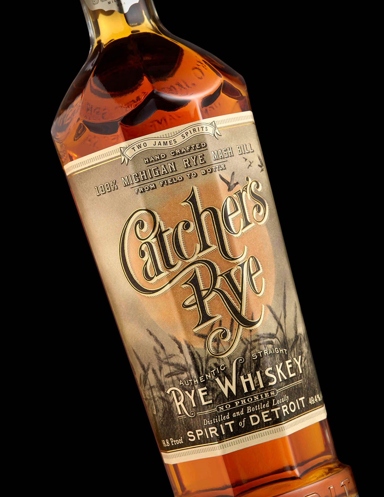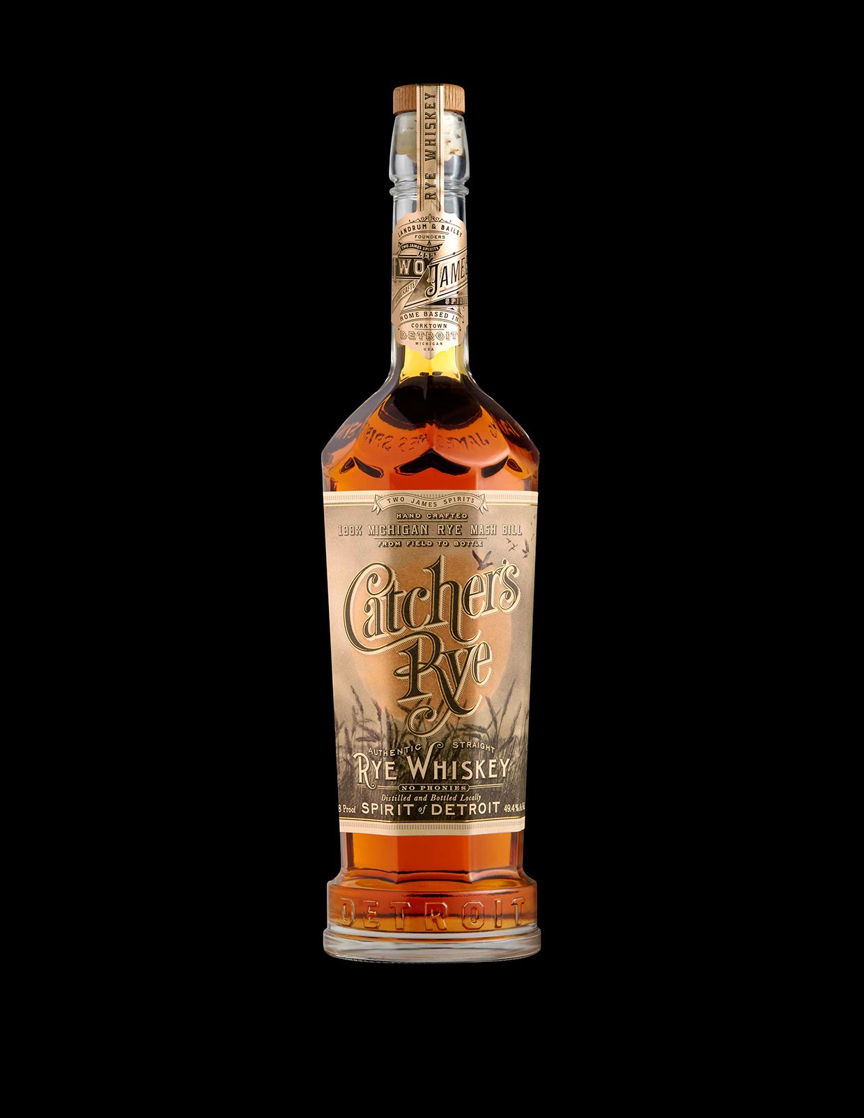
Often it seems that wine & spirit companies instruct their label designers to focus 100% of their creativity on the main body labels, and virtually “phone it in” when it comes to the neck labeling. Leave it to Stranger & Stranger to provide us with the exception that proves the rule.
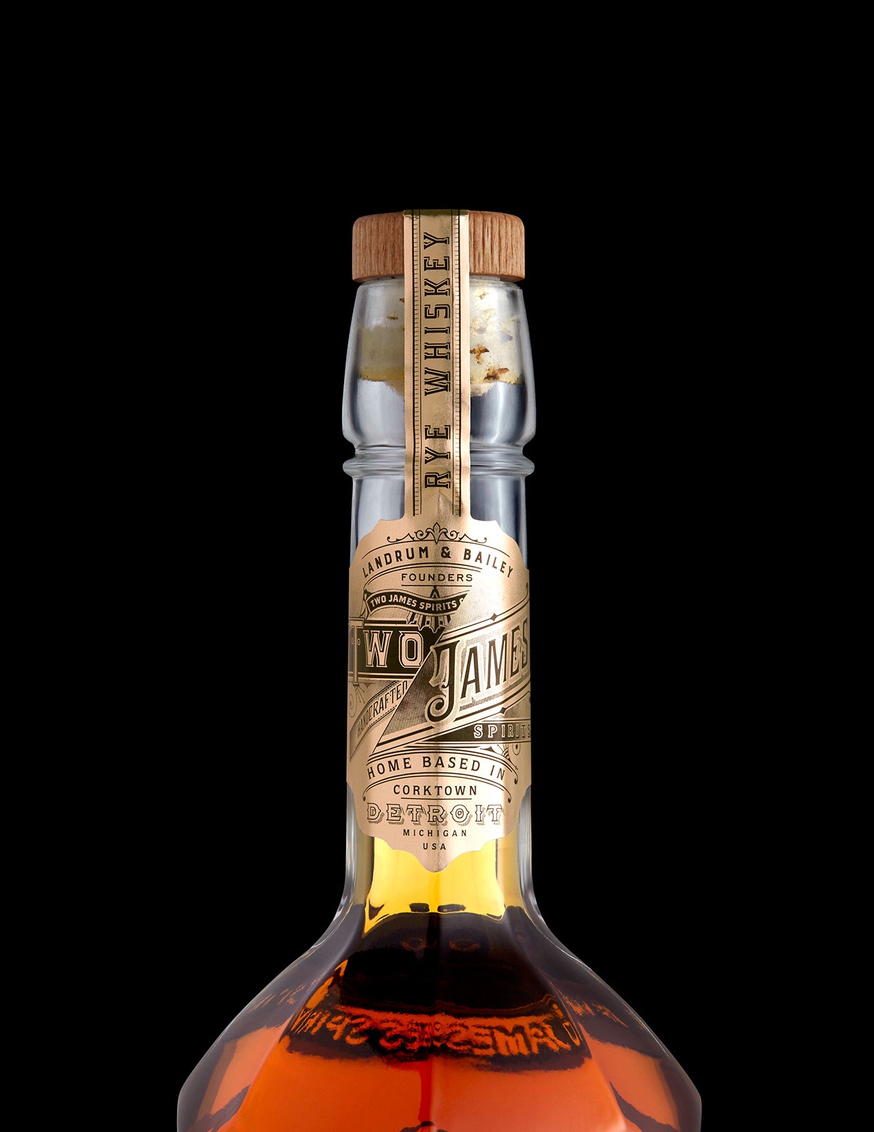
The overall design for Catcher’s Rye even includes a nice treatment of the cap strap. Nothing showy, mind you, but only a continuation of that sensible typography. More than anything, this is one of those spirit labels that works hand in hand with the bottle’s design to create something that doesn’t hit you over the head with its beauty all it once, but rather reveals its elegant intricacies to you the longer you look at it. (Possibly a little faster after a few shots of the rye whiskey inside.)
PRO members: Check out our ‘Designing Spirited Labels’ webinar with Stranger & Stranger founder Kevin Shaw!
Discover more Cool Packaging right here!