While the COVID crisis continues to keep us from the many art galleries and museums that normally would keep us creatively inspired, the packaging world seems ready to fill the gap with masterpieces of their own.
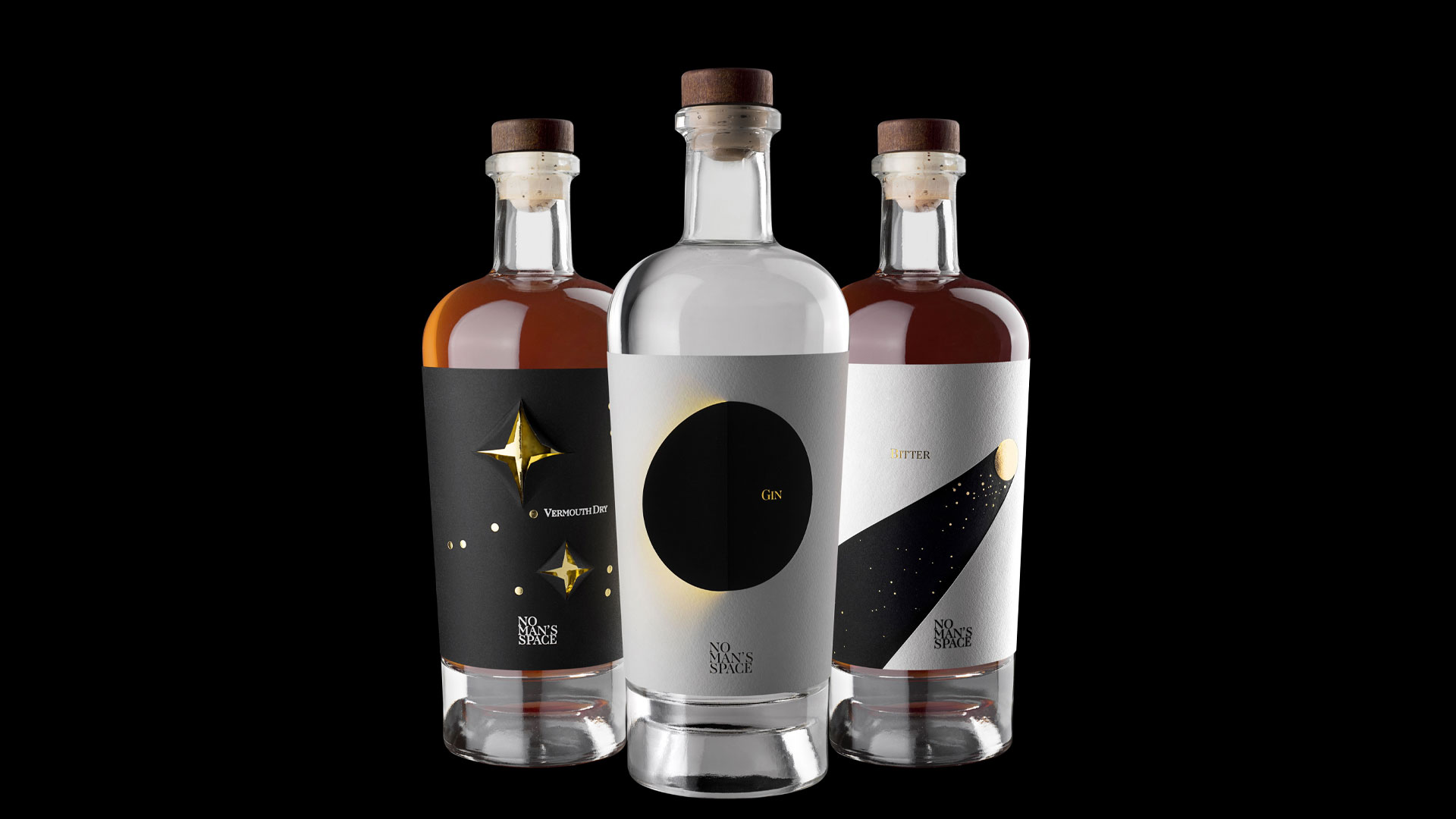
Look no further than the thoughtful, complex labels that Italian design maestros Spazio Di Paolo crafted for Brand Breeder’s “No Man’s Space” line of spirits. With their use of layered papers, hidden foils and unexpected interactivity, they are three-dimensional art objects like no other.
Design studio Spazio Di Paolo first appeared on my radar with its gorgeous multi-layered labels for Con Vista Wine [Check out the video], and has been close to my heart ever since.
For the Brand Breeder creations, Mario di Paolo was inspired by the idea that people have always regarded unexplored space as a means for testing one’s limits, from the moon landing to earth’s great explorers. Here, each label design tells a story through the use of multiple layered substrates and finishing techniques, all arranged in poetic combinations.
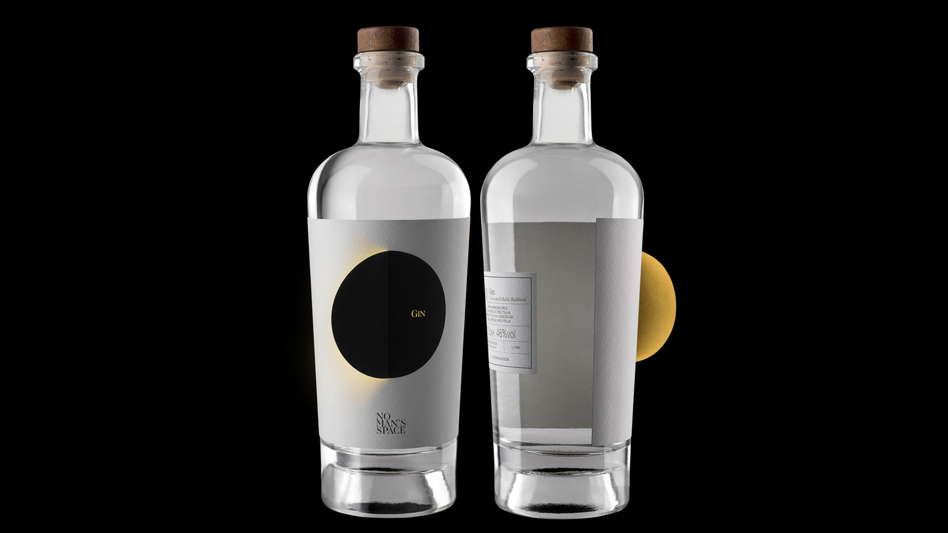
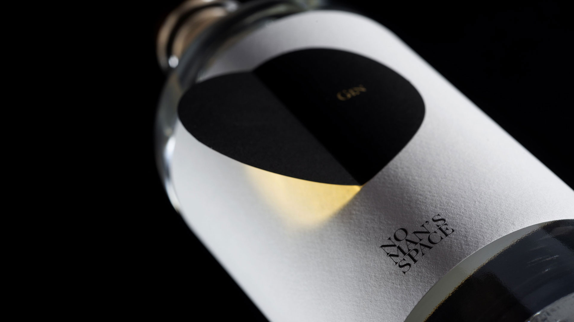
Prepare Yourself for the Gin Eclipse
Take Gin Eclipse, whose White Arconvert Cotone Bianco label features the “No Man’s Space” name offset printed in Black on its cottony, moon-like surface. The word “gin” is subtly foil stamped onto a circular die cut of matching Black paper, which is partially tipped on to the label. Duplex laminated to the underside of the remaining loose half is a sheet of Gold foil so that, should you peel back the Black “moon,” you’re left with the impression of the sun peeking out from behind it like the eclipse of the title. How much of it you peel away determines the degree of the effect, making every bottle just a little bit different. All of this was beautifully produced by Tonutti Tecniche Grafiche [Tonutti Graphic Techniques].
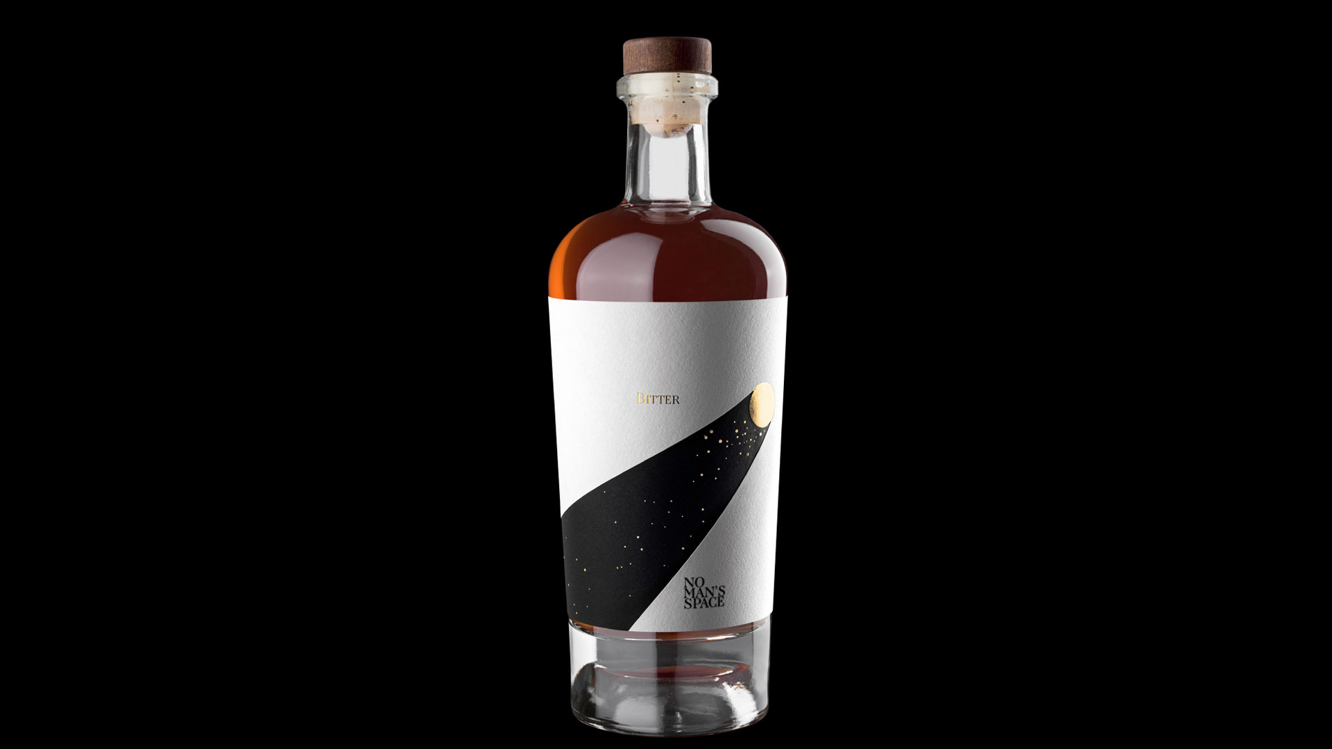
Behold a Bitter Comet
For “Bitter Comet,” Mario took a less interactive, yet no less impressive, approach. To depict the passage of a comet through the heavens, Modulgraf used the same White Arconvert Cotone Bianco, die cut it, and layered it over Black Arconvert Cotone Nero. The finishing touch? Gold foil stamping on the White sheet to create the comet and “Bitter” lettering, and on the Black paper to represent the stars it whizzes by.
Putting it All Together: Capricorn Vermouth Dry
Just when you think this brand suite couldn’t possibly get any more stellar, we come to Capricorn Vermouth Dry, which combines the techniques and looks glimpsed in the first two spirit labels for an innovative creation produced by Eurostampa.
Here the Black label paper features the constellation of Capricorn through Gold foil stamped dots. Sticking to the designer’s signature layering of multiple substrates, four triangular panels in each of the two diamond-shaped die cuts can be pulled up to reveal Gold foil, creating the illusion of glimmering stars set against the black emptiness of space. Not only is the resulting look completely up to the user, the pulled-up panels add a surprising three-dimensional aspect to this label.

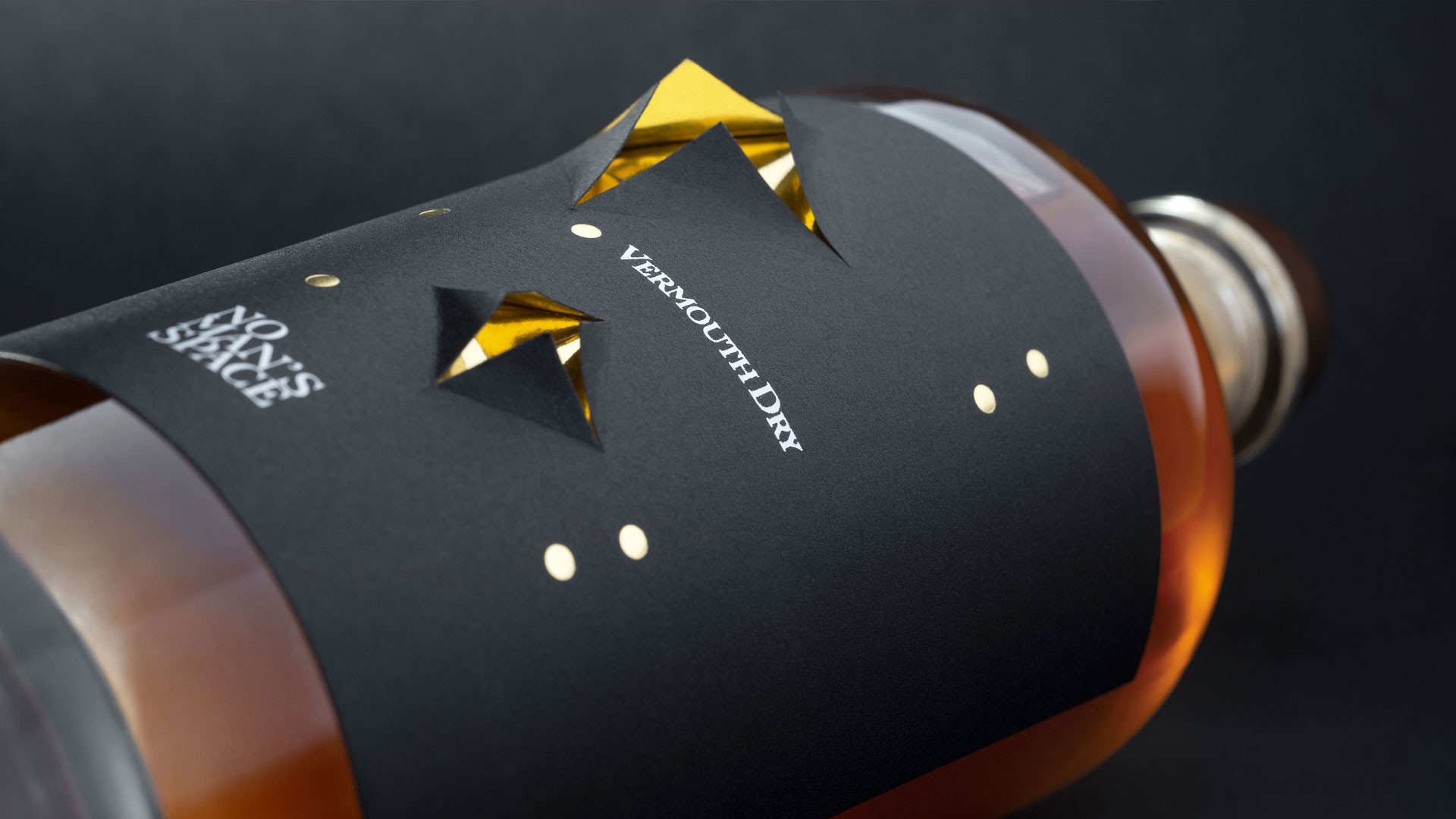
Every label in this line has been printed in Black and White to obtain the best contrast, as well as to best play off of the Gold foil. And the choice of thick natural cotton papers adds an unexpectedly tactile quality to a design otherwise meant to call to mind the vast nothingness of space.


The simplicity is brilliant. Thank you for sharing Sabine!
Thanks, Jen. We feel duty-bound to reply that it only looks simple, which only makes it more brilliant 😉