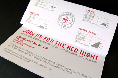
Quality is a sensual experience. We know it as soon as we see it … taste it … hear it … touch it. In fact, once quality presents itself and grabs our attention – as it does with this invitation – we realize how mediocrity is an empty pit to be sidestepped at all costs.
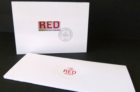
Red wines are the theme of the evening, and the letters R-E-D figure as the prominent design element in a clever marriage of the word and the color. A diecut window on the front of the save-the-date card reveals “RED” in the color red.

Open the card and you find 22 words covering one inside panel. All contain R-E-D: INCREDIBLE, ADMIRED, SAVORED, REDISCOVER. Each R-E-D is letterpress printed in red. (The balance of the letters in the words are letterpress printed in silver.)
The pieces were done on CRANE’S Lettra – butter in the hands and a quintessential paper choice for letterpress work. The simple palette, the straightforward message all make for a REDiculously wonderful invitation.