Every once in a while I come across something so perfect, so utterly different from everything I’ve seen before, I experience a little chill. That was just what happened the moment I opened this exquisite “jewelry box of honey.” With its daring use of digital printing, foil and intense screen– printed color accents, the sight that awaited me inside was like nothing I’d ever seen before.
Designed by branding agency Stag&Hare – which strives to move its audience through a potent blend of texture, visuals, smells and tastes – this packaging features four flavors of artisanal honey from the Capital Bee Co., and was created as a client gift and promotional piece to show off the company’s creative capabilities.
Of prime importance to the agency: using the packaging to highlight how, much like wine, honey can differ greatly depending on the plant life that surrounds the area in which the honeybees make honey. To do this, the wizards at DataGraphic used a wide variety of printing and finishing techniques.
Exploring this One-of-a-Kind Honey Packaging
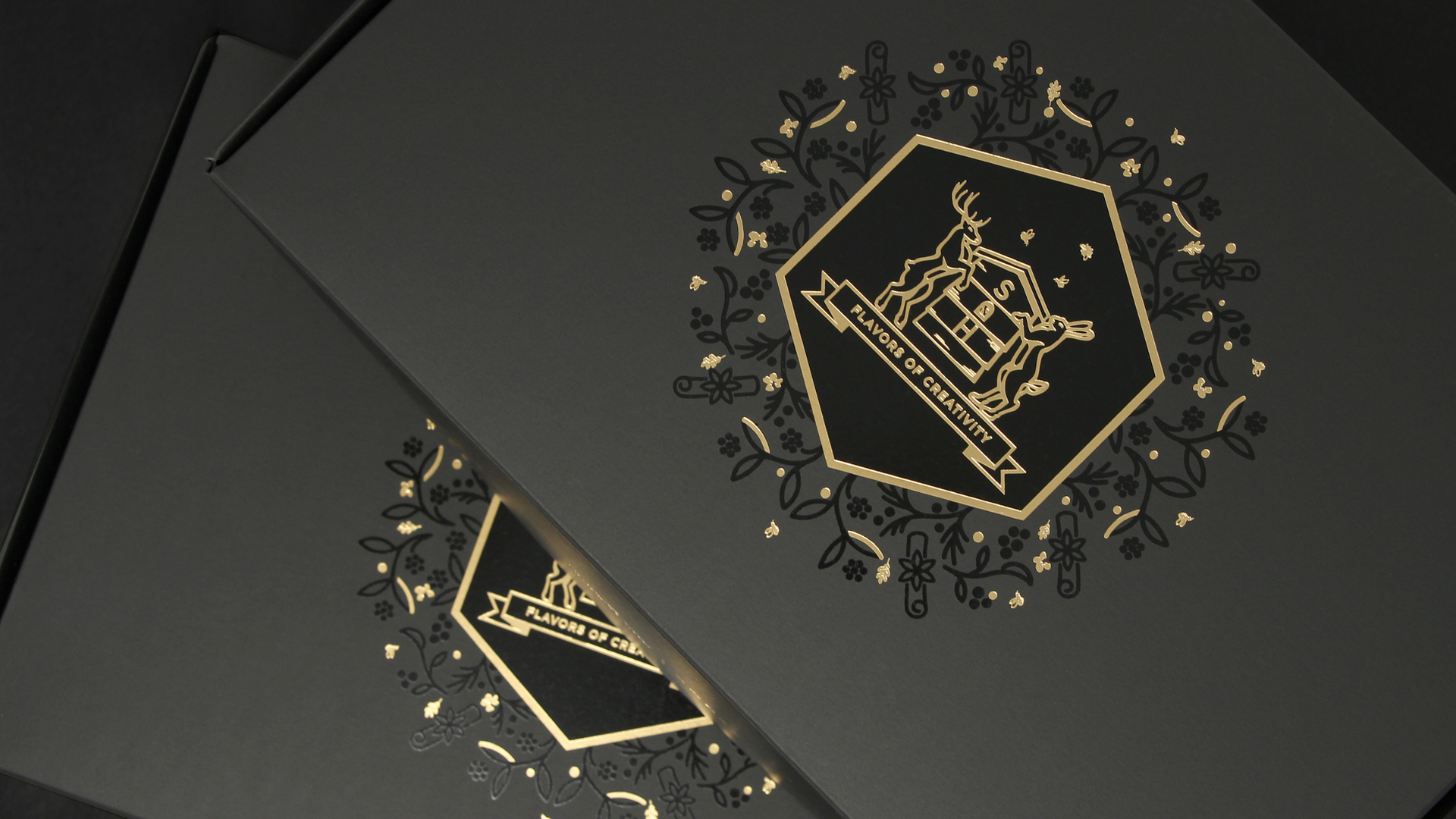
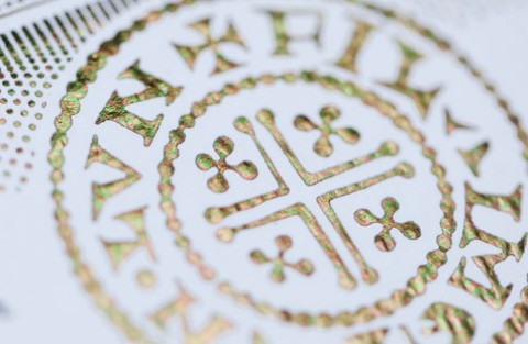
First, the exquisite outer box was crafted from super matte 122 lb. Black Neenah Plike. On the lid, a regal coat of arms created through an intricate interplay of spot gloss UV patterns and Gold foil highlights the motto “Flavors of Creativity.” Lifting that lid, however, is when the fun truly begins.
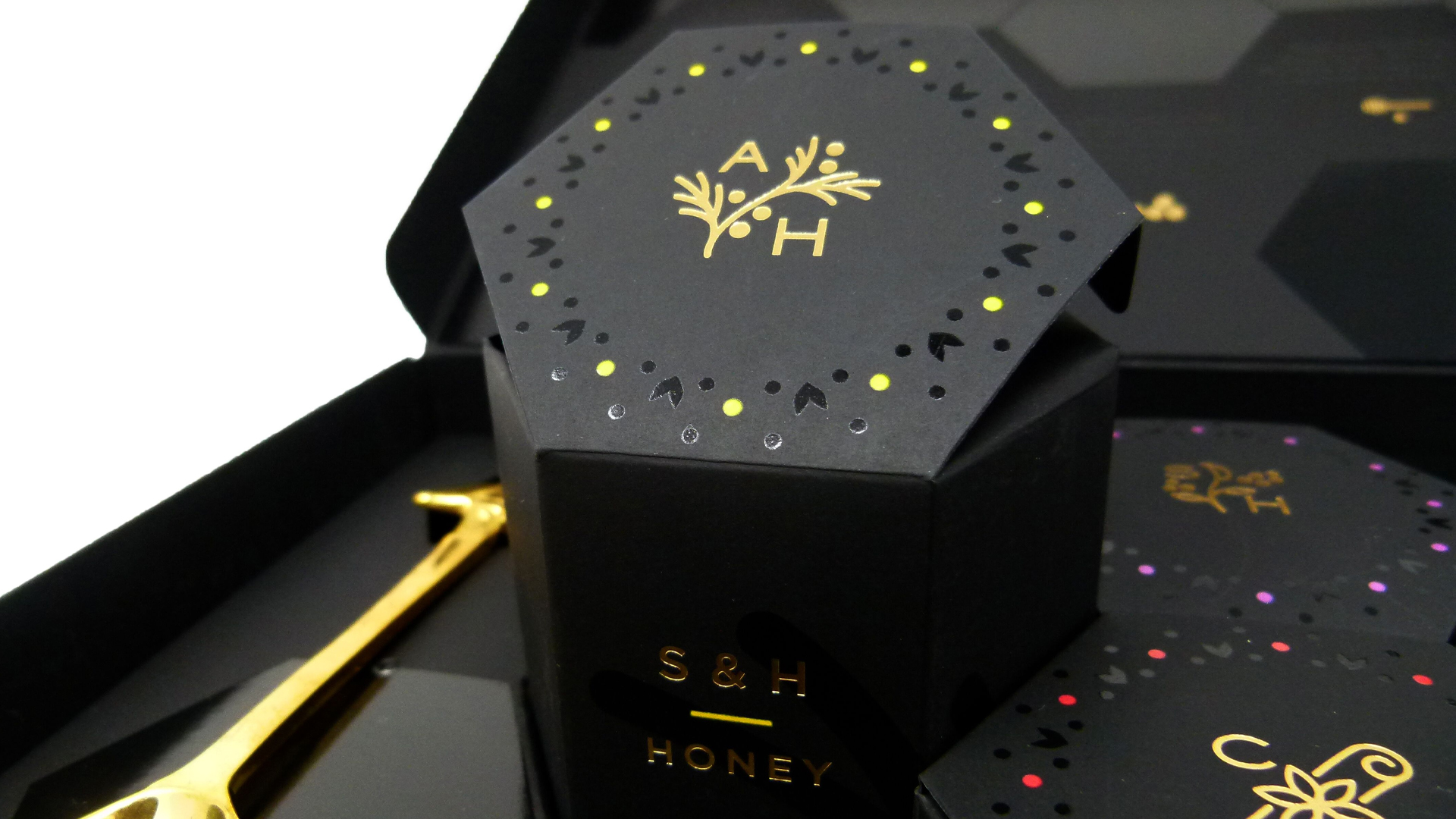
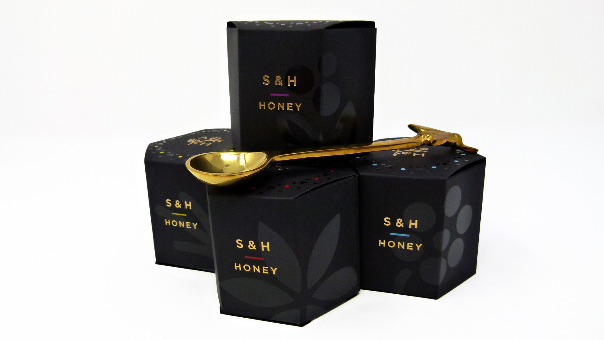
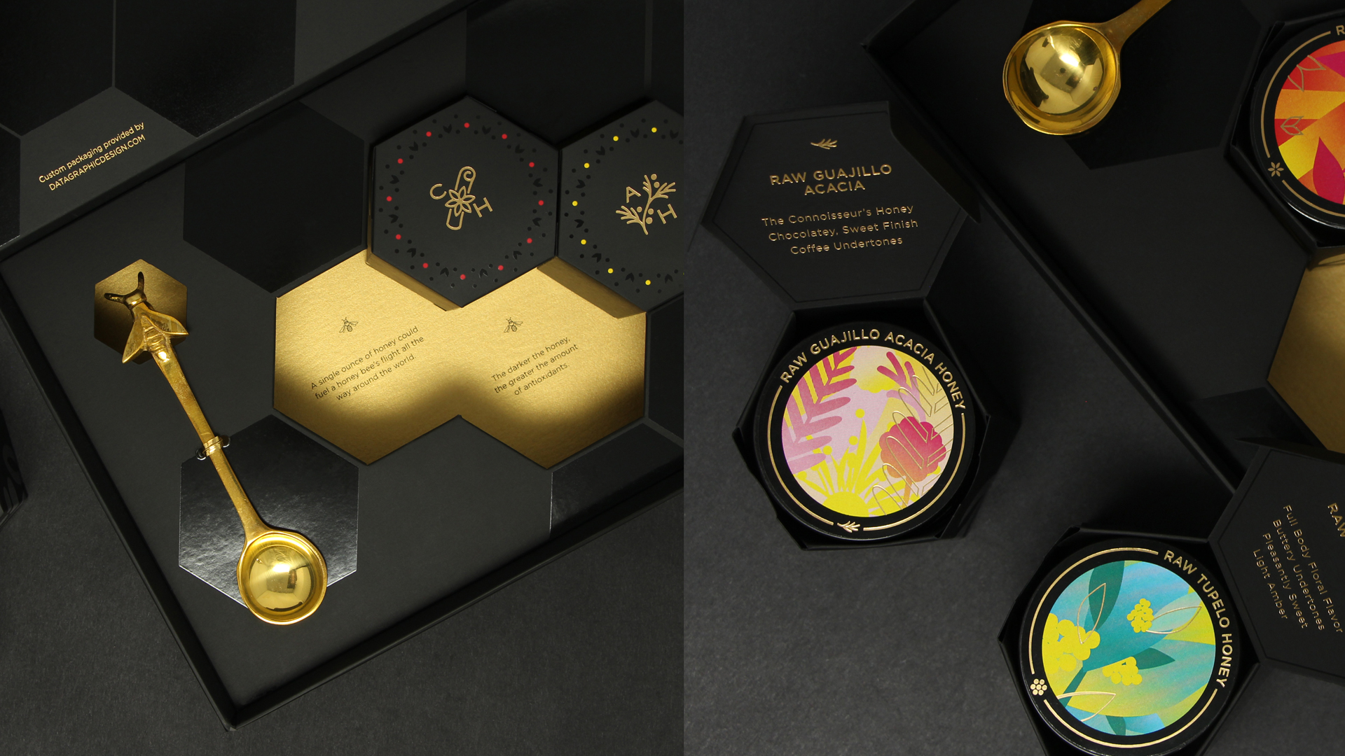
Inside, four hexagonal honey-jar boxes sit nestled in an insert tray. The die-cut spaces for the jars combined with precisely arranged hexagonal spot UV designs give the impression of a honeycomb; there’s even a special brass spoon with a honeybee motif. Removing the boxes reveals interesting honeybee-related facts printed inside the packaging beneath them.
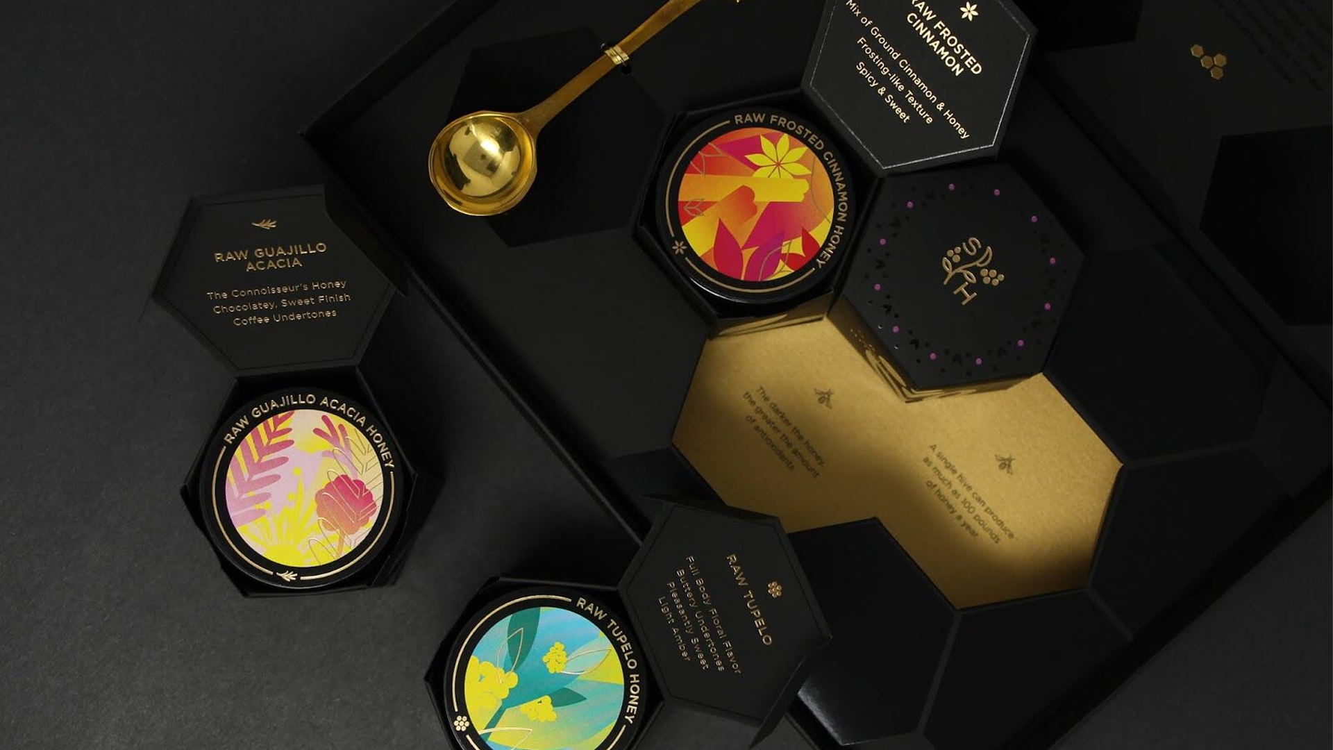
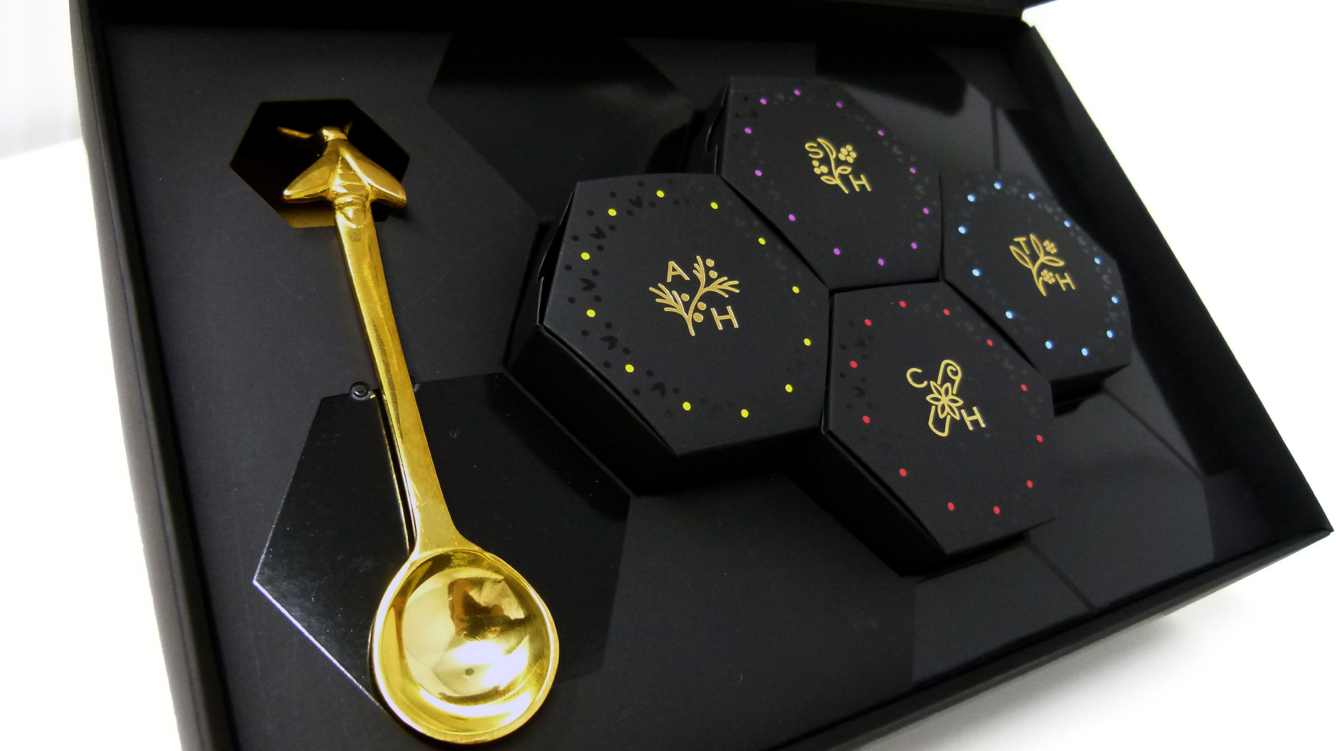
On the top of each hexagonal–box lid is a unique logo hot foil stamped in Gold and surrounded by tiny spot varnished patterns and pops of vivid, screen-printed colors. The words “S&H Honey” are also emblazoned on each box’s side in Gold foil.
“Digital printing does not register well sheet to sheet so we eliminated that idea for the small inner boxes,” explains DataGraphic President Glenn Schuster, “and switched to screen printing, which hit the mark very precisely.”
My breath now completely taken away, I flip up the jar-box lid to reveal another 1-2 punch of foil and color: the name of the honey and a brief description rendered in Gold foil on the underside of the lid, and the revelation of the jar top itself, which comes as QUITE a revelation indeed. That’s because each top features not only the name of the honey in Gold foil but also a large vibrant screen-printed floral illustration: a beautiful nod to the unique ingredient that informs the distinct flavor of the honey within.
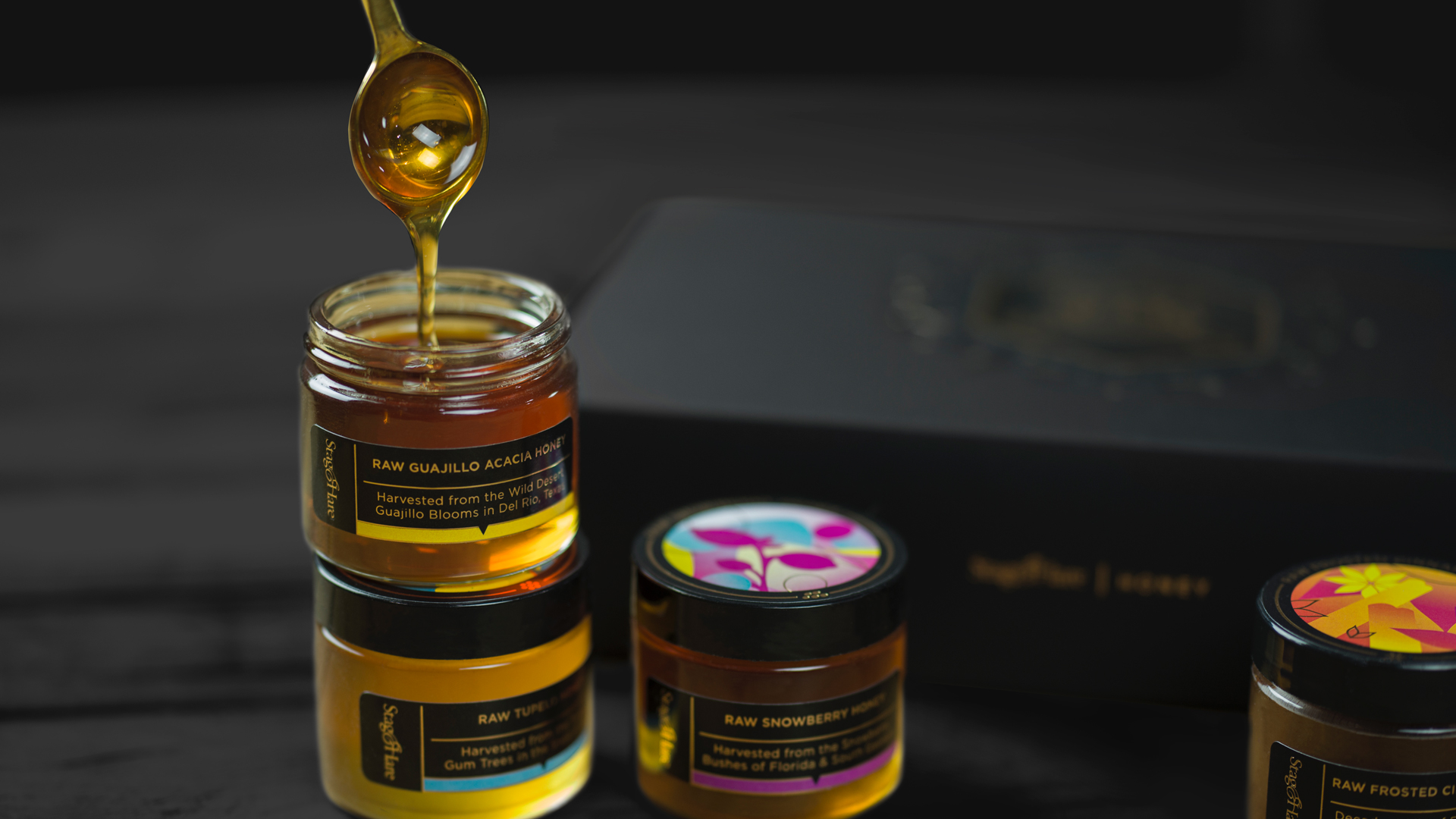
The final opulent revelation comes when you slide the jar from its carton, revealing its own color-coded, digitally printed label. Taking in all of these sumptuous design ingredients, there’s really only one word to sum up this project: Sweet 😉


