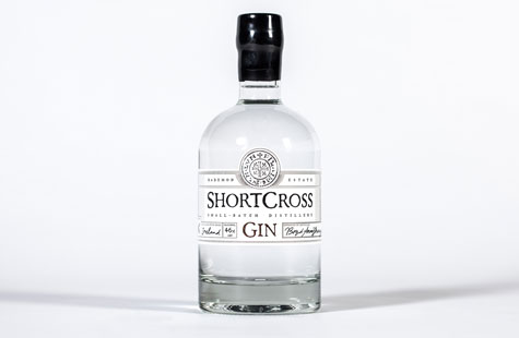
Inspired by the historic family estate that’s home to Northern Ireland’s first craft gin distillery, Paperjam Design designed a distinctive label befitting the bottle’s high-end, quality contents. The team first established the product name (from the Gaelic word crossgar that subtly references the location of the distillery) before they created the visual style.
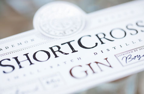
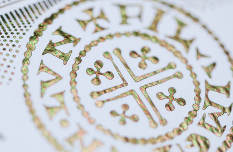
An interesting circular decoration at the top of the label came about after discovering a coin called the “short cross penny” that dates back to the 10th century. Paperjam sourced an original coin and took high-resolution scans to incorporate into the gin’s branding and packaging.
The label documents the distillation process by openly displaying the batch number, flavor and alcohol content. An “x” and a signature in script type look handwritten and help to emphasize artisanal craftsmanship.
Three foil colors (silver, copper and black); luxuriously textured paper (Mohawk Strathmore Pastelle); hand-applied labels; a traditionally shaped, clear glass bottle; and that finishing touch of black wax convey a standout brand message in a very competitive industry.