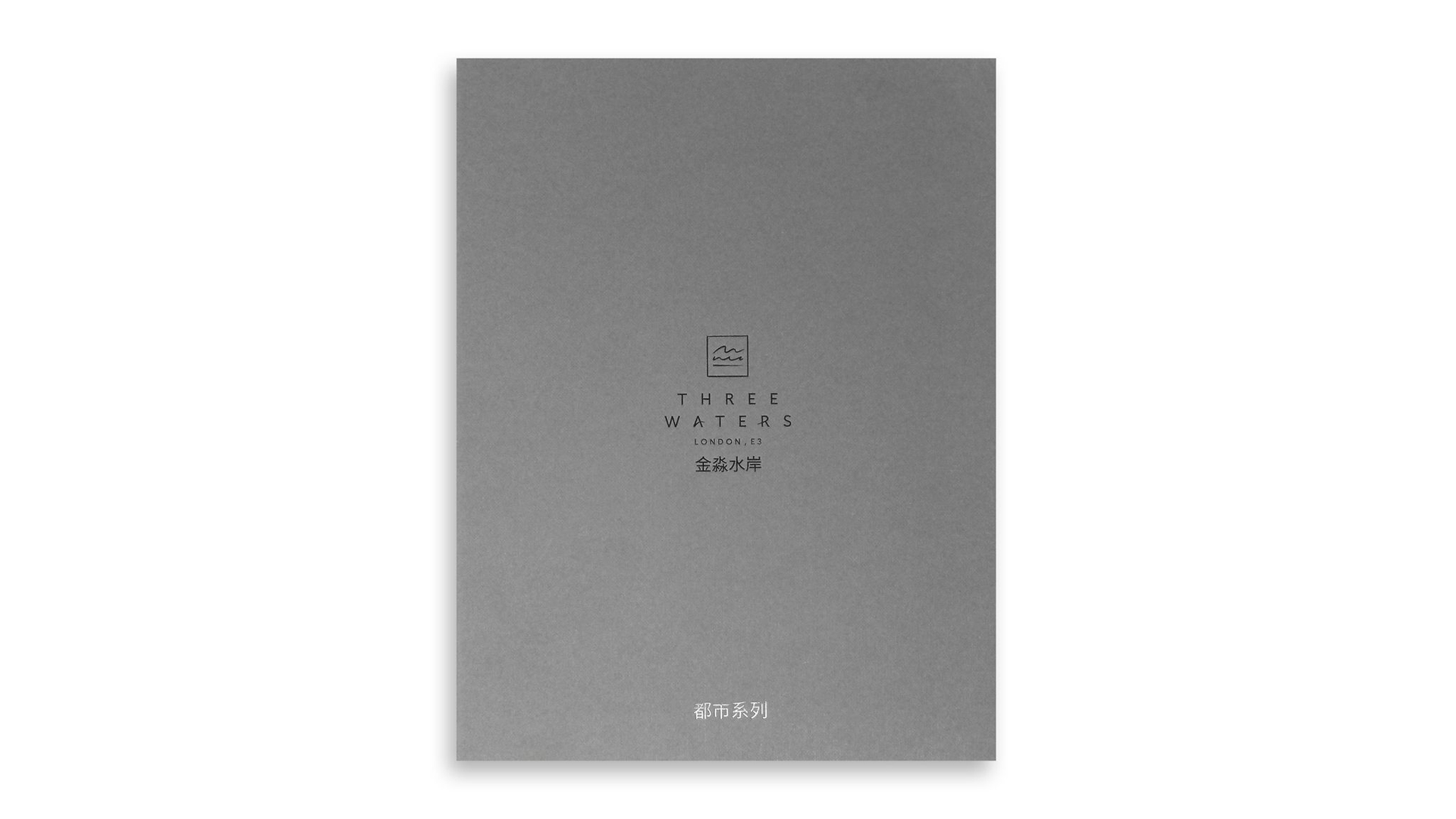
When you’re trying to entice overseas investors into backing your luxury London properties, a simple portfolio simply won’t do. Taking this development’s name – Three Waters – as inspiration, Design studio Lantern London and Kingsbury Press crafted a creative brochure that emphasizes the little details that set this real estate apart through the use of creative and powerful finishing details all their own.
A Creative Binding for an Unexpected Experience
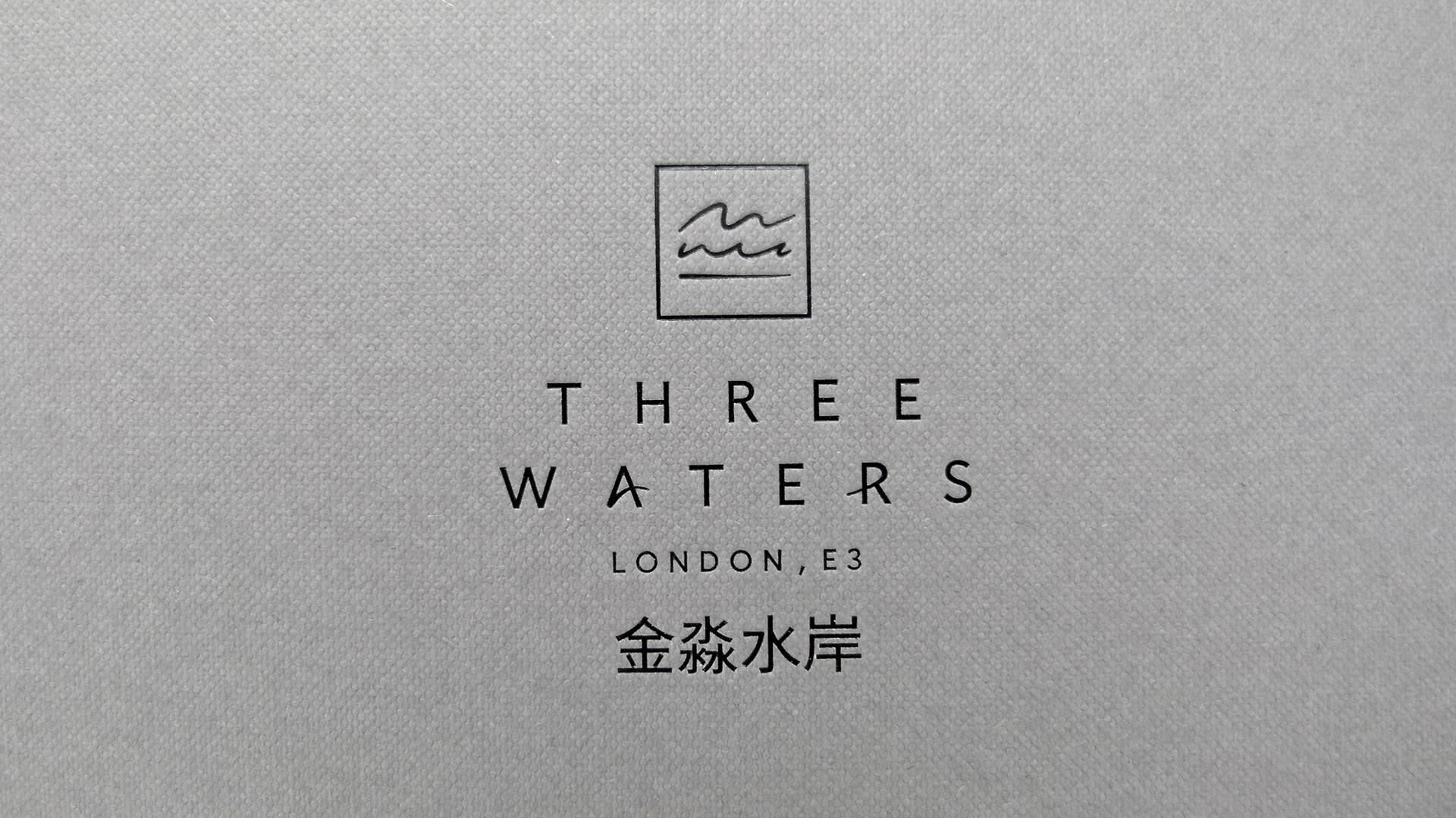
We all know how important first impressions are; the Three Waters brochure grabs our attention in two ways. First there is the all-important tactile connection thanks to the Buckram embossed pattern on this 540 gm (365 lb.) Colorplan Dark Grey cover. Secondly, the Black foil design elements also convey an understated elegance and charm.
For those expecting a perfect-bound brochure, the exposed Smyth-sewn spine will come as a surprise. (The vibrant Red thread used is a snazzy touch.) As PaperSpecs PRO members already know, this technique – Swiss binding to give it its proper name – is very trendy right now. With Swiss binding, the text block is glued to the inside back cover so as to leave the spine exposed, giving the piece a handcrafted appearance. As the printer observes, it gives this portfolio “a casual feel in keeping with the development itself, which is luxurious but approachable.”
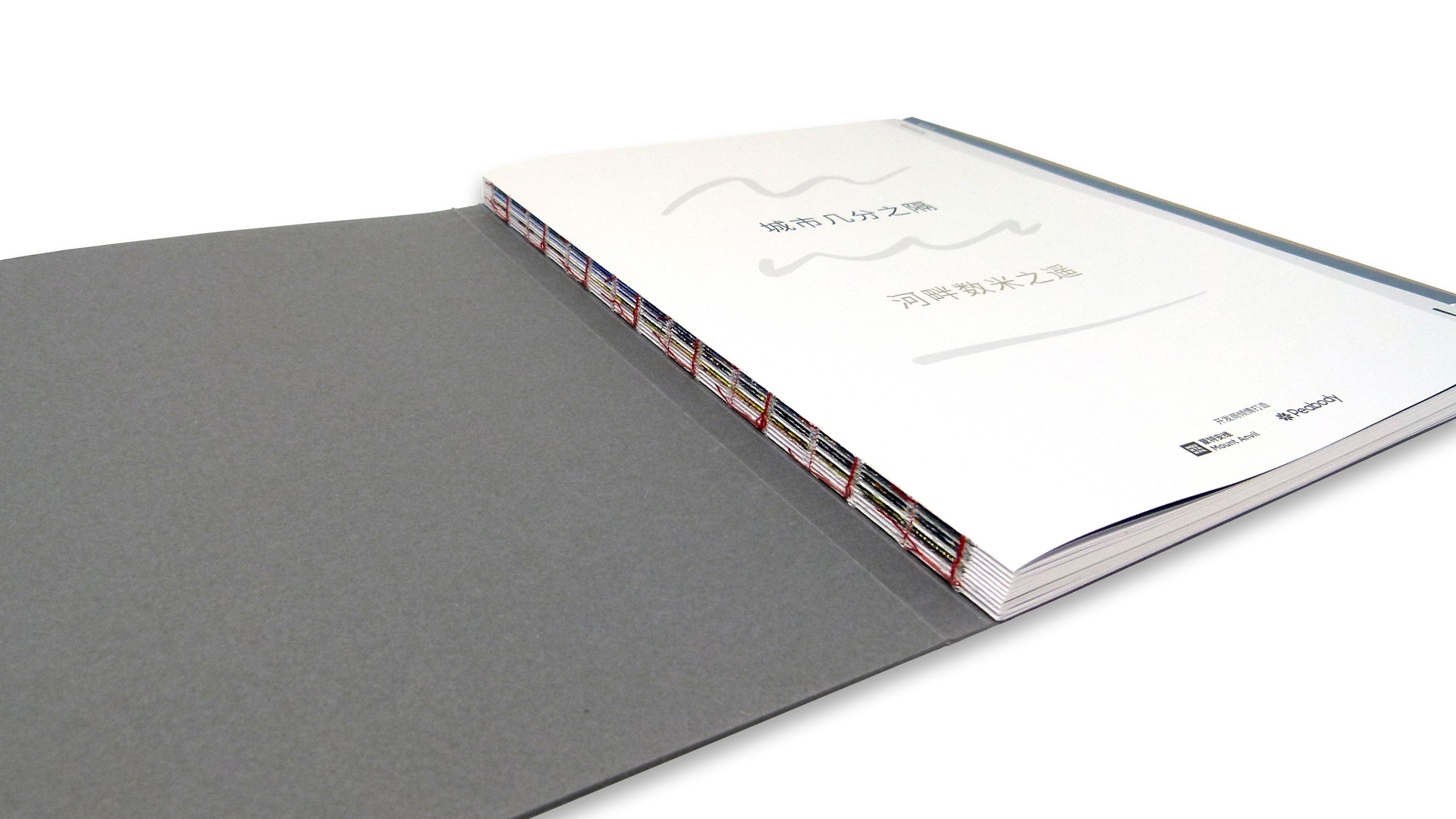
And because the text block is broken up into small signatures – 8 pages each – and Smyth sewn, the brochure not only lays open flat, but also allows for the gorgeous photographs to run full-spread. This means that rather than having to calculate how much of each page’s half-photo would be lost in the gutter (as with perfect binding), the images here are cut in half exactly and printed edge to edge.
Making Waves
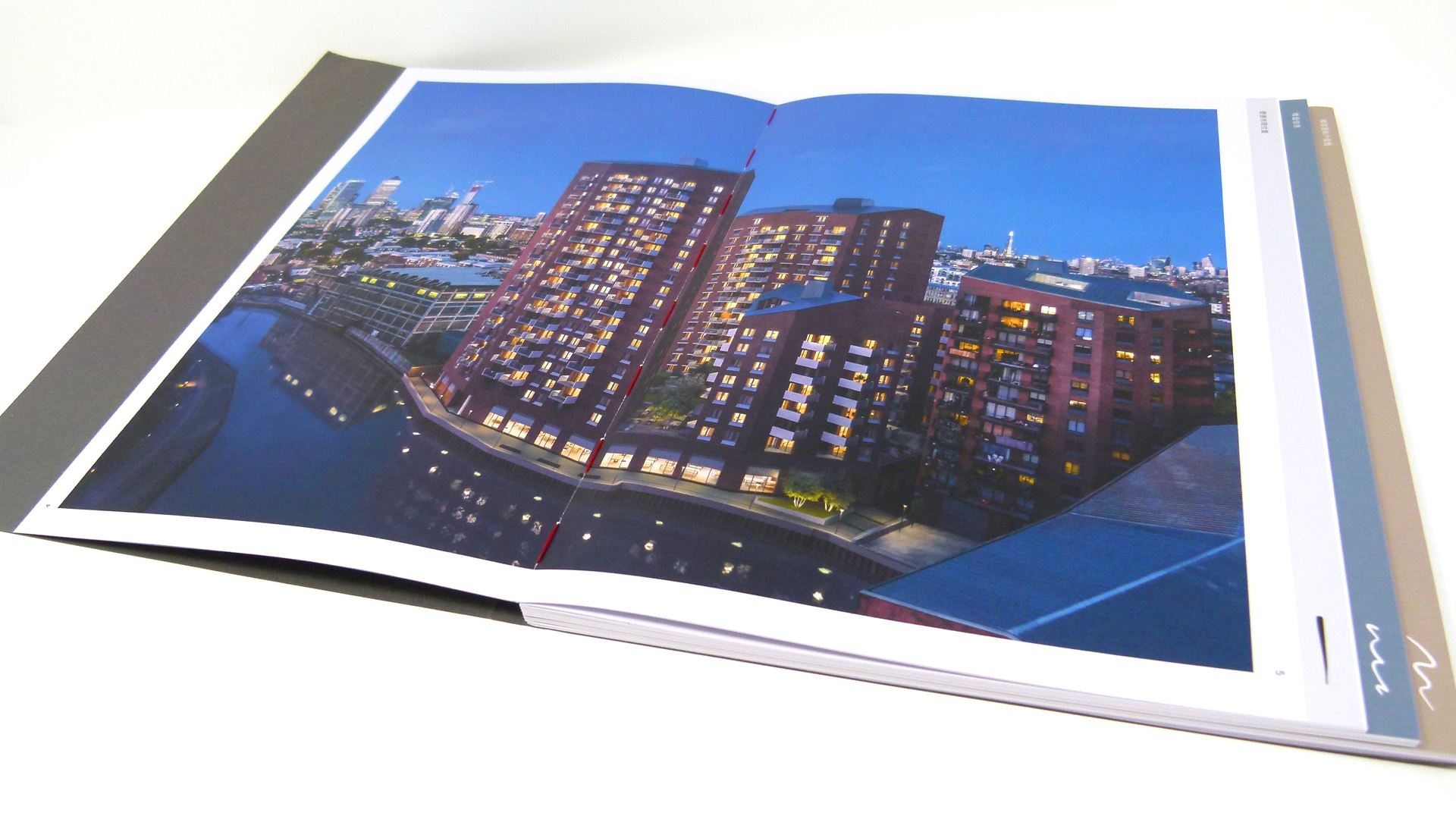
As the three featured buildings are waterside properties, the design team played off this aspect in a particularly attention-grabbing way. Each section of the brochure is “index cut” to a different width to create the impression of three “steps” along the right side of the brochure – a symbolic nod to the waves just off shore.
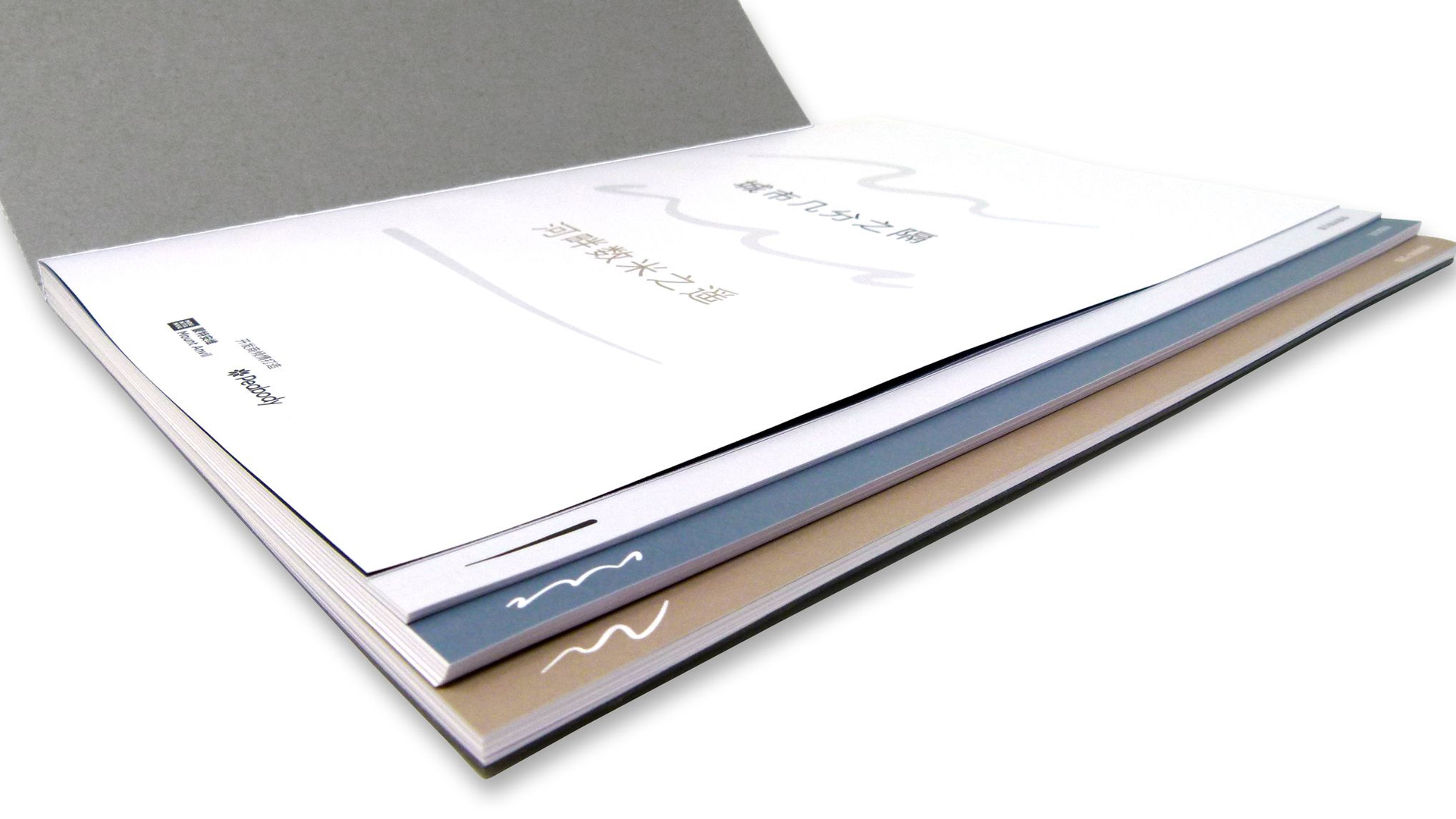
Keeping each signature to a specific width would have been an easier way to create the stepped look and feel, but the perfectionists behind this piece also kept the reader experience in mind. Making the last page of the signature the width of the next section guides us seamlessly from one section to the next.
Pulling this off was no easy feat. It required rigid organization not only among Kingsbury Press’ own finishing team, but also across its multiple suppliers, to ensure that everything fit together perfectly, right down to the design elements on the edge of each “step.”
As you can see, the right binding technique doesn’t just keep your beautifully designed pages together, it can lend a whole new dimension to your work. Not sure what your options are? Be sure to download our free Binding Cheat Sheet right now!


