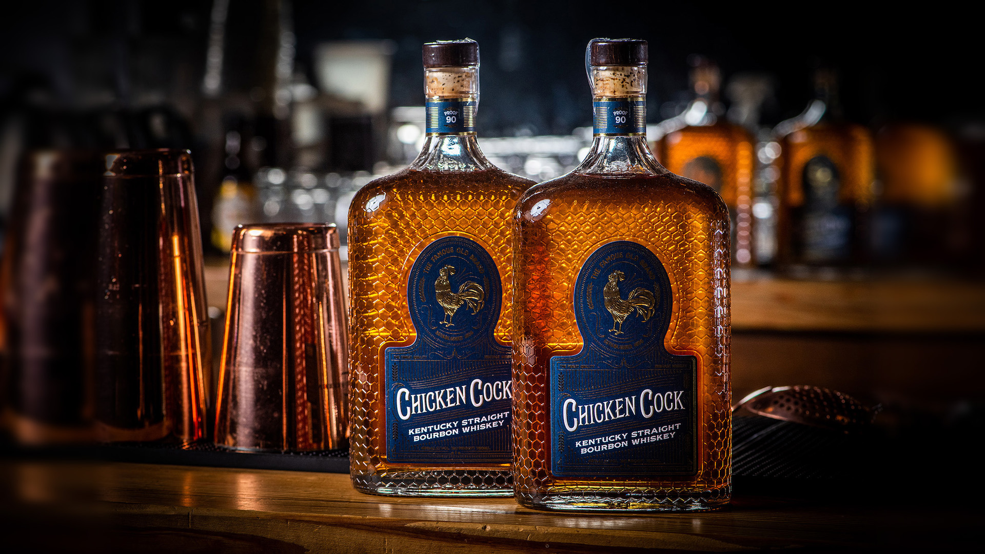
When you’re selling a bourbon that both pre-dates the Civil War and flowed freely at the famous Cotton Club nightclub in Harlem during Prohibition, you naturally want your packaging to express its rich, storied past. Like the taste of the elixir inside, the bourbon label for Chicken Cock Kentucky Straight Bourbon Whiskey is pleasing at first glance, and gets better as you savor its rich, well-crafted details.
Photography: Stephenblackmon.com
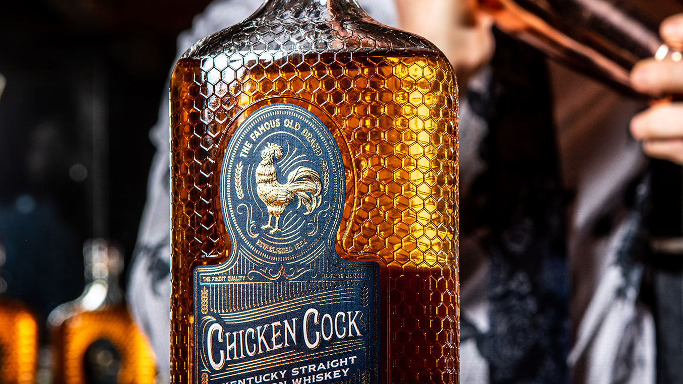
They began with a tactilely exciting texture featuring a unique “chicken fence” pattern embossed onto the glass that completely covers the bottle, giving it the appearance of an ornate spirits container from the Roaring ‘20s. (It’s actually modeled after the original Chicken Cock packaging used during Prohibition.)
Photography: Stephenblackmon.com
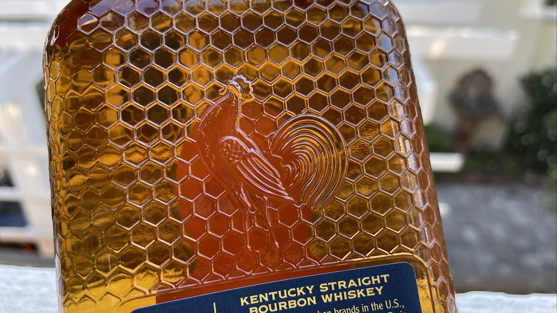
On the back, you can just make out the wings and outline of a chicken embedded within the same chain-link pattern. On the front is an indented space in the glass – the perfect size and shape for the label. And here’s where the real detail work comes in.
Designed by Alyson Curtis and digitally printed CMYK on finger-pleasing Neenah Classic Linen paper [PaperSpecs PRO members: Get Swatchbook!] by Wright Global Graphics, the label feels as rich as it looks. Gold hot foil stamping is everywhere in the form of swirls, lines and text. But it is the proud rooster perched at the top that grabs the eye, and rightfully so.

This is thanks to a superbly detailed sculptured emboss which brings the proud creature to life, with minute line work that emphasizes every feature and feather, from the proud cockscomb at the top of its head to its finely rendered claws.
The sculptured emboss, when paired with the Kurz 231 Gold foil, provides shading throughout this eminently touchable illustration, providing a beak-dropping 3D effect. Foiled “motion lines” around the head and feet give the impression of the rooster greeting the dawn with a hearty crow. (Yes, roosters “crow” and crows “caw” – you have to love this language ;-))
On the back of the bottle is another digitally printed label, with relevant ingredient and backstory information delivered in Golden Yellow ink on a Blue background.
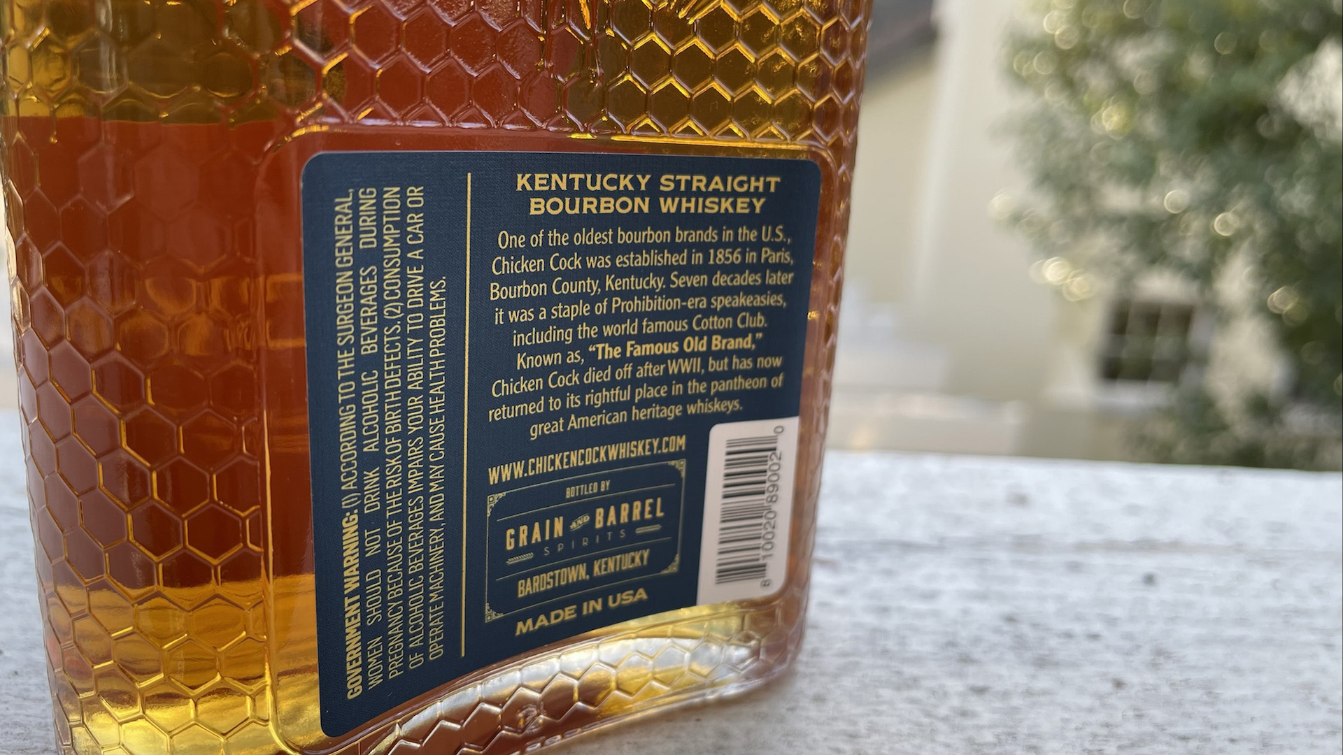
A low-key neck band using the same color scheme completes this attention-grabbing packaging.

Photography: Stephenblackmon.com
The sculptured emboss and generous use of foil combine beautifully with the textured glass of the bottle to remind connoisseurs of the liquor’s glorious past, even as they savor the taste of modern bourbon crafting methods. A potent cocktail indeed.


I have one of these bottles without the label, just the rooster. Looks like the bottom of the bottle has an impression of a dove or similar and the number 8 is also raised on the bottom. Any idea what age this bottle is?
I’m afraid the best we can say is that the post appears to be from 2022. Sorry we can’t be of more help on this one.